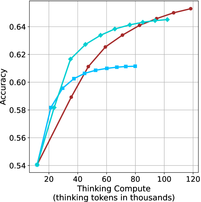
## Line Chart: Accuracy vs. Thinking Compute
### Overview
The image is a line chart comparing the accuracy of three different models as a function of "Thinking Compute," measured in thousands of thinking tokens. The x-axis represents the thinking compute, ranging from 0 to 120 (in thousands), and the y-axis represents the accuracy, ranging from 0.54 to 0.64. Three lines, each representing a different model, are plotted on the chart.
### Components/Axes
* **X-axis:** "Thinking Compute (thinking tokens in thousands)". The axis ranges from 0 to 120, with tick marks at intervals of 20 (20, 40, 60, 80, 100, 120).
* **Y-axis:** "Accuracy". The axis ranges from 0.54 to 0.64, with tick marks at intervals of 0.02 (0.54, 0.56, 0.58, 0.60, 0.62, 0.64).
* **Data Series:** There are three data series represented by lines of different colors and markers:
* **Cyan with Diamond Markers:** This line starts at approximately (15, 0.54) and increases rapidly, then plateaus around (100, 0.64).
* **Brown with Circle Markers:** This line starts at approximately (15, 0.54) and increases steadily, reaching approximately (120, 0.65).
* **Light Blue with Square Markers:** This line starts at approximately (25, 0.60) and increases slightly, then plateaus around (70, 0.61).
### Detailed Analysis
* **Cyan (Diamond Markers):**
* (15, 0.54)
* (25, 0.58)
* (30, 0.60)
* (35, 0.62)
* (45, 0.63)
* (60, 0.635)
* (80, 0.64)
* (100, 0.64)
* **Brown (Circle Markers):**
* (15, 0.54)
* (40, 0.59)
* (60, 0.61)
* (80, 0.63)
* (100, 0.64)
* (120, 0.65)
* **Light Blue (Square Markers):**
* (25, 0.60)
* (40, 0.61)
* (60, 0.61)
* (75, 0.61)
### Key Observations
* The cyan line (diamond markers) shows the highest initial increase in accuracy with increasing thinking compute, but plateaus earlier than the brown line.
* The brown line (circle markers) demonstrates a more consistent increase in accuracy across the entire range of thinking compute, eventually surpassing the cyan line.
* The light blue line (square markers) plateaus at a lower accuracy level compared to the other two lines.
### Interpretation
The chart illustrates the relationship between the amount of computational resources ("Thinking Compute") allocated to three different models and their resulting accuracy. The data suggests that increasing the thinking compute generally leads to higher accuracy, but the specific gains vary depending on the model. The brown model appears to benefit most from increased compute, while the light blue model plateaus quickly. The cyan model shows a strong initial improvement but diminishing returns at higher compute levels. This information could be used to optimize resource allocation for each model, focusing on the range of compute where each model shows the most significant gains in accuracy.