## Grouped Bar Chart: Accuracy Comparison of Raw vs. Processed Data for Two Metrics
### Overview
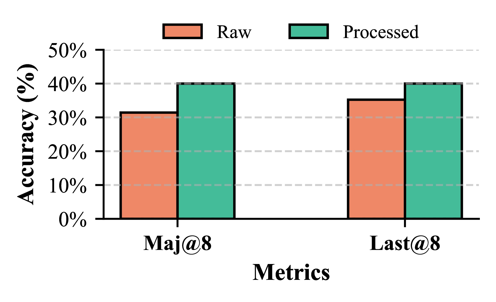
The image displays a grouped bar chart comparing the accuracy percentage of two data processing states ("Raw" and "Processed") across two distinct metrics ("Maj@8" and "Last@8"). The chart visually demonstrates the performance improvement achieved by applying a processing step to the raw data for both evaluated metrics.
### Components/Axes
* **Chart Type:** Grouped Bar Chart.
* **Y-Axis (Vertical):**
* **Label:** "Accuracy (%)"
* **Scale:** Linear scale from 0% to 50%.
* **Axis Markers/Ticks:** 0%, 10%, 20%, 30%, 40%, 50%.
* **Grid Lines:** Horizontal dashed grid lines extend from each major tick mark across the plot area.
* **X-Axis (Horizontal):**
* **Label:** "Metrics"
* **Categories:** Two primary categories are displayed: "Maj@8" (left group) and "Last@8" (right group).
* **Legend:**
* **Position:** Centered at the top of the chart, above the plot area.
* **Items:**
1. **Raw:** Represented by a salmon/orange colored bar.
2. **Processed:** Represented by a teal/green colored bar.
* **Data Series:** Two bars are grouped under each metric category on the x-axis, one for "Raw" and one for "Processed".
### Detailed Analysis
The chart presents the following specific data points (values are approximate based on visual alignment with the y-axis grid lines):
| Metric | Data State | Estimated Accuracy | Observation |
| :--- | :--- | :--- | :--- |
| **Maj@8** (Left Group) | Raw (Orange Bar) | ~31-32% | Top aligns slightly above the 30% grid line. |
| | Processed (Teal Bar) | 40% | Top aligns exactly with the 40% grid line. |
| **Last@8** (Right Group) | Raw (Orange Bar) | ~35-36% | Top is positioned midway between the 30% and 40% grid lines. |
| | Processed (Teal Bar) | 40% | Top aligns exactly with the 40% grid line. |
**Trend/Observation:** For both metrics, the "Processed" bar is taller than the "Raw" bar, indicating an accuracy improvement after processing. The gain is approximately 8-9 percentage points for Maj@8 and 4-5 percentage points for Last@8.
### Key Observations
1. **Consistent Improvement:** For both metrics ("Maj@8" and "Last@8"), the "Processed" data yields higher accuracy than the "Raw" data.
2. **Uniform Processed Performance:** The accuracy for the "Processed" state is identical (40%) across both metrics.
3. **Variable Raw Performance:** The "Raw" data shows different baseline accuracies for the two metrics, with "Last@8" (~35-36%) performing better than "Maj@8" (~31-32%).
4. **Magnitude of Gain:** The processing step provides a larger absolute gain for the "Maj@8" metric (~8-9%) compared to the "Last@8" metric (~4-5%).
### Interpretation
This chart provides clear empirical evidence that the applied data processing technique is effective. It successfully elevates the accuracy of both evaluated metrics to a consistent, higher standard (40%).
The data suggests that the "Maj@8" metric is more sensitive to or benefits more dramatically from the processing step than the "Last@8" metric. This could imply that the "Maj@8" metric is more susceptible to noise or artifacts present in the raw data, which the processing effectively removes. Conversely, the "Last@8" metric may be inherently more robust or may capture a different aspect of performance that is less affected by the unprocessed data's flaws.
The fact that both processed metrics converge to the same 40% accuracy might indicate a performance ceiling for the current model or task under these specific conditions, or it could suggest that the processing optimizes the data to a point where these two different evaluation criteria yield equivalent results. The chart effectively communicates the value of the processing pipeline, showing it not only improves performance but also standardizes it across different evaluation metrics.