\n
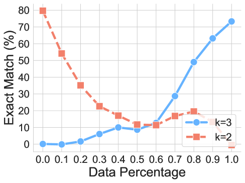
## Line Chart: Exact Match vs. Data Percentage
### Overview
This image presents a line chart illustrating the relationship between "Data Percentage" on the x-axis and "Exact Match (%)" on the y-axis, for two different values of 'k' (k=2 and k=3). The chart appears to demonstrate how the percentage of exact matches changes as the amount of data used increases.
### Components/Axes
* **X-axis:** "Data Percentage", ranging from 0.0 to 1.0, with increments of 0.1.
* **Y-axis:** "Exact Match (%)", ranging from 0 to 80, with increments of 10.
* **Line 1 (Blue):** Represents data for k=3.
* **Line 2 (Orange/Red):** Represents data for k=2.
* **Legend:** Located in the bottom-right corner, clearly labeling each line with its corresponding 'k' value and color.
### Detailed Analysis
**Line k=3 (Blue):**
The blue line starts at approximately 1% Exact Match at 0.0 Data Percentage. It exhibits a generally upward trend, with some fluctuations.
* 0.0 Data Percentage: ~1% Exact Match
* 0.1 Data Percentage: ~2% Exact Match
* 0.2 Data Percentage: ~4% Exact Match
* 0.3 Data Percentage: ~7% Exact Match
* 0.4 Data Percentage: ~9% Exact Match
* 0.5 Data Percentage: ~11% Exact Match
* 0.6 Data Percentage: ~13% Exact Match
* 0.7 Data Percentage: ~29% Exact Match
* 0.8 Data Percentage: ~49% Exact Match
* 0.9 Data Percentage: ~69% Exact Match
* 1.0 Data Percentage: ~74% Exact Match
**Line k=2 (Orange/Red):**
The orange/red line begins at approximately 79% Exact Match at 0.0 Data Percentage and demonstrates a steep downward trend initially.
* 0.0 Data Percentage: ~79% Exact Match
* 0.1 Data Percentage: ~57% Exact Match
* 0.2 Data Percentage: ~41% Exact Match
* 0.3 Data Percentage: ~27% Exact Match
* 0.4 Data Percentage: ~22% Exact Match
* 0.5 Data Percentage: ~16% Exact Match
* 0.6 Data Percentage: ~14% Exact Match
* 0.7 Data Percentage: ~18% Exact Match
* 0.8 Data Percentage: ~22% Exact Match
* 0.9 Data Percentage: ~33% Exact Match
* 1.0 Data Percentage: ~40% Exact Match
### Key Observations
* The k=2 line starts with a very high Exact Match percentage but rapidly decreases as the Data Percentage increases.
* The k=3 line starts with a low Exact Match percentage but steadily increases as the Data Percentage increases.
* The lines intersect around a Data Percentage of 0.7, where the Exact Match percentages are approximately equal.
* At 1.0 Data Percentage, the k=3 line has a significantly higher Exact Match percentage than the k=2 line.
### Interpretation
The chart suggests that using a larger 'k' value (k=3) leads to a higher percentage of exact matches when a larger percentage of the data is considered. Conversely, a smaller 'k' value (k=2) provides a high initial Exact Match percentage but quickly degrades as more data is included. This could indicate that k=2 is more sensitive to noise or variations in the data, while k=3 is more robust. The intersection point around 0.7 suggests that for data percentages above this threshold, k=3 is the preferable choice for maximizing exact matches. The 'k' parameter likely represents a threshold or a parameter in a matching algorithm, and the chart demonstrates the trade-offs between initial accuracy and robustness to data volume. The chart is likely demonstrating the performance of a similarity search or matching algorithm as the amount of data increases.