## Bar Chart: Percentage Distribution by Overlap Ratio
### Overview
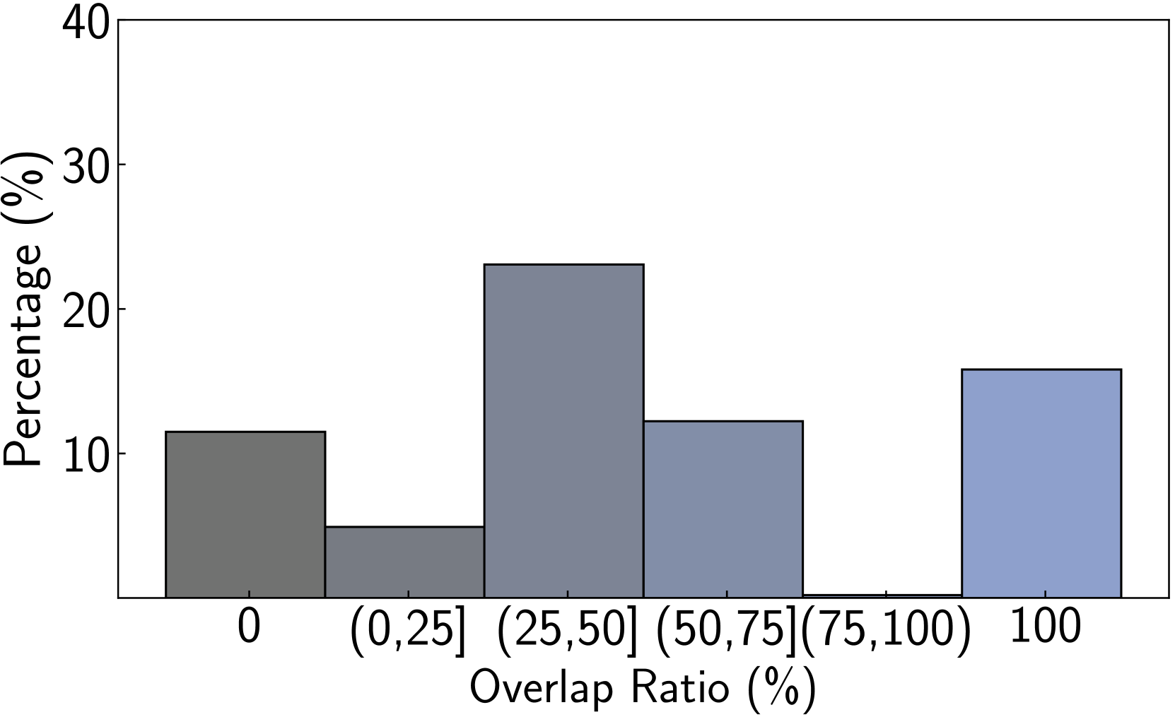
This image displays a bar chart illustrating the percentage distribution across different overlap ratio ranges. The x-axis represents the "Overlap Ratio (%)", and the y-axis represents the "Percentage (%)". The chart shows five distinct bars, each corresponding to a specific range of overlap ratios, with varying heights indicating their respective percentages.
### Components/Axes
* **X-axis Title:** "Overlap Ratio (%)"
* **X-axis Labels:**
* "0"
* "(0,25]"
* "(25,50]"
* "(50,75]"
* "100"
* **Y-axis Title:** "Percentage (%)"
* **Y-axis Labels:** 0, 10, 20, 30, 40. The scale increments by 10.
### Content Details
The chart displays the following bars, from left to right:
1. **Bar 1 (Dark Grey):** Corresponds to an overlap ratio of "0".
* **Height:** Approximately 12%.
2. **Bar 2 (Light Grey):** Corresponds to an overlap ratio range of "(0,25]".
* **Height:** Approximately 5%.
3. **Bar 3 (Medium Grey/Blue):** Corresponds to an overlap ratio range of "(25,50]".
* **Height:** Approximately 23%.
4. **Bar 4 (Light Blue/Grey):** Corresponds to an overlap ratio range of "(50,75]".
* **Height:** Approximately 12%.
5. **Bar 5 (Light Blue):** Corresponds to an overlap ratio of "100".
* **Height:** Approximately 16%.
**Note:** The x-axis labels are not perfectly aligned with the bars. The first bar appears to be centered around "0", the second bar between "0" and "25", the third between "25" and "50", the fourth between "50" and "75", and the fifth bar is labeled "100" and appears to represent the range up to and including 100%. There is a gap between the "(50,75]" label and the "100" label, suggesting a missing category or a different representation for the "100" value. However, the bar labeled "100" is positioned to the right of the "(50,75]" range, and its height is clearly depicted.
### Key Observations
* The highest percentage (approximately 23%) is observed for the overlap ratio range of (25,50]%.
* The lowest percentage (approximately 5%) is observed for the overlap ratio range of (0,25]%.
* There are significant variations in percentages across the different overlap ratio categories.
* The overlap ratio of 0% and the range (50,75]% have similar percentages (approximately 12%).
* The overlap ratio of 100% has a percentage of approximately 16%.
### Interpretation
This bar chart suggests a distribution of data points or occurrences based on their overlap ratio. The peak at the (25,50]% range indicates that this particular overlap ratio is the most common or significant in the dataset being represented. The low percentage at (0,25]% suggests that very low overlap ratios are less frequent. The distribution shows a bimodal tendency, with peaks around (25,50]% and a secondary, smaller peak at 100%. The presence of distinct bars for "0" and "100" suggests these are specific, discrete values of interest, while the bracketed ranges represent intervals. The chart effectively visualizes how the frequency or proportion of data varies with the degree of overlap. Without further context, it's difficult to determine the exact nature of what is being measured (e.g., image segmentation accuracy, text similarity, object detection performance), but the pattern implies that moderate to high overlap ratios are generally more prevalent than very low ones, with a notable concentration in the mid-range.