\n
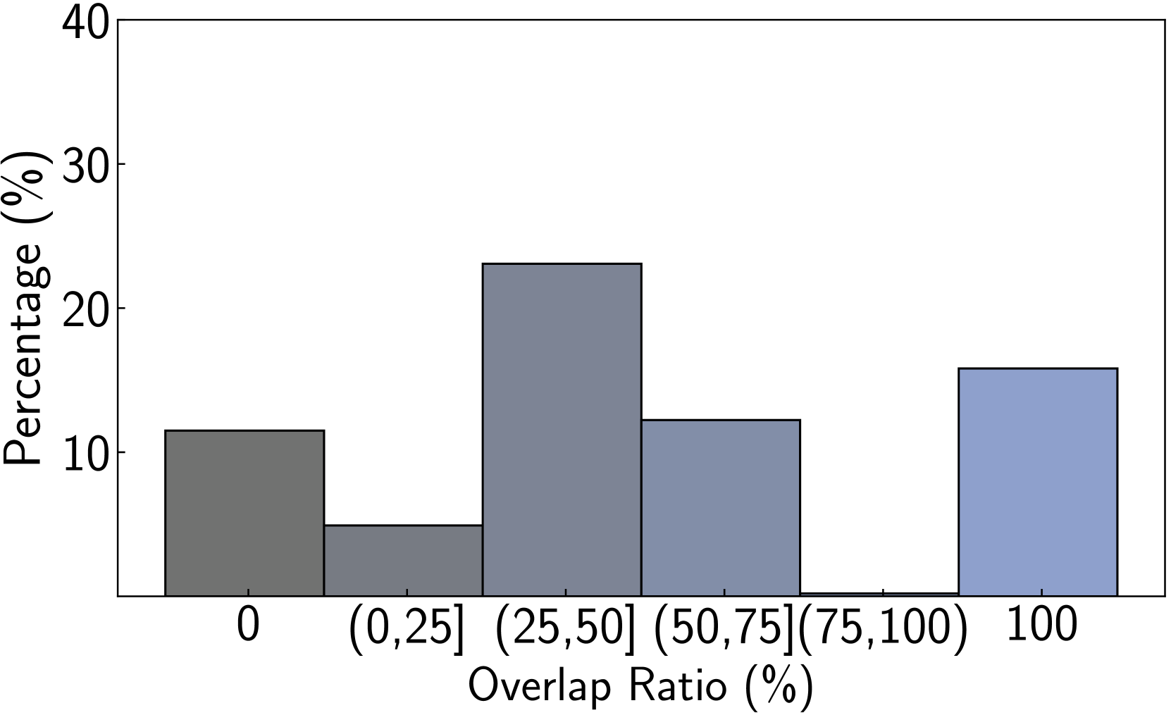
## Histogram: Distribution of Overlap Ratios
### Overview
The image displays a histogram showing the percentage distribution of data across different overlap ratio categories. The chart illustrates how frequently various levels of overlap occur within a dataset, with the x-axis representing the overlap ratio as a percentage and the y-axis representing the percentage of occurrences.
### Components/Axes
* **Chart Type:** Histogram (bar chart with categorical bins).
* **X-Axis (Horizontal):**
* **Label:** "Overlap Ratio (%)"
* **Categories/Bins (from left to right):**
1. `0`
2. `(0,25]` (meaning greater than 0% and less than or equal to 25%)
3. `(25,50]`
4. `(50,75]`
5. `(75,100)` (meaning greater than 75% and less than 100%)
6. `100`
* **Y-Axis (Vertical):**
* **Label:** "Percentage (%)"
* **Scale:** Linear scale from 0 to 40, with major tick marks at 0, 10, 20, 30, and 40.
* **Legend:** Not present. The chart represents a single data series.
* **Visual Elements:** Six vertical bars, each corresponding to an x-axis category. The bars are colored in a gradient from dark gray (leftmost) to light blue-gray (rightmost).
### Detailed Analysis
The height of each bar represents the approximate percentage of data points falling within that overlap ratio bin. Values are estimated from the y-axis scale.
1. **Bin `0`:** The bar height is approximately **11%**. This indicates that about 11% of the observed cases have zero overlap.
2. **Bin `(0,25]`:** The bar height is approximately **5%**. This is the lowest frequency category.
3. **Bin `(25,50]`:** The bar height is approximately **23%**. This is the tallest bar, representing the most frequent overlap range.
4. **Bin `(50,75]`:** The bar height is approximately **12%**.
5. **Bin `(75,100)`:** The bar height is very low, approximately **0.5%**. This is a significant dip, indicating very few instances of overlap in this high-but-not-complete range.
6. **Bin `100`:** The bar height is approximately **16%**. This is the second-tallest bar, indicating a substantial number of cases with complete (100%) overlap.
**Trend Verification:** The distribution is not uniform. It shows a bimodal pattern with a primary peak in the moderate overlap range `(25,50]` and a secondary peak at complete overlap `100`. There is a pronounced trough in the `(75,100)` range.
### Key Observations
* **Bimodal Distribution:** The data clusters around two distinct points: moderate overlap (25-50%) and complete overlap (100%).
* **Significant Dip:** The category `(75,100)` has a near-zero frequency, creating a clear separation between the two peaks.
* **Non-Zero Baseline:** A notable portion of the data (11%) exhibits zero overlap.
* **Color Gradient:** The bars transition from dark gray on the left to a lighter blue-gray on the right, which may be a stylistic choice to visually separate the bins.
### Interpretation
This histogram suggests a polarized behavior in the underlying phenomenon being measured. The data does not follow a normal or uniform distribution. Instead, it indicates that overlaps tend to be either:
1. **Moderate** (clustered between 25% and 50%), or
2. **Complete** (exactly 100%).
The near absence of data in the `(75,100)` range is particularly striking. It implies that once overlap exceeds 75%, it almost always jumps to 100%, rather than gradually increasing. This could point to a threshold effect or a binary outcome in the process generating the data (e.g., a match is either partial or exact, with very few "almost exact" matches).
The presence of a 11% `0` overlap category shows that a significant minority of cases have no overlap at all. The overall pattern is crucial for understanding the system's behavior, as it highlights that the most common outcomes are not at the extremes (0 or 100) but in a specific mid-range, with a strong secondary tendency toward perfect alignment.