\n
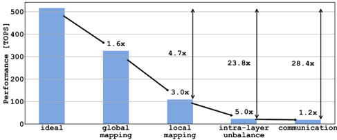
## Bar Chart: Performance Comparison of Mapping Strategies
### Overview
This image presents a bar chart comparing the performance (in TOPS - Tera Operations Per Second) of different mapping strategies. The strategies are "ideal", "global mapping", "local mapping", "intra-layer unbalance", and "communication". Arrows indicate the performance degradation between each step.
### Components/Axes
* **X-axis:** Mapping Strategy (Ideal, Global Mapping, Local Mapping, Intra-layer Unbalance, Communication)
* **Y-axis:** Performance [TOPS]. The scale ranges from 0 to 500, with increments of 100.
* **Bars:** Represent the performance of each mapping strategy. The bars are a light blue color.
* **Arrows:** Indicate the performance reduction from one strategy to the next. The arrows are black and labeled with a multiplier indicating the performance degradation.
### Detailed Analysis
The chart shows a significant decrease in performance as the mapping strategy moves from "ideal" to "communication".
* **Ideal:** Performance is approximately 510 TOPS.
* **Global Mapping:** Performance drops to approximately 320 TOPS. The arrow indicates a 1.6x performance reduction.
* **Local Mapping:** Performance further decreases to approximately 100 TOPS. The arrow indicates a 3.0x performance reduction.
* **Intra-layer Unbalance:** Performance drops to approximately 40 TOPS. The arrow indicates a 4.7x performance reduction.
* **Communication:** Performance reaches a minimum of approximately 20 TOPS. The arrow indicates a 5.0x performance reduction. An additional arrow from the "Intra-layer Unbalance" bar to the "Communication" bar indicates a 23.8x performance reduction, and another from the Y-axis to the "Communication" bar indicates a 28.4x performance reduction.
### Key Observations
* The largest performance drop occurs between "local mapping" and "intra-layer unbalance".
* The "ideal" performance is significantly higher than all other strategies.
* The "communication" strategy exhibits the lowest performance.
* The performance degradation is not linear; the rate of decrease varies between strategies.
### Interpretation
The data suggests that the mapping strategy has a substantial impact on performance. Moving away from an "ideal" mapping configuration leads to significant performance losses. The "communication" strategy is particularly detrimental, indicating that communication overhead or limitations are a major bottleneck. The large multipliers associated with the arrows highlight the severity of the performance degradation at each step. The chart implies that optimizing the mapping strategy is crucial for achieving high performance, and that addressing communication issues is particularly important. The "intra-layer unbalance" strategy appears to be a critical point of failure, as it leads to a dramatic performance drop. The chart does not provide information on *why* these performance differences occur, only that they *do* occur. Further investigation would be needed to understand the underlying causes of the performance degradation.