## Scatter Plot: Layer-Dependent Metric Across Temperatures
### Overview
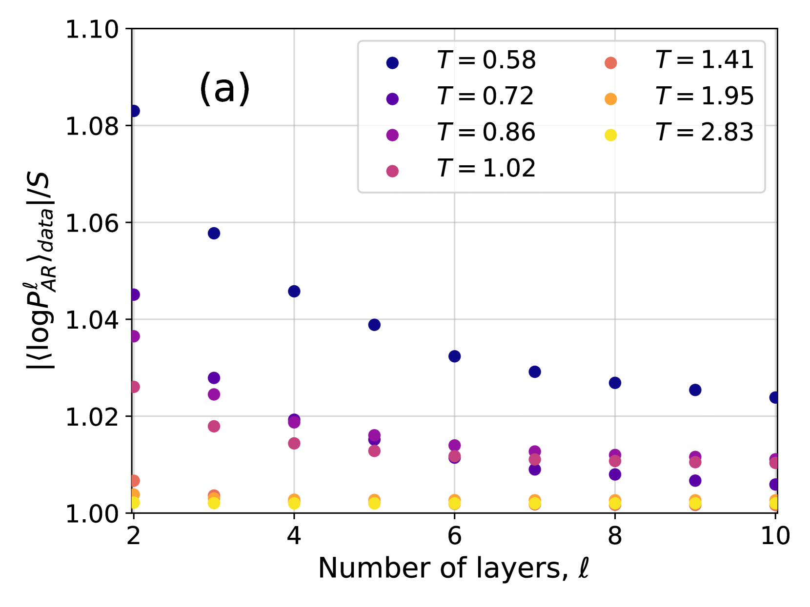
The image is a scatter plot labeled "(a)" in the top-left corner, displaying the relationship between the number of layers (ℓ) in a system and a normalized logarithmic probability metric. The plot compares seven different temperature (T) conditions, each represented by a distinct color. The data suggests an investigation into how a model's internal probability measure changes with depth (layers) under varying thermal or noise conditions.
### Components/Axes
* **Chart Type:** Scatter plot with multiple data series.
* **Label:** "(a)" is positioned in the top-left quadrant of the plot area.
* **X-Axis:**
* **Title:** "Number of layers, ℓ"
* **Scale:** Linear, ranging from 2 to 10.
* **Major Ticks:** 2, 4, 6, 8, 10.
* **Y-Axis:**
* **Title:** `|⟨log P_AR^ℓ⟩_data|/S` (This appears to be the absolute value of an average log probability from an autoregressive model, normalized by a factor S).
* **Scale:** Linear, ranging from 1.00 to 1.10.
* **Major Ticks:** 1.00, 1.02, 1.04, 1.06, 1.08, 1.10.
* **Legend:**
* **Position:** Top-right corner, inside the plot area.
* **Content:** A 2x4 grid mapping colors to temperature values (T).
* **Entries (Color -> T value):**
* Dark Blue -> T = 0.58
* Purple -> T = 0.72
* Magenta -> T = 0.86
* Pink -> T = 1.02
* Salmon -> T = 1.41
* Orange -> T = 1.95
* Yellow -> T = 2.83
### Detailed Analysis
The plot shows data for 9 layer counts (ℓ = 2 through 10). For each ℓ, there are up to 7 data points, one for each temperature. The general trend is that the y-axis metric decreases as the number of layers increases for lower temperatures, while it remains stable and close to 1.00 for higher temperatures.
**Data Series Trends and Approximate Points:**
1. **T = 0.58 (Dark Blue):** Shows the strongest downward trend.
* ℓ=2: ~1.083
* ℓ=3: ~1.058
* ℓ=4: ~1.046
* ℓ=5: ~1.039
* ℓ=6: ~1.033
* ℓ=7: ~1.029
* ℓ=8: ~1.027
* ℓ=9: ~1.026
* ℓ=10: ~1.024
2. **T = 0.72 (Purple):** Shows a moderate downward trend.
* ℓ=2: ~1.045
* ℓ=3: ~1.028
* ℓ=4: ~1.019
* ℓ=5: ~1.016
* ℓ=6: ~1.014
* ℓ=7: ~1.013
* ℓ=8: ~1.012
* ℓ=9: ~1.011
* ℓ=10: ~1.010
3. **T = 0.86 (Magenta):** Shows a slight downward trend.
* ℓ=2: ~1.037
* ℓ=3: ~1.024
* ℓ=4: ~1.019
* ℓ=5: ~1.016
* ℓ=6: ~1.014
* ℓ=7: ~1.013
* ℓ=8: ~1.012
* ℓ=9: ~1.011
* ℓ=10: ~1.010
4. **T = 1.02 (Pink):** Shows a very slight downward trend, converging with T=0.86 and T=0.72 at higher ℓ.
* ℓ=2: ~1.026
* ℓ=3: ~1.018
* ℓ=4: ~1.015
* ℓ=5: ~1.013
* ℓ=6: ~1.012
* ℓ=7: ~1.011
* ℓ=8: ~1.011
* ℓ=9: ~1.010
* ℓ=10: ~1.010
5. **T = 1.41 (Salmon):** Nearly flat, very close to 1.00.
* All points from ℓ=2 to ℓ=10 cluster between ~1.003 and ~1.006.
6. **T = 1.95 (Orange):** Flat, extremely close to 1.00.
* All points from ℓ=2 to ℓ=10 cluster between ~1.001 and ~1.003.
7. **T = 2.83 (Yellow):** Flat, essentially at the baseline of 1.00.
* All points from ℓ=2 to ℓ=10 are at or very near ~1.000.
### Key Observations
1. **Temperature Stratification:** There is a clear, consistent ordering of the data series by temperature. At any given layer ℓ, a lower T value corresponds to a higher y-axis value.
2. **Convergence with Depth:** The spread between the different temperature series is largest at shallow layers (ℓ=2) and narrows significantly as the number of layers increases. By ℓ=10, the four lowest temperature series (T=0.58 to 1.02) are tightly grouped between ~1.010 and ~1.024, while the three highest temperature series are indistinguishable near 1.00.
3. **Decay Rate:** The rate of decrease in the y-metric with respect to layers is inversely related to temperature. The coldest condition (T=0.58) decays the fastest, while the hottest conditions show no decay.
4. **Baseline Behavior:** For T ≥ 1.41, the metric `|⟨log P_AR^ℓ⟩_data|/S` is effectively constant at a value of 1.00 across all measured layers.
### Interpretation
This plot likely visualizes a phenomenon in deep learning or statistical physics, examining how the confidence or "sharpness" of an autoregressive model's probability distribution (normalized by entropy S) evolves through its layers under different levels of noise or temperature (T).
* **Low Temperature (T < 1):** The model's internal probability measure is initially high (far from 1.00) but becomes progressively more "smeared out" or entropic (approaching the normalized baseline of 1.00) as information propagates through deeper layers. This suggests that without noise, the model's certainty decays with depth.
* **High Temperature (T > 1):** The system starts and remains in a high-entropy state (metric ≈ 1.00) regardless of depth. The added noise dominates, preventing the model from developing sharp probability distributions at any layer.
* **Critical Region (T ≈ 1):** The temperatures around 1.02 show transitional behavior, starting with a slight elevation that quickly decays to the baseline.
The key insight is that **depth acts as a regularizer that drives the system toward a maximum-entropy state (metric=1.00), and the temperature T controls the starting point and rate of this convergence.** Lower temperatures allow the model to maintain more structured (lower-entropy) representations initially, but these structures are gradually lost through the layers. The plot demonstrates a fundamental trade-off between model depth, noise level, and the preservation of information sharpness.