## Scatter Plot: Adult Census Income
### Overview
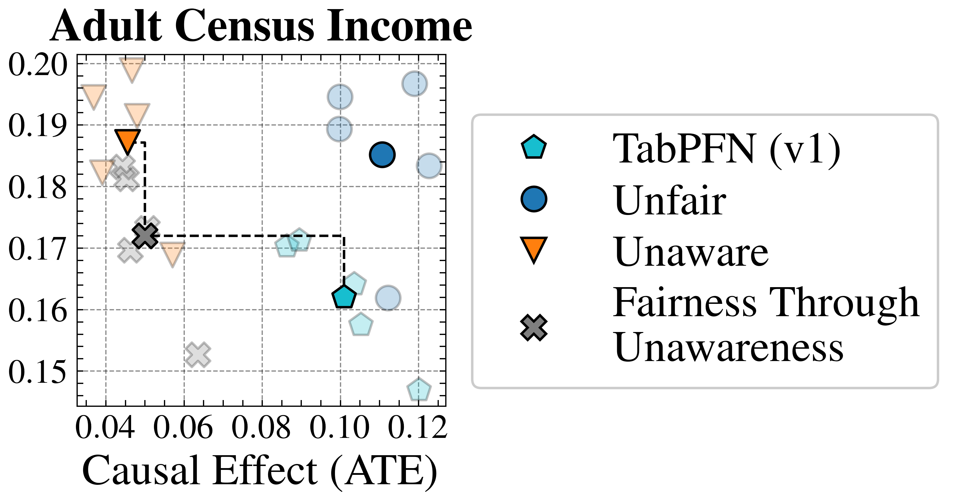
The image is a scatter plot titled "Adult Census Income". It visualizes the relationship between "Causal Effect (ATE)" on the x-axis and an unspecified metric on the y-axis, ranging from 0.15 to 0.20. The plot compares four different methods: TabPFN (v1), Unfair, Unaware, and Fairness Through Unawareness. A dashed line connects two data points, representing a specific transition or comparison.
### Components/Axes
* **Title:** Adult Census Income
* **X-axis:** Causal Effect (ATE), with tick marks at 0.04, 0.06, 0.08, 0.10, and 0.12.
* **Y-axis:** Values range from 0.15 to 0.20, with tick marks at 0.15, 0.16, 0.17, 0.18, 0.19, and 0.20.
* **Grid:** The plot has a grid of dashed gray lines.
* **Legend:** Located on the right side of the plot.
* **TabPFN (v1):** Represented by a cyan pentagon.
* **Unfair:** Represented by a blue circle.
* **Unaware:** Represented by an orange triangle pointing downwards.
* **Fairness Through Unawareness:** Represented by a gray "X" mark.
* **Dashed Line:** A black dashed line connects the "Fairness Through Unawareness" point at approximately (0.04, 0.17) to the "TabPFN (v1)" point at approximately (0.10, 0.17).
### Detailed Analysis
* **TabPFN (v1):**
* There are multiple cyan pentagons, some more transparent than others.
* One is located at approximately (0.10, 0.16).
* Another is located at approximately (0.10, 0.17).
* Other points are scattered around (0.11, 0.19) and (0.12, 0.15).
* **Unfair:**
* There are multiple blue circles, some more transparent than others.
* One is located at approximately (0.11, 0.185).
* Other points are scattered around (0.12, 0.20) and (0.12, 0.19).
* **Unaware:**
* There are multiple orange triangles pointing downwards, some more transparent than others.
* One is located at approximately (0.04, 0.188).
* Another is located at approximately (0.04, 0.195).
* Other points are scattered around (0.04, 0.18) and (0.06, 0.17).
* **Fairness Through Unawareness:**
* There are multiple gray "X" marks, some more transparent than others.
* One is located at approximately (0.04, 0.172).
* Other points are scattered around (0.05, 0.18) and (0.06, 0.15).
### Key Observations
* The "Unaware" method has the lowest Causal Effect (ATE) values, clustered around 0.04-0.06.
* The "Unfair" method has the highest Causal Effect (ATE) values, clustered around 0.11-0.12.
* The "TabPFN (v1)" method has Causal Effect (ATE) values between 0.10 and 0.12.
* The "Fairness Through Unawareness" method has the lowest Causal Effect (ATE) values, clustered around 0.04-0.06.
* The dashed line connects "Fairness Through Unawareness" to "TabPFN (v1)", suggesting a potential transition or comparison between these two methods.
### Interpretation
The scatter plot compares the performance of four different methods related to fairness and causal effect in the context of adult census income prediction. The x-axis, "Causal Effect (ATE)", likely represents the average treatment effect, indicating the causal impact of a certain intervention or variable. The y-axis represents an unspecified metric, possibly related to accuracy or fairness.
The plot suggests that the "Unaware" and "Fairness Through Unawareness" methods have lower causal effects compared to "Unfair" and "TabPFN (v1)". The dashed line connecting "Fairness Through Unawareness" to "TabPFN (v1)" might indicate an improvement or a trade-off between these two methods. The scattering of points for each method could represent different experimental runs or variations of the method.
The data suggests a trade-off between causal effect and whatever the y-axis represents. The "Unfair" method achieves the highest causal effect, but potentially at the cost of fairness or another performance metric. The "Fairness Through Unawareness" method prioritizes fairness, but sacrifices causal effect. "TabPFN (v1)" appears to be a compromise between the two.