## Scatter Plot: Adult Census Income
### Overview
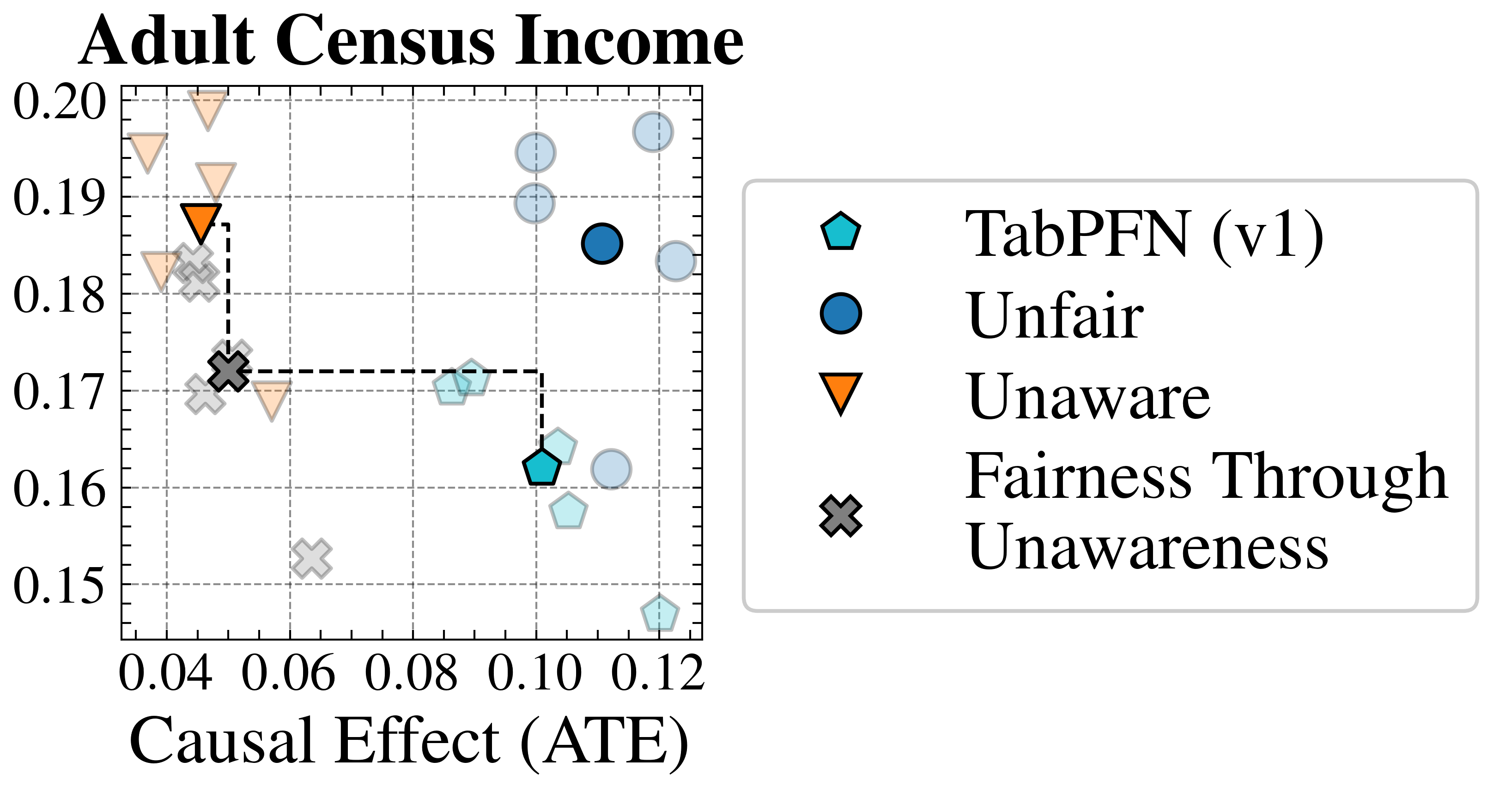
This image presents a scatter plot visualizing data related to "Adult Census Income," likely representing the performance of different fairness-aware machine learning models. The plot compares "Causal Effect (ATE)" against an unspecified y-axis value, with data points distinguished by shape and color according to the model they represent. A dashed rectangle highlights a region of interest.
### Components/Axes
* **Title:** "Adult Census Income" (top-center)
* **X-axis Label:** "Causal Effect (ATE)" (bottom-center)
* **Y-axis:** The y-axis is not explicitly labeled, but ranges from approximately 0.15 to 0.20.
* **Legend:** Located in the top-right corner, containing the following entries:
* Light Blue Diamond: TabPFN (v1)
* Dark Blue Circle: Unfair
* Orange Downward-Pointing Triangle: Unaware
* Gray Cross: Fairness Through Unawareness
* **Dashed Rectangle:** A dashed rectangle is drawn on the plot, spanning approximately from x=0.04 to x=0.10 and y=0.16 to 0.19.
### Detailed Analysis
The plot contains several data points, each representing a model's performance.
* **TabPFN (v1) - Light Blue Diamonds:**
* Point 1: Approximately (0.04, 0.175)
* Point 2: Approximately (0.08, 0.16)
* Point 3: Approximately (0.10, 0.165)
* Point 4: Approximately (0.12, 0.155)
* Trend: The points generally show a slight upward trend, but with considerable variance.
* **Unfair - Dark Blue Circles:**
* Point 1: Approximately (0.06, 0.185)
* Point 2: Approximately (0.08, 0.19)
* Point 3: Approximately (0.10, 0.18)
* Point 4: Approximately (0.12, 0.18)
* Trend: The points show a relatively flat trend, with values clustered around 0.18-0.19.
* **Unaware - Orange Downward-Pointing Triangles:**
* Point 1: Approximately (0.05, 0.19)
* Point 2: Approximately (0.06, 0.17)
* Trend: The points show a downward trend.
* **Fairness Through Unawareness - Gray Crosses:**
* Point 1: Approximately (0.05, 0.17)
* Point 2: Approximately (0.08, 0.165)
* Trend: The points show a relatively flat trend.
### Key Observations
* The "Unfair" model consistently exhibits higher values on the y-axis compared to other models, particularly within the range of x-values from 0.06 to 0.12.
* The "Unaware" model shows a decreasing trend as the "Causal Effect (ATE)" increases.
* The dashed rectangle appears to highlight a region where the "TabPFN (v1)" and "Fairness Through Unawareness" models perform similarly.
* There is significant overlap in the y-axis values across different models, suggesting that the performance differences are not always substantial.
### Interpretation
The scatter plot likely aims to compare the trade-off between fairness and accuracy (as represented by the "Causal Effect (ATE)") for different machine learning models applied to the Adult Census Income dataset. The "Unfair" model, despite its name, appears to achieve the highest values on the y-axis, potentially indicating better performance on some metric (e.g., accuracy) but at the cost of fairness. The "Unaware" model, which doesn't explicitly account for fairness, shows a negative correlation between "Causal Effect (ATE)" and the y-axis value, suggesting that increasing the causal effect might lead to a decrease in performance. The "TabPFN (v1)" and "Fairness Through Unawareness" models represent attempts to balance fairness and accuracy, and their performance falls within a narrower range. The dashed rectangle highlights a region where these models exhibit comparable performance. The lack of explicit y-axis labeling makes it difficult to draw definitive conclusions, but the plot suggests that achieving fairness may involve a trade-off with other performance metrics.