## Line Chart: Step vs. Unspecified Metric
### Overview
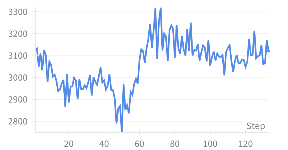
The image displays a single-series line chart plotting a metric (y-axis) against a "Step" count (x-axis). The chart shows significant volatility with a pronounced dip and subsequent recovery. No chart title, legend, or y-axis label is present.
### Components/Axes
* **X-Axis:**
* **Label:** "Step" (located at the bottom-right of the axis).
* **Scale:** Linear scale from approximately 0 to 130.
* **Major Tick Marks:** Labeled at 20, 40, 60, 80, 100, 120.
* **Y-Axis:**
* **Label:** None present.
* **Scale:** Linear scale from 2800 to 3300.
* **Major Tick Marks:** Labeled at 2800, 2900, 3000, 3100, 3200, 3300.
* **Data Series:**
* **Color:** Solid blue line.
* **Legend:** Not present.
### Detailed Analysis
The blue line represents a single data series. The following describes its visual trend and approximate key points (values are visual estimates with inherent uncertainty):
1. **Initial Phase (Steps 0-50):** The line begins at approximately 3100 at Step 0. It exhibits a general downward trend with high-frequency volatility, reaching its lowest point (global minimum) of approximately **2750** near Step 50.
2. **Recovery Phase (Steps 50-70):** Following the low, the line shows a steep and volatile upward trend. It surpasses its starting value and reaches its highest point (global maximum) of approximately **3320** near Step 70.
3. **Stabilization Phase (Steps 70-130):** After the peak, the line enters a period of high volatility but within a narrower range, oscillating roughly between 3000 and 3200. It ends at approximately **3120** at the final visible step (~130).
**Approximate Data Points (Selected):**
* Step 0: ~3100
* Step 20: ~2900
* Step 50 (Trough): ~2750
* Step 70 (Peak): ~3320
* Step 100: ~3100
* Step 130 (End): ~3120
### Key Observations
* **High Volatility:** The data series is characterized by constant, sharp fluctuations from point to point throughout the entire range.
* **Significant Dip and Spike:** The most prominent feature is a deep trough (~2750) followed immediately by a sharp spike to the peak (~3320) within a span of about 20 steps (50 to 70).
* **Range:** The data spans a range of approximately 570 units (from ~2750 to ~3320).
* **Lack of Context:** The absence of a y-axis label and chart title makes it impossible to determine what metric is being measured (e.g., loss, accuracy, score, count).
### Interpretation
The chart depicts a process or metric that is inherently noisy or subject to rapid change. The dramatic dip and recovery around step 50 suggest a significant event or adjustment occurred at that point. This could represent:
* A model encountering a difficult batch of data or a temporary instability during training (if this is a loss curve).
* A system undergoing a reset, recalibration, or intervention that initially caused a drop but led to a higher subsequent performance.
* An external shock to a measured process followed by a correction and overshoot.
The subsequent volatility after step 70 indicates that while the metric recovered to a higher baseline, it did not stabilize into a smooth trend, suggesting ongoing dynamic conditions or inherent noise in the measurement. Without the y-axis label, the practical significance of the values (e.g., whether a change from 3000 to 3100 is minor or critical) cannot be assessed. The primary takeaway is the system's non-linear response and resilience, recovering from a severe low to exceed its initial value.