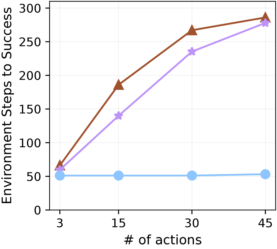
## Line Chart: Environment Steps to Success vs. Number of Actions
### Overview
This is a line chart plotting "Environment Steps to Success" against the "# of actions". It displays three distinct data series, each represented by a different color and marker shape, showing how the required steps change as the number of actions increases. The chart has a clean, white background with light gray grid lines.
### Components/Axes
* **X-Axis (Horizontal):**
* **Label:** "# of actions"
* **Scale/Ticks:** The axis is marked with four discrete values: 3, 15, 30, and 45.
* **Y-Axis (Vertical):**
* **Label:** "Environment Steps to Success"
* **Scale/Ticks:** The axis ranges from 0 to 300, with major tick marks at intervals of 50 (0, 50, 100, 150, 200, 250, 300).
* **Data Series (Legend inferred from visual markers):**
1. **Brown Line with Upward-Pointing Triangle Markers:** Represents one method or condition.
2. **Purple Line with Star Markers:** Represents a second method or condition.
3. **Light Blue Line with Circle Markers:** Represents a third method or condition.
* **Spatial Grounding:** There is no explicit legend box within the chart area. The series are identified solely by their line color and marker shape as plotted.
### Detailed Analysis
**Data Points (Approximate Values):**
| # of Actions (X) | Brown Line (Triangles) | Purple Line (Stars) | Light Blue Line (Circles) |
| :--- | :--- | :--- | :--- |
| **3** | ~65 | ~60 | ~50 |
| **15** | ~185 | ~140 | ~50 |
| **30** | ~265 | ~235 | ~50 |
| **45** | ~285 | ~275 | ~52 |
**Trend Verification:**
* **Brown Line (Triangles):** Exhibits a strong, positive, and slightly decelerating upward trend. The slope is steepest between 3 and 15 actions, remains strong between 15 and 30, and flattens slightly between 30 and 45.
* **Purple Line (Stars):** Shows a consistent, positive upward trend. The slope is relatively steady across the entire range, though it appears slightly less steep than the brown line's initial segment.
* **Light Blue Line (Circles):** Displays a flat, horizontal trend. The value remains nearly constant at approximately 50 steps across all measured action counts, with a very slight, possibly negligible, increase at 45 actions.
### Key Observations
1. **Diverging Performance:** The performance (in terms of steps required) of the three methods diverges significantly as the number of actions increases. At 3 actions, all three are clustered closely between ~50-65 steps. By 45 actions, a gap of over 200 steps separates the highest (Brown) from the lowest (Blue).
2. **Efficiency of the Blue Method:** The method represented by the light blue line demonstrates remarkable scalability. Its success cost (environment steps) is invariant to the increase in the number of actions within the tested range.
3. **Relative Cost:** The brown method is consistently the most "expensive" (requires the most steps) for any given number of actions greater than 3. The purple method is intermediate, and the blue method is the most efficient.
4. **Convergence at Low Action Count:** At the lowest action count (3), the brown and purple methods start at nearly the same point (~60-65 steps), suggesting similar initial overhead or baseline cost.
### Interpretation
This chart likely compares the efficiency or scalability of different algorithms, policies, or system configurations in a sequential decision-making or reinforcement learning context. The "# of actions" could represent task complexity, planning horizon, or the number of decisions an agent must make. "Environment Steps to Success" is a common metric for sample efficiency or computational cost.
* **The Blue Line's Flat Trend** suggests a method whose performance is **decoupled from the action count**. This could indicate a highly optimized planner, a heuristic-based approach, or a system that pre-computes a solution, making its execution cost constant regardless of problem size (within this range).
* **The Brown and Purple Lines' Upward Trends** indicate methods whose cost scales with problem size. The brown method scales more poorly (steeper slope) than the purple one. This could represent different search algorithms (e.g., brute-force vs. heuristic search), where more actions exponentially increase the search space for the brown method.
* **The Divergence** highlights a critical trade-off: methods that may be competitive on simple tasks (3 actions) can become prohibitively expensive on more complex tasks (45 actions). The blue method appears to be the most robust and scalable solution presented.
**Notable Anomaly:** The data point for the brown line at 45 actions (~285) is very close to the purple line's value (~275). This near-convergence at the high end might suggest a ceiling effect or that both methods are approaching a fundamental limit for the task, though the brown method still requires slightly more steps.