\n
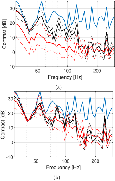
## Line Chart: Contrast vs. Frequency
### Overview
The image presents two line charts, labeled (a) and (b), displaying contrast in decibels (dB) as a function of frequency in Hertz (Hz). Each chart contains three distinct line series, visually differentiated by color and line style. The charts appear to compare contrast performance across different conditions or algorithms.
### Components/Axes
* **X-axis:** Frequency [Hz]. Scale ranges from approximately 0 to 250 Hz, with major ticks at 50 Hz, 100 Hz, 150 Hz, 200 Hz, and 250 Hz.
* **Y-axis:** Contrast [dB]. Scale ranges from approximately -10 dB to 30 dB, with major ticks at -10 dB, 0 dB, 10 dB, 20 dB, and 30 dB.
* **Line Series:**
* Blue Solid Line: Represents one condition/algorithm.
* Black Dashed Line: Represents another condition/algorithm.
* Red Dash-Dot Line: Represents a third condition/algorithm.
* **Labels:**
* (a) - Bottom left corner
* (b) - Bottom right corner
### Detailed Analysis or Content Details
**Chart (a):**
* **Blue Line:** Starts at approximately 25 dB at 0 Hz, decreases to around 18 dB at 20 Hz, then fluctuates between 18 dB and 28 dB with multiple peaks and troughs until 250 Hz, ending at approximately 22 dB.
* **Black Line:** Starts at approximately 15 dB at 0 Hz, decreases to around 10 dB at 20 Hz, then fluctuates between 10 dB and 22 dB with multiple peaks and troughs until 250 Hz, ending at approximately 12 dB.
* **Red Line:** Starts at approximately 8 dB at 0 Hz, decreases to around 2 dB at 20 Hz, then fluctuates between -2 dB and 12 dB with multiple peaks and troughs until 250 Hz, ending at approximately 6 dB.
**Chart (b):**
* **Blue Line:** Starts at approximately 28 dB at 0 Hz, decreases to around 20 dB at 20 Hz, then fluctuates between 18 dB and 30 dB with multiple peaks and troughs until 250 Hz, ending at approximately 25 dB.
* **Black Line:** Starts at approximately 18 dB at 0 Hz, decreases to around 12 dB at 20 Hz, then fluctuates between 10 dB and 22 dB with multiple peaks and troughs until 250 Hz, ending at approximately 15 dB.
* **Red Line:** Starts at approximately 10 dB at 0 Hz, decreases to around 4 dB at 20 Hz, then fluctuates between -2 dB and 14 dB with multiple peaks and troughs until 250 Hz, ending at approximately 8 dB.
### Key Observations
* Both charts exhibit similar trends, with all three lines generally decreasing in contrast from 0 Hz to 20 Hz, followed by fluctuations at higher frequencies.
* The blue line consistently demonstrates the highest contrast values across both charts.
* The red line consistently demonstrates the lowest contrast values across both charts.
* Chart (b) shows generally higher contrast values across all lines compared to chart (a).
* The fluctuations in contrast at higher frequencies are more pronounced in chart (b).
### Interpretation
The data suggests a comparison of contrast sensitivity or performance between three different conditions or algorithms (represented by the blue, black, and red lines) across a range of frequencies. The higher contrast values observed in chart (b) indicate that the condition/algorithm represented by this chart performs better than the one represented by chart (a). The consistent ranking of the lines (blue > black > red) suggests a systematic difference in performance between the three conditions. The initial decrease in contrast from 0 Hz to 20 Hz could represent a low-frequency attenuation effect, while the subsequent fluctuations likely reflect the complex frequency response of the system being evaluated. The variations in contrast at higher frequencies could be due to noise, interference, or the inherent limitations of the measurement system. The data could be used to optimize the parameters of the algorithms or to select the best condition for a specific application.