## Timing Attack Chart: Guess Timing Analysis
### Overview
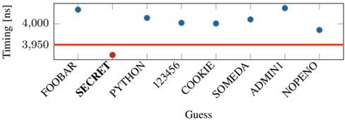
The image is a scatter plot showing the timing (in nanoseconds) for different "Guess" values. The x-axis represents the "Guess" values, and the y-axis represents the "Timing [ns]". A horizontal red line is present at 3950 ns. Most data points are blue, except for "PYTHON" which is red.
### Components/Axes
* **X-axis:** "Guess" - Categorical values: FOOBAR, SECRET, PYTHON, 123456, COOKIE, SOMEDA, ADMINI, NOPEΝΟ
* **Y-axis:** "Timing [ns]" - Numerical scale with markers at 3950 and 4000.
* **Horizontal Line:** A red line at Timing = 3950 ns.
* **Data Points:** Blue circles, except for PYTHON which is a red circle.
### Detailed Analysis
* **FOOBAR:** Timing is approximately 4030 ns (blue).
* **SECRET:** Timing is approximately 4030 ns (blue).
* **PYTHON:** Timing is approximately 3930 ns (red).
* **123456:** Timing is approximately 4020 ns (blue).
* **COOKIE:** Timing is approximately 4000 ns (blue).
* **SOMEDA:** Timing is approximately 4010 ns (blue).
* **ADMINI:** Timing is approximately 4030 ns (blue).
* **NOPEΝΟ:** Timing is approximately 3980 ns (blue).
### Key Observations
* The timing for "PYTHON" is significantly lower than the other "Guess" values. It is also the only data point colored red.
* All other "Guess" values have timings clustered around 4000-4030 ns.
* The red horizontal line at 3950 ns serves as a visual reference point.
### Interpretation
The chart likely represents the results of a timing attack. The "Guess" values are attempts to guess a secret. The timing of each guess is measured. The significantly lower timing for "PYTHON" suggests that this guess might be correct or have a different execution path, making it distinguishable from the other guesses. The red color highlights this anomaly. The horizontal line at 3950 ns could represent a threshold or a baseline timing value. The data suggests that "PYTHON" is a potential vulnerability.