## Chart/Diagram Type: Scatter Plot with Reference Line
### Overview
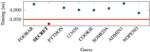
The image displays a scatter plot with categorical labels on the x-axis and numerical values on the y-axis. A horizontal red reference line at 3,950 ns is present, with blue data points plotted above it. The x-axis labels include terms like "FOOBAR," "SECRET," "PYTHON," and others, while the y-axis is labeled "Timing [ns]."
### Components/Axes
- **X-axis (Guess)**: Categorical labels: FOOBAR, SECRET, PYTHON, 123456, COOKIE, SOMEDA, ADMINI, NOPENO.
- **Y-axis (Timing [ns])**: Numerical scale from ~3,950 to ~4,100 ns.
- **Reference Line**: A horizontal red line at 3,950 ns.
- **Data Points**: Blue dots representing timing values for each category.
- **Legend**: Not explicitly visible in the image.
### Detailed Analysis
- **FOOBAR**: Blue dot at ~4,000 ns.
- **SECRET**: Blue dot at 3,950 ns (aligned with the red reference line).
- **PYTHON**: Blue dot at ~4,050 ns.
- **123456**: Blue dot at ~4,000 ns.
- **COOKIE**: Blue dot at ~4,000 ns.
- **SOMEDA**: Blue dot at ~4,050 ns.
- **ADMINI**: Blue dot at ~4,100 ns (highest value).
- **NOPENO**: Blue dot at ~3,975 ns (closest to the red line).
### Key Observations
1. **Reference Line**: The red line at 3,950 ns serves as a baseline for comparison.
2. **Data Distribution**: Most blue dots (FOOBAR, PYTHON, 123456, COOKIE, SOMEDA, ADMINI) are above the red line, indicating higher timing values.
3. **Outliers**:
- **SECRET** is exactly at the red line (3,950 ns).
- **NOPENO** is the closest to the red line at 3,975 ns.
4. **Trend**: Timing values generally increase from left to right, with ADMINI being the highest and NOPENO the lowest among the blue dots.
### Interpretation
The chart suggests that the timing values for most categories exceed the reference threshold of 3,950 ns, with ADMINI showing the longest delay. SECRET and NOPENO are the only categories at or near the reference line, indicating they meet or approach the target timing. The red line likely represents a performance benchmark, and the blue dots reflect actual measurements. The variation in values highlights inconsistencies or differences in performance across categories. The absence of a legend limits direct interpretation of the blue dots' meaning, but their placement above the red line implies they represent higher-than-target timings.