## Line Chart: Accuracy vs. Sample Size
### Overview
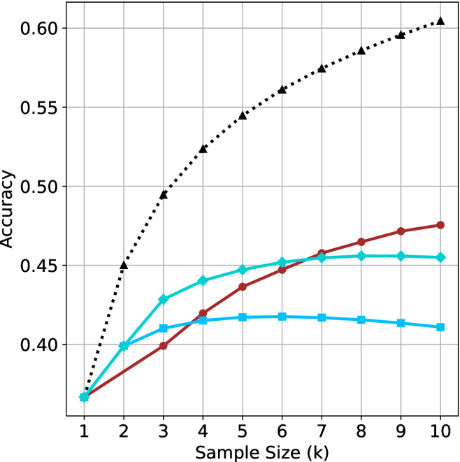
The image is a line chart comparing the accuracy of three different methods as a function of sample size. The x-axis represents the sample size (k), ranging from 1 to 10. The y-axis represents the accuracy, ranging from 0.40 to 0.60. Three lines, each representing a different method, are plotted on the chart.
### Components/Axes
* **X-axis:** Sample Size (k), with tick marks at each integer value from 1 to 10.
* **Y-axis:** Accuracy, with tick marks at 0.40, 0.45, 0.50, 0.55, and 0.60.
* **Data Series:**
* Black dotted line with triangle markers.
* Brown line with circle markers.
* Cyan line with diamond markers.
* Blue line with square markers.
### Detailed Analysis
**1. Black Dotted Line (Triangle Markers):**
* Trend: The black dotted line with triangle markers shows a steep upward trend initially, which gradually slows down as the sample size increases.
* Data Points:
* k=1, Accuracy ≈ 0.37
* k=2, Accuracy ≈ 0.45
* k=3, Accuracy ≈ 0.50
* k=4, Accuracy ≈ 0.53
* k=5, Accuracy ≈ 0.55
* k=6, Accuracy ≈ 0.57
* k=7, Accuracy ≈ 0.58
* k=8, Accuracy ≈ 0.59
* k=9, Accuracy ≈ 0.60
* k=10, Accuracy ≈ 0.61
**2. Brown Line (Circle Markers):**
* Trend: The brown line with circle markers shows an upward trend, but it is less steep than the black dotted line. The rate of increase slows down as the sample size increases.
* Data Points:
* k=1, Accuracy ≈ 0.37
* k=2, Accuracy ≈ 0.39
* k=3, Accuracy ≈ 0.40
* k=4, Accuracy ≈ 0.42
* k=5, Accuracy ≈ 0.44
* k=6, Accuracy ≈ 0.45
* k=7, Accuracy ≈ 0.46
* k=8, Accuracy ≈ 0.46
* k=9, Accuracy ≈ 0.47
* k=10, Accuracy ≈ 0.48
**3. Cyan Line (Diamond Markers):**
* Trend: The cyan line with diamond markers shows an upward trend, similar to the brown line, but it plateaus and slightly decreases towards the end.
* Data Points:
* k=1, Accuracy ≈ 0.37
* k=2, Accuracy ≈ 0.40
* k=3, Accuracy ≈ 0.43
* k=4, Accuracy ≈ 0.44
* k=5, Accuracy ≈ 0.45
* k=6, Accuracy ≈ 0.455
* k=7, Accuracy ≈ 0.455
* k=8, Accuracy ≈ 0.46
* k=9, Accuracy ≈ 0.455
* k=10, Accuracy ≈ 0.455
**4. Blue Line (Square Markers):**
* Trend: The blue line with square markers shows an upward trend, but it plateaus and slightly decreases towards the end.
* Data Points:
* k=1, Accuracy ≈ 0.37
* k=2, Accuracy ≈ 0.40
* k=3, Accuracy ≈ 0.41
* k=4, Accuracy ≈ 0.415
* k=5, Accuracy ≈ 0.417
* k=6, Accuracy ≈ 0.417
* k=7, Accuracy ≈ 0.417
* k=8, Accuracy ≈ 0.415
* k=9, Accuracy ≈ 0.413
* k=10, Accuracy ≈ 0.41
### Key Observations
* The black dotted line (triangle markers) consistently outperforms the other methods across all sample sizes.
* The brown line (circle markers) shows a steady increase in accuracy, but it remains lower than the black dotted line.
* The cyan line (diamond markers) and blue line (square markers) show similar trends, with accuracy plateauing and slightly decreasing at larger sample sizes.
* All methods start at approximately the same accuracy level when the sample size is 1.
### Interpretation
The chart suggests that the method represented by the black dotted line (triangle markers) is the most effective in terms of accuracy, especially as the sample size increases. The other methods show diminishing returns or even a slight decrease in accuracy at larger sample sizes, indicating that they may not benefit as much from increased data. The initial convergence of all methods at a sample size of 1 suggests that they may have similar baseline performance, but the black dotted line method is better at leveraging larger datasets to improve accuracy.