## Line Chart: Accuracy vs. Sample Size (k)
### Overview
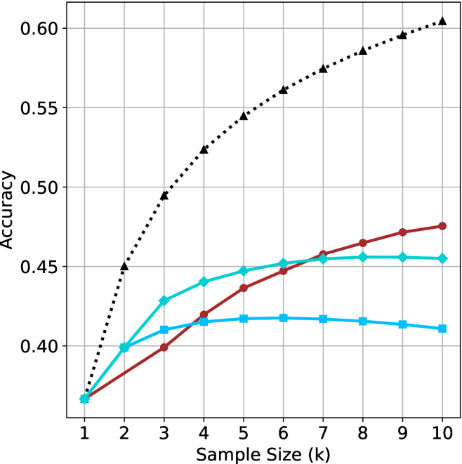
This image is a line chart illustrating the relationship between "Accuracy" (y-axis) and "Sample Size (k)" (x-axis). The chart displays four distinct data series, each represented by a unique color and marker shape. Notably, there is no legend provided in the image to identify what specific models or methods these series represent. All four series originate from a common starting point at k=1.
### Components/Axes
* **X-Axis:** Labeled "Sample Size (k)". The scale is linear, ranging from 1 to 10 in integer increments.
* **Y-Axis:** Labeled "Accuracy". The scale ranges from 0.40 to 0.60, with grid lines at 0.05 intervals. The origin point for all lines at k=1 is approximately 0.37.
* **Grid:** A light gray grid is overlaid on the plot area, intersecting at the major axis ticks.
* **Data Series (No Legend Provided):**
1. **Black Dotted Line:** Marked with triangles.
2. **Red/Maroon Solid Line:** Marked with circles.
3. **Cyan/Light Blue Solid Line:** Marked with diamonds.
4. **Blue Solid Line:** Marked with squares.
### Detailed Analysis
The following values are approximations based on visual inspection of the grid intersections.
| Sample Size (k) | Black (Dotted/Triangle) | Red (Solid/Circle) | Cyan (Solid/Diamond) | Blue (Solid/Square) |
| :--- | :--- | :--- | :--- | :--- |
| **1** | ~0.37 | ~0.37 | ~0.37 | ~0.37 |
| **2** | ~0.45 | ~0.385 | ~0.40 | ~0.40 |
| **3** | ~0.495 | ~0.40 | ~0.43 | ~0.41 |
| **4** | ~0.525 | ~0.42 | ~0.44 | ~0.415 |
| **5** | ~0.545 | ~0.435 | ~0.445 | ~0.418 |
| **6** | ~0.56 | ~0.445 | ~0.45 | ~0.418 |
| **7** | ~0.575 | ~0.455 | ~0.455 | ~0.417 |
| **8** | ~0.585 | ~0.465 | ~0.455 | ~0.415 |
| **9** | ~0.595 | ~0.47 | ~0.455 | ~0.413 |
| **10** | ~0.605 | ~0.475 | ~0.455 | ~0.411 |
**Trend Verification:**
* **Black Dotted Line:** Exhibits a steep, consistent upward slope across the entire range (k=1 to k=10) with no signs of plateauing.
* **Red Solid Line:** Exhibits a steady, monotonic upward slope. It is the second-best performing series.
* **Cyan Solid Line:** Exhibits a rapid increase initially (k=1 to k=3), followed by a diminishing rate of return, eventually plateauing around k=7-8.
* **Blue Solid Line:** Exhibits a rapid increase initially (k=1 to k=3), followed by a very slight peak at k=5-6, and a subsequent slow decline in accuracy as k increases further.
### Key Observations
* **Common Origin:** All four series begin at approximately 0.37 accuracy at k=1.
* **Divergence:** The series diverge significantly after k=2.
* **Performance Gap:** The Black Dotted line is the clear outlier, significantly outperforming the other three series. By k=10, it is approximately 0.13 accuracy points higher than the Red line and nearly 0.20 higher than the Blue line.
* **Saturation/Overfitting:** The Blue and Cyan lines demonstrate clear signs of saturation or overfitting. The Blue line, in particular, shows a negative trend after k=6, suggesting that adding more samples beyond this point is detrimental to the model's accuracy.
### Interpretation
This chart is characteristic of a machine learning performance evaluation, likely comparing different algorithms or architectures in a "few-shot" learning context, where "k" represents the number of examples per class.
* **The Black Dotted line** represents a robust model that scales effectively with more data, suggesting it has high capacity and is not overfitting.
* **The Red line** represents a model that benefits from more data but at a slower rate than the Black line.
* **The Cyan and Blue lines** represent models that reach a performance ceiling very quickly. The Blue line's decline after k=6 is a classic indicator of overfitting, where the model may be memorizing the training data rather than generalizing, or the specific architecture is unable to handle the increased complexity of the larger sample size.
In a technical context, this graph would be used to justify selecting the method represented by the Black Dotted line, as it provides the highest accuracy and the best scalability.