\n
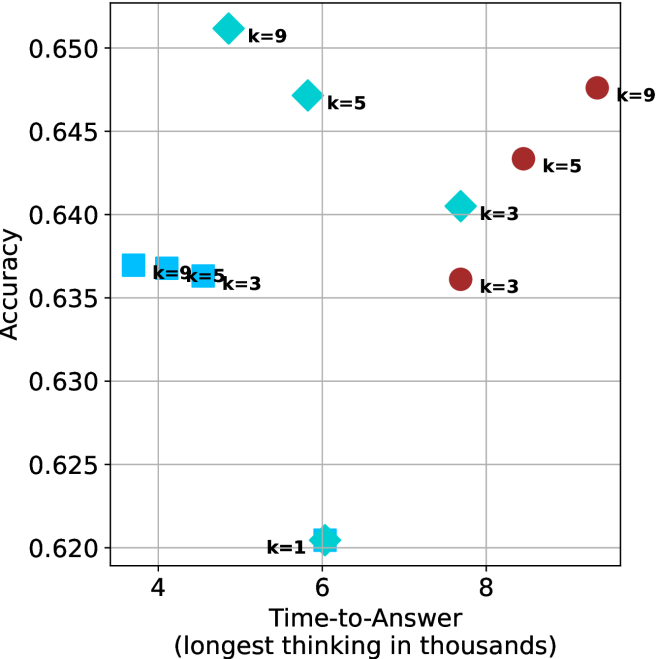
## Scatter Plot: Accuracy vs. Time-to-Answer for Different 'k' Values
### Overview
The image is a scatter plot comparing model accuracy against time-to-answer (measured in thousands of thinking steps) for different values of a parameter 'k'. The plot displays three distinct series of data points, differentiated by marker shape and color, each representing a different method or condition. The data suggests a trade-off between computational time and accuracy, with performance varying significantly across the different 'k' settings and series.
### Components/Axes
* **X-Axis:** Labeled "Time-to-Answer (longest thinking in thousands)". The scale runs from approximately 3.5 to 9.5, with major grid lines at 4, 6, and 8.
* **Y-Axis:** Labeled "Accuracy". The scale runs from 0.620 to 0.650, with major grid lines at intervals of 0.005 (0.620, 0.625, 0.630, 0.635, 0.640, 0.645, 0.650).
* **Data Series & Legend (Inferred from markers):**
* **Cyan Diamonds:** A series where accuracy increases with 'k'.
* **Cyan Squares:** A series clustered at lower time and moderate accuracy.
* **Red Circles:** A series located at higher time and accuracy values.
* **Cyan Star:** A single data point for k=1.
* **Data Point Labels:** Each marker is annotated with its corresponding 'k' value (e.g., "k=9", "k=5", "k=3", "k=1").
### Detailed Analysis
**Data Points (Approximate Coordinates):**
* **Cyan Diamond Series:**
* k=9: (x ≈ 5.0, y ≈ 0.650) - Highest accuracy point on the plot.
* k=5: (x ≈ 6.0, y ≈ 0.647)
* k=3: (x ≈ 7.5, y ≈ 0.640)
* *Trend:* This series shows a clear negative correlation between Time-to-Answer and Accuracy. As 'k' increases, time decreases and accuracy increases.
* **Cyan Square Series:**
* k=9: (x ≈ 3.8, y ≈ 0.637)
* k=5: (x ≈ 4.2, y ≈ 0.636)
* k=3: (x ≈ 4.5, y ≈ 0.636)
* *Trend:* This series is tightly clustered. Accuracy remains relatively flat (~0.636-0.637) while Time-to-Answer increases slightly with decreasing 'k'.
* **Red Circle Series:**
* k=9: (x ≈ 9.2, y ≈ 0.647)
* k=5: (x ≈ 8.5, y ≈ 0.643)
* k=3: (x ≈ 7.8, y ≈ 0.636)
* *Trend:* This series shows a positive correlation. As 'k' increases, both Time-to-Answer and Accuracy increase.
* **Single Point:**
* Cyan Star, k=1: (x ≈ 6.0, y ≈ 0.620) - The lowest accuracy point on the plot.
### Key Observations
1. **Performance Clusters:** The three series occupy distinct regions of the plot. Cyan squares are left (fastest), cyan diamonds are central, and red circles are right (slowest).
2. **k=1 Baseline:** The k=1 point (cyan star) serves as a low-accuracy baseline, positioned at a moderate time cost.
3. **Accuracy Ceiling:** The highest achieved accuracy is approximately 0.650 (cyan diamond, k=9).
4. **Time-Accuracy Trade-off:** The relationship between time and accuracy is not uniform. For the cyan diamond series, higher accuracy comes with *lower* time cost as 'k' increases. For the red circle series, higher accuracy requires *higher* time cost as 'k' increases.
5. **Convergence at k=3:** The k=3 data points for the cyan square and red circle series have nearly identical accuracy (~0.636), but the red circle point requires about 73% more time (x≈7.8 vs x≈4.5).
### Interpretation
This chart likely compares different strategies (represented by marker shapes/colors) for a reasoning or search task where 'k' is a key hyperparameter (e.g., number of candidates, beam width, or reasoning steps).
* The **Cyan Diamond** strategy appears highly efficient: increasing 'k' improves accuracy *and* reduces computation time, suggesting it better focuses its effort or prunes ineffective paths early.
* The **Cyan Square** strategy is fast but hits an accuracy plateau quickly. Varying 'k' has minimal impact, indicating it may be a simpler or more constrained method.
* The **Red Circle** strategy is computationally expensive. Its positive correlation suggests a brute-force or expansive approach where investing more time (higher 'k') directly yields better results, but with diminishing returns in efficiency.
* The **k=1** point represents a minimal-effort baseline, confirming that some level of 'thinking' (k>1) is crucial for acceptable performance.
The data demonstrates that algorithmic choice (series) is more impactful than simply tuning 'k'. The optimal strategy (cyan diamonds) achieves top accuracy at moderate time cost, while other methods either sacrifice accuracy for speed (squares) or incur high time costs for similar gains (circles). The investigation would benefit from knowing what the different series represent to explain these divergent behaviors.