## Scatter Plot: Accuracy vs. Time-to-Answer
### Overview
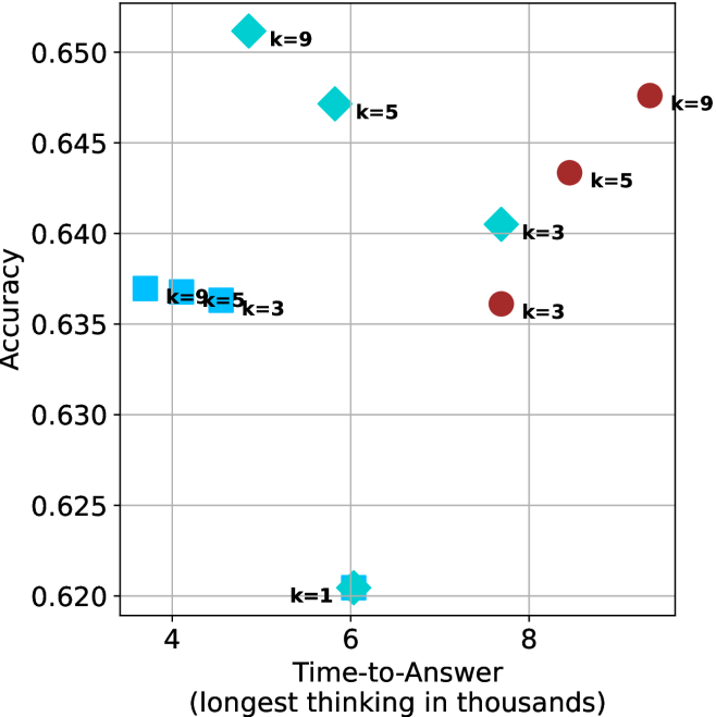
The image is a scatter plot showing the relationship between "Accuracy" and "Time-to-Answer" for different values of 'k'. There are two distinct data series, represented by cyan and brown markers, with each point labeled with its corresponding 'k' value.
### Components/Axes
* **X-axis:** "Time-to-Answer (longest thinking in thousands)". The scale ranges from approximately 3.5 to 9.
* **Y-axis:** "Accuracy". The scale ranges from 0.620 to 0.650.
* **Data Series:**
* Cyan markers (squares, diamonds, and star): Represent one data series.
* Brown markers (circles): Represent another data series.
* **Labels:** Each data point is labeled with "k=[value]", where [value] is 1, 3, 5, or 9.
* **Gridlines:** Present on the plot.
### Detailed Analysis
**Cyan Data Series:**
* **k=1:** Located at approximately (6, 0.620). Shape is a star.
* **k=3:** Located at approximately (4, 0.637). Shape is a square.
* **k=5:** Located at approximately (4, 0.637). Shape is a square.
* **k=9:** Located at approximately (4, 0.637). Shape is a square.
* **k=3:** Located at approximately (7.5, 0.640). Shape is a diamond.
* **k=5:** Located at approximately (7, 0.647). Shape is a diamond.
* **k=9:** Located at approximately (6, 0.652). Shape is a diamond.
**Brown Data Series:**
* **k=3:** Located at approximately (8, 0.636). Shape is a circle.
* **k=5:** Located at approximately (8.5, 0.643). Shape is a circle.
* **k=9:** Located at approximately (9, 0.648). Shape is a circle.
### Key Observations
* For the cyan data series, as 'k' increases from 1 to 9, the time-to-answer generally decreases, while accuracy increases.
* For the brown data series, as 'k' increases from 3 to 9, both time-to-answer and accuracy increase.
* The cyan data series has a cluster of points at approximately (4, 0.637) for k=3, 5, and 9.
* The cyan data series has a point at approximately (6, 0.620) for k=1.
* The brown data series has a point at approximately (8, 0.636) for k=3.
### Interpretation
The scatter plot visualizes the trade-off between accuracy and time-to-answer for two different algorithms or configurations, represented by the cyan and brown data series. The 'k' value likely represents a parameter within these algorithms.
The cyan data series shows that increasing 'k' initially improves accuracy while decreasing time-to-answer, but plateaus around (4, 0.637) for k=3, 5, and 9. The point at k=1 shows a lower accuracy and a higher time-to-answer.
The brown data series shows a positive correlation between 'k', time-to-answer, and accuracy. Increasing 'k' leads to both higher accuracy and longer processing times.
The choice of 'k' would depend on the specific application and the relative importance of accuracy versus speed. If speed is critical, a lower 'k' value in the cyan data series might be preferable. If accuracy is paramount, a higher 'k' value in the brown data series might be chosen, accepting the longer time-to-answer.