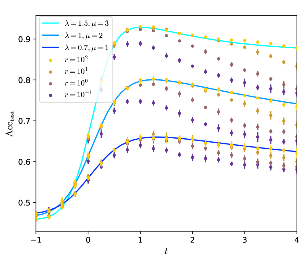
## Line Chart: A_CC_test vs. t for Varying Parameters
### Overview
The chart displays the relationship between the variable **A_CC_test** (y-axis) and **t** (x-axis) across multiple data series. Each series represents combinations of parameters **λ**, **μ**, and **r**, with trends showing growth, peaking, and decay over time. The legend categorizes data into three theoretical models (cyan, blue, dark blue lines) and four empirical datasets (yellow, brown, purple, dark purple markers).
---
### Components/Axes
- **X-axis (t)**: Ranges from **-1 to 4** in increments of 1. Label: "t".
- **Y-axis (A_CC_test)**: Ranges from **0.45 to 0.9** in increments of 0.05. Label: "A_CC_test".
- **Legend**:
- **Top-left placement**.
- **Theoretical models**:
- Cyan line: λ=1.5, μ=3.
- Blue line: λ=1, μ=2.
- Dark blue line: λ=0.7, μ=1.
- **Empirical datasets**:
- Yellow markers: r=10².
- Brown markers: r=10¹.
- Purple markers: r=10⁰.
- Dark purple markers: r=10⁻¹.
---
### Detailed Analysis
1. **Cyan Line (λ=1.5, μ=3)**:
- Starts at **~0.45** at t=-1.
- Peaks at **~0.9** near t=1.
- Declines gradually to **~0.85** by t=4.
- Smooth, continuous curve with no visible noise.
2. **Blue Line (λ=1, μ=2)**:
- Starts at **~0.45** at t=-1.
- Peaks at **~0.8** near t=1.5.
- Declines to **~0.75** by t=4.
- Slightly noisier than the cyan line.
3. **Dark Blue Line (λ=0.7, μ=1)**:
- Starts at **~0.45** at t=-1.
- Peaks at **~0.7** near t=1.
- Declines to **~0.65** by t=4.
- Most gradual slope among theoretical models.
4. **Empirical Datasets**:
- **Yellow (r=10²)**:
- Peaks at **~0.9** near t=1.
- Declines to **~0.85** by t=4.
- Matches cyan line’s trend but with minor fluctuations.
- **Brown (r=10¹)**:
- Peaks at **~0.8** near t=1.5.
- Declines to **~0.75** by t=4.
- Aligns with blue line’s trajectory.
- **Purple (r=10⁰)**:
- Peaks at **~0.7** near t=1.
- Declines to **~0.65** by t=4.
- Matches dark blue line’s pattern.
- **Dark Purple (r=10⁻¹)**:
- Peaks at **~0.65** near t=1.
- Declines to **~0.6** by t=4.
- Lowest peak among empirical datasets.
---
### Key Observations
- **Peak Timing**: All series peak near **t=1**, suggesting a critical threshold or event at this point.
- **Parameter Sensitivity**:
- Higher **λ** and **μ** values correlate with higher peak A_CC_test (e.g., λ=1.5, μ=3 peaks at 0.9 vs. λ=0.7, μ=1 at 0.7).
- Larger **r** values (e.g., r=10²) exhibit higher peaks compared to smaller **r** (e.g., r=10⁻¹).
- **Decay Phase**: Post-peak decline is consistent across all series, indicating stabilization or damping over time.
- **Noise**: Empirical datasets (markers) show more variability than theoretical models (lines).
---
### Interpretation
The chart demonstrates how **A_CC_test** evolves over time under different parameter regimes:
- **λ and μ** govern the **growth rate and peak magnitude**: Larger values accelerate growth and increase peak height.
- **r** modulates the **peak amplitude**: Larger **r** amplifies the maximum A_CC_test value.
- The decay phase suggests a **self-limiting mechanism** or resource exhaustion post-peak.
- Discrepancies between theoretical models (lines) and empirical data (markers) may indicate unaccounted variables or measurement noise in real-world scenarios.
This analysis implies that optimizing **λ**, **μ**, and **r** could maximize A_CC_test in systems governed by similar dynamics, such as signal processing or ecological models.