## Pie Chart: Distribution of Categories
### Overview
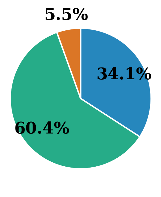
The image displays a pie chart with three distinct segments, each labeled with a percentage. The chart visually represents the distribution of three categories, with the largest segment occupying the majority of the chart, a medium-sized segment, and a very small segment. The colors of the segments are teal, blue, and orange, respectively.
### Components/Axes
- **Legend**: Located at the top of the chart, with percentages written in black text. The legend does not include explicit category labels but directly associates percentages with their corresponding segments.
- **Segments**:
- **Teal Segment**: Largest portion, labeled **60.4%**.
- **Blue Segment**: Medium portion, labeled **34.1%**.
- **Orange Segment**: Smallest portion, labeled **5.5%**.
- **Color Coding**:
- Teal (60.4%) is the dominant color.
- Blue (34.1%) is the second-largest.
- Orange (5.5%) is the smallest.
### Detailed Analysis
- **Teal Segment (60.4%)**: Occupies the left side of the chart, covering approximately 60% of the total area. Its size and position emphasize its dominance.
- **Blue Segment (34.1%)**: Positioned on the right side, it accounts for roughly one-third of the chart. Its placement and size suggest it is a significant but secondary category.
- **Orange Segment (5.5%)**: A small slice at the top of the chart, visually distinct due to its size and color. It represents the smallest portion of the distribution.
### Key Observations
1. **Dominance of Teal**: The teal segment (60.4%) is the largest, indicating it constitutes the majority of the data.
2. **Significant Blue Portion**: The blue segment (34.1%) is the second-largest, representing a substantial but smaller share.
3. **Minor Orange Slice**: The orange segment (5.5%) is negligible in size, highlighting its minimal contribution.
4. **Sum of Percentages**: The total of all segments (60.4% + 34.1% + 5.5%) equals 100%, confirming the chart's accuracy.
### Interpretation
The chart illustrates a clear hierarchical distribution:
- **Teal (60.4%)** is the primary category, suggesting it dominates the dataset (e.g., market share, survey responses, or resource allocation).
- **Blue (34.1%)** represents a secondary but notable portion, indicating a secondary but significant factor.
- **Orange (5.5%)** is a minor outlier, possibly representing an edge case or a small subset of the data.
The spatial arrangement (teal on the left, blue on the right, orange at the top) reinforces the visual hierarchy, with the largest segment positioned to draw immediate attention. The absence of explicit category labels in the legend implies that the percentages themselves serve as the primary identifiers, which may require additional context for interpretation (e.g., what the categories represent). The data suggests a scenario where one category is overwhelmingly dominant, while the others are comparatively smaller, with the smallest segment being particularly marginal.