## Line Chart: Accuracy vs. Thinking Compute
### Overview
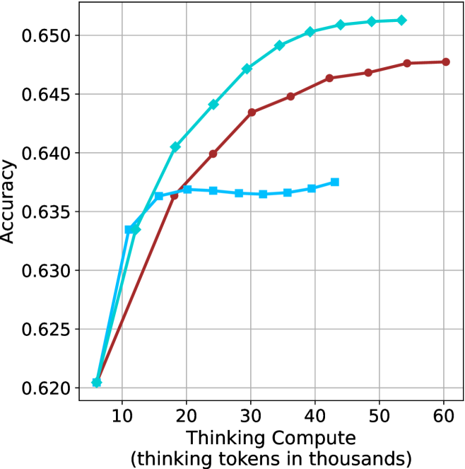
The image is a line chart plotting model accuracy against computational effort, measured in "thinking tokens." It displays three distinct data series, each represented by a different colored line with markers, showing how accuracy changes as the thinking compute increases from approximately 5,000 to 60,000 tokens.
### Components/Axes
* **X-Axis (Horizontal):** Labeled "Thinking Compute (thinking tokens in thousands)". The scale runs from 0 to 60, with major tick marks at 10, 20, 30, 40, 50, and 60. The axis represents the amount of computational resources (in thousands of tokens) allocated to a model's reasoning process.
* **Y-Axis (Vertical):** Labeled "Accuracy". The scale runs from 0.620 to 0.650, with major tick marks at 0.620, 0.625, 0.630, 0.635, 0.640, 0.645, and 0.650. This represents a performance metric, likely a proportion or score.
* **Legend:** There is no explicit legend box within the chart area. The three data series are distinguished solely by color and marker shape.
* **Grid:** A light gray grid is present, with vertical lines at each major x-axis tick and horizontal lines at each major y-axis tick.
### Detailed Analysis
The chart contains three data series. Their trends and approximate data points are as follows:
**1. Cyan Line with Diamond Markers:**
* **Trend:** Shows the steepest initial increase in accuracy, followed by a continued but more gradual rise, achieving the highest final accuracy.
* **Data Points (Approximate):**
* (5, 0.620)
* (10, 0.633)
* (15, 0.636)
* (20, 0.640)
* (25, 0.644)
* (30, 0.647)
* (35, 0.649)
* (40, 0.650)
* (45, 0.651)
* (50, 0.651)
* (55, 0.651)
**2. Red Line with Circle Markers:**
* **Trend:** Shows a steady, consistent increase in accuracy across the entire range, with a slope that is less steep than the cyan line's initial phase but remains positive throughout.
* **Data Points (Approximate):**
* (5, 0.620)
* (15, 0.636)
* (20, 0.637)
* (25, 0.640)
* (30, 0.643)
* (35, 0.645)
* (40, 0.646)
* (45, 0.647)
* (50, 0.648)
* (55, 0.648)
* (60, 0.648)
**3. Blue Line with Square Markers:**
* **Trend:** Shows a rapid initial increase in accuracy, which then plateaus very early (around 15-20k tokens) and remains nearly flat for the remainder of the chart.
* **Data Points (Approximate):**
* (5, 0.620)
* (10, 0.633)
* (15, 0.636)
* (20, 0.637)
* (25, 0.637)
* (30, 0.636)
* (35, 0.636)
* (40, 0.637)
* (45, 0.637)
### Key Observations
1. **Common Starting Point:** All three models/series begin at the same accuracy point (~0.620) at the lowest compute level (5k tokens).
2. **Diverging Paths:** The performance diverges significantly after the initial point. The cyan line consistently outperforms the others from about 20k tokens onward.
3. **Plateau Behavior:** The blue line exhibits an early and severe performance plateau, showing negligible accuracy gains beyond ~15k thinking tokens. The cyan and red lines show diminishing returns but continue to improve, with the cyan line's gains becoming very marginal after ~45k tokens.
4. **Final Performance Hierarchy:** At the highest comparable compute levels (~55k tokens), the final accuracy order is: Cyan (~0.651) > Red (~0.648) > Blue (~0.637).
### Interpretation
This chart demonstrates the relationship between allocated reasoning compute ("thinking tokens") and task accuracy for three different models or model configurations. The data suggests:
* **The Efficiency-Performance Trade-off:** The blue line represents a model that is highly efficient at low compute but hits a hard performance ceiling quickly. It cannot leverage additional compute for better results.
* **The Value of Scalable Reasoning:** The cyan line represents a model architecture or method that effectively translates increased computational investment into higher accuracy, showing strong scalability. It is the most capable when sufficient resources are available.
* **A Middle Ground:** The red line shows a model that scales reliably but less efficiently than the cyan model. It requires more compute to reach the same accuracy levels the cyan model achieves earlier.
* **Practical Implication:** The choice between these models would depend on the computational budget. For low-latency or resource-constrained applications, the blue model might be sufficient. For tasks where maximum accuracy is critical and compute is available, the cyan model is superior. The chart underscores that "more compute" only improves performance if the underlying model is designed to utilize it effectively.