## Line Chart: Accuracy Test (Acc_test) vs. Parameter K
### Overview
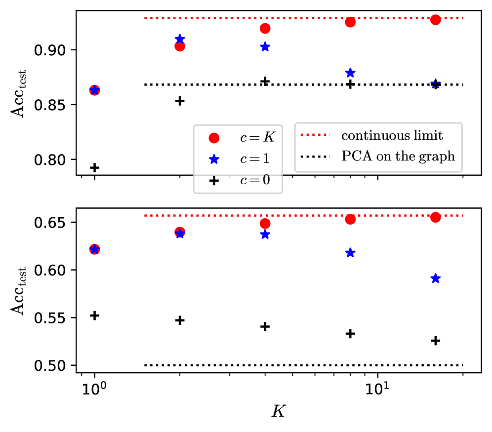
The image contains two vertically stacked line charts comparing test accuracy (Acc_test) across different values of parameter K (logarithmic scale from 10⁰ to 10¹). Three data series are plotted with distinct markers: red circles (c=K), blue stars (c=1), and black pluses (c=0). Two reference lines are shown: a red dotted line labeled "continuous limit" and a black dotted line labeled "PCA on the graph."
### Components/Axes
- **X-axis (K)**: Logarithmic scale from 10⁰ to 10¹, with gridlines at 10⁰, 10¹.
- **Y-axis (Acc_test)**: Ranges from 0.50 to 0.90 in the top subplot and 0.50 to 0.65 in the bottom subplot.
- **Legends**: Located in the top-left corner of each subplot, with:
- Red circles: `c = K`
- Blue stars: `c = 1`
- Black pluses: `c = 0`
- **Reference Lines**:
- Red dotted line: "continuous limit" (top subplot: ~0.90, bottom subplot: ~0.65)
- Black dotted line: "PCA on the graph" (top subplot: ~0.85, bottom subplot: ~0.50)
### Detailed Analysis
#### Top Subplot (Higher Accuracy Range)
- **Red Circles (c=K)**:
- Values: ~0.87 (K=1), ~0.90 (K=10), ~0.91 (K=100)
- Trend: Slightly increasing with K, plateauing near the red dotted line.
- **Blue Stars (c=1)**:
- Values: ~0.89 (K=1), ~0.88 (K=10), ~0.86 (K=100)
- Trend: Slightly decreasing with K, remaining below red circles.
- **Black Pluses (c=0)**:
- Values: ~0.85 (K=1), ~0.84 (K=10), ~0.83 (K=100)
- Trend: Gradual decline with K, consistently lowest.
#### Bottom Subplot (Lower Accuracy Range)
- **Red Circles (c=K)**:
- Values: ~0.63 (K=1), ~0.64 (K=10), ~0.65 (K=100)
- Trend: Slight increase with K, approaching the red dotted line.
- **Blue Stars (c=1)**:
- Values: ~0.62 (K=1), ~0.61 (K=10), ~0.59 (K=100)
- Trend: Decreasing with K, diverging from red circles.
- **Black Pluses (c=0)**:
- Values: ~0.55 (K=1), ~0.54 (K=10), ~0.53 (K=100)
- Trend: Steady decline with K, far below other series.
### Key Observations
1. **Red Circles (c=K)** consistently outperform other series, suggesting parameter adaptation to K improves accuracy.
2. **Black Pluses (c=0)** show the worst performance, indicating fixed parameters (c=0) degrade results as K increases.
3. **Blue Stars (c=1)** maintain mid-tier performance but degrade slightly with larger K.
4. **Reference Lines**:
- The red dotted line ("continuous limit") acts as an upper bound for both subplots.
- The black dotted line ("PCA on the graph") represents a lower bound, with data points generally above it.
### Interpretation
The data demonstrates that parameter scaling (`c=K`) yields the highest accuracy, particularly as K increases. This suggests adaptive parameter selection is critical for performance. The PCA method (`c=0`) underperforms, likely due to information loss from dimensionality reduction. The "continuous limit" line may represent an asymptotic upper bound achievable only with idealized conditions. The divergence between `c=1` and `c=K` in the bottom subplot highlights the importance of parameter tuning in low-resource regimes.