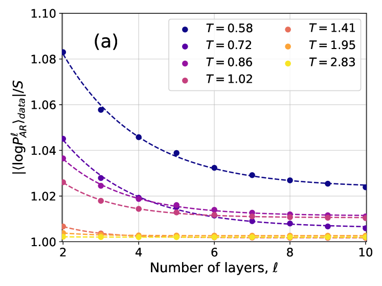
## Chart: Log Probability Ratio vs. Number of Layers
### Overview
The image presents a chart illustrating the relationship between the log probability ratio (⟨log P<sup>ℓ</sup><sub>AR</sub>⟩<sub>data</sub>/S) and the number of layers (ℓ) for different values of a parameter T. The chart displays multiple data series, each representing a specific T value, plotted as discrete points connected by dashed lines.
### Components/Axes
* **X-axis:** Number of layers (ℓ), ranging from approximately 2 to 10. The axis is labeled "Number of layers, ℓ".
* **Y-axis:** Log probability ratio (⟨log P<sup>ℓ</sup><sub>AR</sub>⟩<sub>data</sub>/S), ranging from approximately 1.00 to 1.08. The axis is labeled "⟨log P<sup>ℓ</sup><sub>AR</sub>⟩<sub>data</sub>/S".
* **Legend:** Located in the top-right corner of the chart. It identifies each data series with a corresponding color and T value. The T values are: 0.58 (dark blue), 0.72 (blue), 0.86 (purple), 1.02 (magenta), 1.41 (red), 1.95 (orange), and 2.83 (yellow).
* **Title:** "(a)" is present in the top-left corner, likely indicating this is a sub-figure within a larger figure.
* **Gridlines:** Horizontal and vertical gridlines are present to aid in reading values.
### Detailed Analysis
The chart contains seven data series, each corresponding to a different T value.
* **T = 0.58 (Dark Blue):** The line slopes downward sharply from ℓ = 2 to ℓ = 4, then levels off with a slight downward trend.
* ℓ = 2: Approximately 1.078
* ℓ = 3: Approximately 1.065
* ℓ = 4: Approximately 1.045
* ℓ = 5: Approximately 1.035
* ℓ = 6: Approximately 1.030
* ℓ = 7: Approximately 1.027
* ℓ = 8: Approximately 1.025
* ℓ = 9: Approximately 1.024
* ℓ = 10: Approximately 1.023
* **T = 0.72 (Blue):** The line slopes downward, but less steeply than T = 0.58.
* ℓ = 2: Approximately 1.065
* ℓ = 3: Approximately 1.050
* ℓ = 4: Approximately 1.038
* ℓ = 5: Approximately 1.030
* ℓ = 6: Approximately 1.025
* ℓ = 7: Approximately 1.023
* ℓ = 8: Approximately 1.022
* ℓ = 9: Approximately 1.021
* ℓ = 10: Approximately 1.020
* **T = 0.86 (Purple):** The line slopes downward, but less steeply than T = 0.72.
* ℓ = 2: Approximately 1.045
* ℓ = 3: Approximately 1.035
* ℓ = 4: Approximately 1.028
* ℓ = 5: Approximately 1.024
* ℓ = 6: Approximately 1.022
* ℓ = 7: Approximately 1.021
* ℓ = 8: Approximately 1.020
* ℓ = 9: Approximately 1.020
* ℓ = 10: Approximately 1.019
* **T = 1.02 (Magenta):** The line is relatively flat, with a slight downward trend.
* ℓ = 2: Approximately 1.025
* ℓ = 3: Approximately 1.020
* ℓ = 4: Approximately 1.017
* ℓ = 5: Approximately 1.015
* ℓ = 6: Approximately 1.014
* ℓ = 7: Approximately 1.013
* ℓ = 8: Approximately 1.013
* ℓ = 9: Approximately 1.012
* ℓ = 10: Approximately 1.012
* **T = 1.41 (Red):** The line is nearly flat, fluctuating around 1.00.
* ℓ = 2: Approximately 1.010
* ℓ = 3: Approximately 1.007
* ℓ = 4: Approximately 1.005
* ℓ = 5: Approximately 1.004
* ℓ = 6: Approximately 1.003
* ℓ = 7: Approximately 1.003
* ℓ = 8: Approximately 1.002
* ℓ = 9: Approximately 1.002
* ℓ = 10: Approximately 1.002
* **T = 1.95 (Orange):** The line is almost perfectly flat, hovering around 1.00.
* ℓ = 2: Approximately 1.003
* ℓ = 3: Approximately 1.002
* ℓ = 4: Approximately 1.002
* ℓ = 5: Approximately 1.002
* ℓ = 6: Approximately 1.002
* ℓ = 7: Approximately 1.002
* ℓ = 8: Approximately 1.002
* ℓ = 9: Approximately 1.002
* ℓ = 10: Approximately 1.002
* **T = 2.83 (Yellow):** The line is almost perfectly flat, hovering around 1.00.
* ℓ = 2: Approximately 1.002
* ℓ = 3: Approximately 1.002
* ℓ = 4: Approximately 1.002
* ℓ = 5: Approximately 1.002
* ℓ = 6: Approximately 1.002
* ℓ = 7: Approximately 1.002
* ℓ = 8: Approximately 1.002
* ℓ = 9: Approximately 1.002
* ℓ = 10: Approximately 1.002
### Key Observations
* The log probability ratio decreases with increasing number of layers for lower T values (0.58, 0.72, 0.86, and 1.02).
* For higher T values (1.41, 1.95, and 2.83), the log probability ratio remains relatively constant around 1.00, showing minimal change with increasing layers.
* The rate of decrease in log probability ratio is most pronounced for T = 0.58.
* The lines converge as the number of layers increases, suggesting a diminishing effect of adding more layers for all T values.
### Interpretation
The chart suggests that the impact of increasing the number of layers on the log probability ratio is dependent on the value of the parameter T. For lower T values, adding layers initially leads to a significant decrease in the log probability ratio, indicating improved model performance or a better fit to the data. However, this effect diminishes as the number of layers increases. For higher T values, adding layers has a negligible effect on the log probability ratio, suggesting that the model has already reached a point of saturation or that the additional layers do not contribute meaningfully to the model's performance. This could indicate that the optimal number of layers is dependent on the value of T, and that there is a trade-off between model complexity (number of layers) and performance. The convergence of the lines at higher layer counts suggests a limit to the benefits of increasing model depth beyond a certain point.