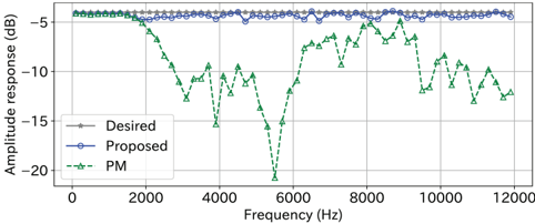
## Line Graph: Amplitude Response vs. Frequency
### Overview
The image is a line graph comparing three amplitude response curves across a frequency range. The graph shows three data series: "Desired" (gray stars), "Proposed" (blue circles), and "PM" (green triangles). The x-axis represents frequency (Hz), and the y-axis represents amplitude response (dB). The graph highlights deviations between the proposed system and the desired performance, as well as the performance of a PM (possibly a physical or mathematical model).
### Components/Axes
- **X-axis (Frequency)**: Labeled "Frequency (Hz)" with a range from 0 to 12,000 Hz. Tick marks are at 0, 2000, 4000, 6000, 8000, 10,000, and 12,000 Hz.
- **Y-axis (Amplitude Response)**: Labeled "Amplitude response (dB)" with a range from -20 dB to -5 dB. Tick marks are at -20, -15, -10, -5 dB.
- **Legend**: Located in the bottom-left corner, with three entries:
- **Desired**: Gray stars (solid line).
- **Proposed**: Blue circles (dashed line).
- **PM**: Green triangles (dotted line).
### Detailed Analysis
1. **Desired (Gray Stars)**:
- A flat, horizontal line at approximately **-5 dB** across all frequencies.
- No variation observed; represents the target amplitude response.
2. **Proposed (Blue Circles)**:
- Slightly above the Desired line, with minor fluctuations.
- Amplitude response ranges between **-5 dB and -4 dB**.
- Peaks at ~-4 dB near 2000 Hz and 10,000 Hz.
- Dips to ~-5.5 dB near 6000 Hz.
3. **PM (Green Triangles)**:
- Highly variable, with sharp dips and peaks.
- Amplitude response ranges from **-5 dB to -18 dB**.
- Sharp drop to **-15 dB** near 4000 Hz.
- Another dip to **-18 dB** near 6000 Hz.
- Peaks at **-5 dB** near 8000 Hz and 10,000 Hz.
- Ends at ~-12 dB at 12,000 Hz.
### Key Observations
- The **Desired** line is perfectly flat, indicating an idealized target.
- The **Proposed** line closely follows the Desired line but shows minor deviations, suggesting a near-optimal but imperfect system.
- The **PM** line exhibits significant instability, with large deviations from the Desired line, particularly at 4000 Hz and 6000 Hz. This suggests the PM model or system has critical performance issues at these frequencies.
### Interpretation
The graph demonstrates a comparison between a target (Desired), a proposed solution (Proposed), and a physical/mathematical model (PM). The Proposed system performs well but does not fully meet the Desired target, while the PM model shows severe instability, likely due to design flaws or unaccounted variables. The PM's sharp dips at 4000 Hz and 6000 Hz may indicate resonance issues, filtering errors, or modeling inaccuracies. The Proposed system’s minor fluctuations suggest it could be optimized further to align more closely with the Desired line. The PM’s performance highlights the need for refinement in its design or implementation.