\n
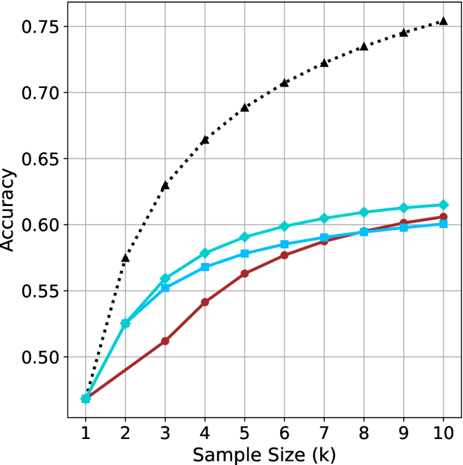
## Line Chart: Accuracy vs. Sample Size (k)
### Overview
The image is a line chart comparing the performance (accuracy) of four different methods or models as a function of increasing sample size. The chart demonstrates how accuracy improves with more data for each method, with one method consistently outperforming the others.
### Components/Axes
* **X-Axis (Horizontal):** Labeled "Sample Size (k)". It represents the number of samples in thousands (k). The axis has discrete, evenly spaced markers from 1 to 10.
* **Y-Axis (Vertical):** Labeled "Accuracy". It represents a performance metric, likely a proportion or probability. The axis ranges from 0.50 to 0.75, with major grid lines at intervals of 0.05 (0.50, 0.55, 0.60, 0.65, 0.70, 0.75).
* **Legend:** Positioned in the top-left corner of the chart area. It contains four entries, each associating a line color and marker shape with a label.
1. **Black dotted line with upward-pointing triangle markers:** Label is partially obscured but appears to be a model name (e.g., "Model A" or similar).
2. **Cyan solid line with diamond markers:** Label is partially obscured.
3. **Blue solid line with square markers:** Label is partially obscured.
4. **Red solid line with circle markers:** Label is partially obscured.
* **Grid:** A light gray grid is present, with both horizontal and vertical lines aligned with the axis ticks.
### Detailed Analysis
The chart plots four data series. All series begin at approximately the same accuracy point at k=1 and show a monotonic increase as sample size grows, but at different rates and to different final levels.
**Trend Verification & Data Point Extraction (Approximate Values):**
1. **Black Dotted Line (Triangles):**
* **Trend:** Shows the steepest and most consistent upward slope, indicating the strongest positive correlation between sample size and accuracy. It maintains a clear lead over all other methods throughout the entire range.
* **Data Points (k, Accuracy):**
* (1, ~0.47)
* (2, ~0.575)
* (3, ~0.63)
* (4, ~0.665)
* (5, ~0.69)
* (6, ~0.705)
* (7, ~0.72)
* (8, ~0.735)
* (9, ~0.745)
* (10, ~0.75)
2. **Cyan Line (Diamonds):**
* **Trend:** Shows a strong initial increase from k=1 to k=4, after which the rate of improvement slows, forming a gentle curve that begins to plateau. It is the second-best performing method for most of the range.
* **Data Points (k, Accuracy):**
* (1, ~0.47)
* (2, ~0.525)
* (3, ~0.56)
* (4, ~0.58)
* (5, ~0.59)
* (6, ~0.60)
* (7, ~0.605)
* (8, ~0.61)
* (9, ~0.615)
* (10, ~0.62)
3. **Blue Line (Squares):**
* **Trend:** Follows a similar trajectory to the cyan line but consistently achieves slightly lower accuracy. The gap between the cyan and blue lines remains relatively constant after k=3.
* **Data Points (k, Accuracy):**
* (1, ~0.47)
* (2, ~0.525)
* (3, ~0.55)
* (4, ~0.57)
* (5, ~0.58)
* (6, ~0.585)
* (7, ~0.59)
* (8, ~0.595)
* (9, ~0.60)
* (10, ~0.60)
4. **Red Line (Circles):**
* **Trend:** Starts with the lowest accuracy and the shallowest initial slope. However, it shows a steady, almost linear increase and begins to converge with the blue line at higher sample sizes (k=8 to 10).
* **Data Points (k, Accuracy):**
* (1, ~0.47)
* (2, ~0.49)
* (3, ~0.51)
* (4, ~0.54)
* (5, ~0.56)
* (6, ~0.575)
* (7, ~0.585)
* (8, ~0.595)
* (9, ~0.60)
* (10, ~0.605)
### Key Observations
1. **Universal Improvement:** All four methods benefit from increased sample size, as evidenced by the positive slope of every line.
2. **Clear Performance Hierarchy:** A distinct and consistent ranking is established by k=2 and maintained: Black > Cyan > Blue > Red (until convergence at the end).
3. **Diminishing Returns:** The cyan, blue, and red lines all show signs of diminishing returns (a decreasing marginal gain in accuracy) as sample size increases beyond k=5 or 6. The black line also shows this but to a much lesser degree.
4. **Convergence at High k:** The performance gap between the blue and red methods nearly closes by k=10, suggesting they may have similar asymptotic performance limits.
5. **Significant Outlier:** The method represented by the black dotted line is a significant outlier in terms of performance, achieving substantially higher accuracy at every sample size greater than 1.
### Interpretation
This chart likely compares different machine learning models, algorithms, or training strategies on a specific task. The data suggests:
* **Data Efficiency:** The "Black" method is far more data-efficient, extracting significantly more accuracy from the same amount of data. This could indicate a superior model architecture, better feature engineering, or a more effective learning algorithm.
* **Performance Ceiling:** The cyan, blue, and red methods appear to be approaching a performance ceiling (around 0.60-0.62 accuracy) within the given sample size range, while the black method's ceiling is much higher (above 0.75).
* **Practical Implications:** If collecting labeled data is expensive, the black method is the clear choice. If the black method is computationally more complex, there is a clear trade-off between resource cost and performance gain. The convergence of the blue and red lines suggests that for large datasets, the choice between those two specific methods may become less critical based on accuracy alone.
* **Underlying Cause:** The stark difference in performance prompts investigation into what makes the black method unique. Is it a fundamentally different approach (e.g., a deep neural network vs. traditional models), or does it utilize the same data in a more effective way? The chart provides strong empirical evidence for its superiority but does not explain the cause.