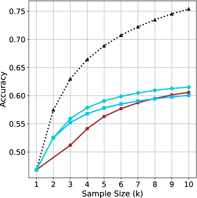
## Line Chart: Accuracy vs. Sample Size
### Overview
The image is a line chart comparing the accuracy of different methods as a function of sample size. The x-axis represents the sample size (k), ranging from 1 to 10. The y-axis represents accuracy, ranging from 0.50 to 0.75. There are three distinct lines, each representing a different method, distinguished by color and marker style.
### Components/Axes
* **X-axis:** Sample Size (k), with values ranging from 1 to 10 in increments of 1.
* **Y-axis:** Accuracy, with values ranging from 0.50 to 0.75 in increments of 0.05.
* **Data Series:**
* Black dotted line with triangle markers.
* Turquoise line with diamond markers.
* Blue line with square markers.
* Brown line with circle markers.
### Detailed Analysis
* **Black dotted line with triangle markers:** This line shows the highest accuracy overall. It starts at approximately 0.47 at sample size 1 and increases rapidly to approximately 0.63 at sample size 3. It continues to increase, but at a decreasing rate, reaching approximately 0.76 at sample size 10.
* (1, 0.47)
* (2, 0.57)
* (3, 0.63)
* (4, 0.66)
* (5, 0.69)
* (6, 0.71)
* (7, 0.725)
* (8, 0.735)
* (9, 0.745)
* (10, 0.76)
* **Turquoise line with diamond markers:** This line starts at approximately 0.47 at sample size 1 and increases to approximately 0.56 at sample size 3. It continues to increase, but at a decreasing rate, reaching approximately 0.61 at sample size 10.
* (1, 0.47)
* (2, 0.53)
* (3, 0.56)
* (4, 0.58)
* (5, 0.595)
* (6, 0.60)
* (7, 0.605)
* (8, 0.61)
* (9, 0.61)
* (10, 0.61)
* **Blue line with square markers:** This line starts lower than the turquoise line and increases steadily.
* (1, 0.47)
* (2, 0.51)
* (3, 0.54)
* (4, 0.56)
* (5, 0.575)
* (6, 0.585)
* (7, 0.59)
* (8, 0.595)
* (9, 0.60)
* (10, 0.605)
* **Brown line with circle markers:** This line starts at approximately 0.47 at sample size 1 and increases to approximately 0.52 at sample size 3. It continues to increase, but at a decreasing rate, reaching approximately 0.60 at sample size 10.
* (1, 0.47)
* (2, 0.49)
* (3, 0.52)
* (4, 0.54)
* (5, 0.56)
* (6, 0.575)
* (7, 0.585)
* (8, 0.59)
* (9, 0.595)
* (10, 0.60)
### Key Observations
* All lines show an increase in accuracy as the sample size increases.
* The black dotted line (with triangle markers) consistently outperforms the other methods in terms of accuracy.
* The rate of increase in accuracy decreases as the sample size increases for all methods, suggesting diminishing returns.
* The brown line (with circle markers) consistently shows the lowest accuracy among the four methods.
* The turquoise and blue lines perform similarly, with the turquoise line showing slightly higher accuracy.
### Interpretation
The chart demonstrates the relationship between sample size and accuracy for different methods. The black dotted line represents the most effective method, achieving the highest accuracy with increasing sample sizes. The diminishing returns observed for all methods suggest that there is a point beyond which increasing the sample size provides only marginal improvements in accuracy. The relative performance of the different methods can be compared directly, with the black dotted line consistently outperforming the others. The data suggests that the choice of method has a significant impact on accuracy, and that increasing the sample size can improve accuracy, but only up to a certain point.