## Line Chart: Accuracy vs. Sample Size
### Overview
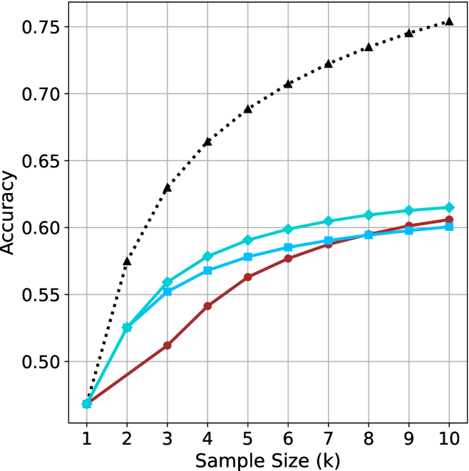
The image is a line chart illustrating the relationship between "Accuracy" (y-axis) and "Sample Size (k)" (x-axis). The chart displays four distinct data series, each represented by a different color and marker style. All four series originate from a common point at Sample Size 1. There is no legend provided in the image to identify what specific models or methods these lines represent.
### Components/Axes
* **X-Axis:** Labeled "Sample Size (k)". The scale is linear, ranging from 1 to 10 in integer increments.
* **Y-Axis:** Labeled "Accuracy". The scale ranges from 0.50 to 0.75, with grid lines at 0.05 intervals.
* **Data Series (Legend Missing):**
* **Series 1 (Black, dotted line, triangle markers):** The highest-performing series.
* **Series 2 (Teal/Cyan, solid line, diamond markers):** The second-highest performing series for most of the range.
* **Series 3 (Blue, solid line, square markers):** A mid-to-low performing series.
* **Series 4 (Dark Red/Brown, solid line, circle markers):** The lowest-performing series initially, which shows a late-stage upward trend.
### Detailed Analysis
All four series begin at a common coordinate of approximately **(1, 0.47)**.
**1. Black Dotted Line (Triangles):**
* **Trend:** This line exhibits the steepest upward trajectory. It shows rapid growth between k=1 and k=4, then continues to grow at a slower, steady rate.
* **Values:**
* k=1: ~0.47
* k=3: ~0.63
* k=5: ~0.69
* k=10: ~0.755
**2. Teal/Cyan Solid Line (Diamonds):**
* **Trend:** This line shows a strong initial increase, similar to the Blue line, but maintains a higher trajectory. It begins to flatten significantly after k=6.
* **Values:**
* k=1: ~0.47
* k=3: ~0.56
* k=6: ~0.60
* k=10: ~0.615
**3. Blue Solid Line (Squares):**
* **Trend:** This line follows a similar path to the Teal line but remains consistently below it. It shows a steady, diminishing rate of improvement as the sample size increases.
* **Values:**
* k=1: ~0.47
* k=3: ~0.555
* k=6: ~0.585
* k=10: ~0.60
**4. Dark Red/Brown Solid Line (Circles):**
* **Trend:** This line has the slowest initial growth (the shallowest slope between k=1 and k=4). However, it maintains a more consistent upward slope compared to the Blue and Teal lines in the latter half of the chart.
* **Crossover:** It crosses the Blue line between k=7 and k=8, ending as the third-highest performer.
* **Values:**
* k=1: ~0.47
* k=4: ~0.54
* k=7: ~0.59
* k=10: ~0.605
### Key Observations
* **Performance Gap:** There is a significant performance gap between the Black dotted line and the other three solid-line series. The Black line achieves an accuracy of ~0.75, while the others cluster between 0.60 and 0.615.
* **Diminishing Returns:** All four lines exhibit a concave shape, indicating that increasing the sample size yields diminishing returns on accuracy.
* **Late-Stage Crossover:** The Dark Red line demonstrates a "slow starter" behavior. While it performs worse than the Blue and Teal lines for the first 7 units of sample size, its trajectory suggests it may continue to improve at a higher rate than the Blue line as sample size increases further.
### Interpretation
This chart likely represents a comparison of machine learning models or algorithms evaluated on increasing amounts of training data.
* **The Black Dotted Line:** This represents a model that is significantly more robust or better suited to the task, as it scales much more effectively with increased data.
* **The Clustered Lines (Teal, Blue, Red):** These likely represent variations of a base model or competing models with similar architectural limitations.
* **The "Slow Starter" (Red Line):** The fact that the Red line overtakes the Blue line suggests that while it may be less efficient with very small datasets (perhaps due to higher variance or complexity requiring more data to converge), it has better long-term scaling properties than the Blue model.
* **Data Saturation:** The flattening of the curves suggests that for the Teal, Blue, and Red models, simply adding more data (up to k=10) is yielding very little additional accuracy, implying these models may have reached their capacity or "ceiling" for this specific task.