## Line Chart: NMSE vs. Frequency for Different Parameters
### Overview
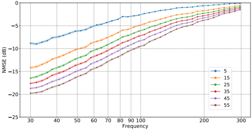
The image is a line chart showing the relationship between NMSE (Normalized Mean Squared Error) in dB and Frequency. There are six different lines, each representing a different parameter value (5, 15, 25, 35, 45, and 55). The chart illustrates how NMSE changes with frequency for each parameter.
### Components/Axes
* **X-axis:** Frequency, ranging from approximately 30 to 300. Major tick marks are present at 30, 40, 50, 60, 70, 80, 90, 100, 200, and 300.
* **Y-axis:** NMSE (dB), ranging from -25 to 0. Major tick marks are present at -25, -20, -15, -10, -5, and 0.
* **Legend:** Located in the bottom-right corner. It identifies each line by its parameter value:
* Blue: 5
* Orange: 15
* Green: 25
* Red: 35
* Purple: 45
* Brown: 55
### Detailed Analysis
* **Blue Line (5):** The NMSE starts at approximately -9 dB at a frequency of 30, then increases steadily to approximately -2 dB at a frequency of 300.
* **Orange Line (15):** The NMSE starts at approximately -14 dB at a frequency of 30, then increases steadily to approximately -3 dB at a frequency of 300.
* **Green Line (25):** The NMSE starts at approximately -16 dB at a frequency of 30, then increases steadily to approximately -4 dB at a frequency of 300.
* **Red Line (35):** The NMSE starts at approximately -17 dB at a frequency of 30, then increases steadily to approximately -4.5 dB at a frequency of 300.
* **Purple Line (45):** The NMSE starts at approximately -18 dB at a frequency of 30, then increases steadily to approximately -5 dB at a frequency of 300.
* **Brown Line (55):** The NMSE starts at approximately -19 dB at a frequency of 30, then increases steadily to approximately -5.5 dB at a frequency of 300.
### Key Observations
* All lines show an upward trend, indicating that NMSE increases with frequency.
* The lines are generally parallel, suggesting a similar relationship between NMSE and frequency for all parameter values.
* The NMSE values are lower for higher parameter values across the frequency range.
* The rate of increase in NMSE decreases as frequency increases, with the lines appearing to flatten out towards the higher end of the frequency range.
### Interpretation
The chart demonstrates the relationship between NMSE and frequency for different parameter values. The data suggests that increasing the frequency generally leads to a higher NMSE, regardless of the parameter value. However, higher parameter values result in lower NMSE across the frequency spectrum. The convergence of the lines at higher frequencies suggests that the impact of the parameter value on NMSE diminishes as frequency increases. This information could be valuable in optimizing system parameters to minimize NMSE at different operating frequencies.