\n
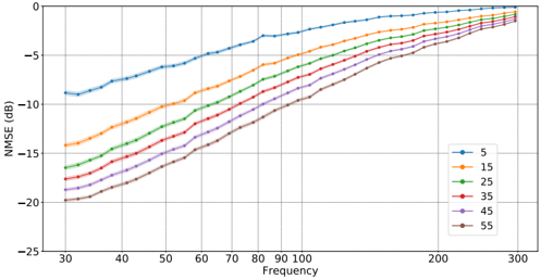
## Line Chart: NMSE vs. Frequency for Different Values
### Overview
The image presents a line chart illustrating the relationship between Normalized Mean Squared Error (NMSE) in decibels (dB) and Frequency, for several different values. The chart displays how NMSE changes as frequency increases for each value.
### Components/Axes
* **X-axis:** Frequency, ranging from approximately 30 to 300. The axis is labeled "Frequency".
* **Y-axis:** NMSE (dB), ranging from approximately -25 to 0. The axis is labeled "NMSE (dB)".
* **Legend:** Located in the top-right corner of the chart. The legend identifies each line by its corresponding value: 5, 15, 25, 35, 45, and 55. Each value is associated with a unique color.
* **Data Series:** Six distinct lines, each representing a different value.
### Detailed Analysis
The chart shows six lines, each representing a different value. The lines generally trend upwards, indicating that NMSE increases with frequency.
* **Value 5 (Blue Line):** The blue line starts at approximately -11 dB at a frequency of 30, and gradually increases to approximately -0.5 dB at a frequency of 300. This line exhibits the lowest NMSE values across the entire frequency range.
* **Value 15 (Orange Line):** The orange line begins at approximately -16 dB at a frequency of 30, and rises to approximately -3 dB at a frequency of 300.
* **Value 25 (Green Line):** The green line starts at approximately -18 dB at a frequency of 30, and increases to approximately -5 dB at a frequency of 300.
* **Value 35 (Red Line):** The red line begins at approximately -19 dB at a frequency of 30, and rises to approximately -7 dB at a frequency of 300.
* **Value 45 (Purple Line):** The purple line starts at approximately -20 dB at a frequency of 30, and increases to approximately -8 dB at a frequency of 300.
* **Value 55 (Brown Line):** The brown line begins at approximately -21 dB at a frequency of 30, and rises to approximately -9 dB at a frequency of 300.
The lines converge towards the higher frequency end of the spectrum, indicating that the difference in NMSE between the different values diminishes as frequency increases.
### Key Observations
* NMSE generally increases with frequency for all values.
* Lower values (5, 15) exhibit lower NMSE values across the entire frequency range.
* The difference in NMSE between the different values is more pronounced at lower frequencies.
* The lines converge at higher frequencies, suggesting that the impact of the value on NMSE decreases as frequency increases.
### Interpretation
The chart demonstrates the relationship between NMSE and frequency for different values. The increasing trend of NMSE with frequency suggests that the accuracy of a model or estimation decreases as frequency increases. The lower NMSE values for lower values indicate that these values provide better accuracy, particularly at lower frequencies. The convergence of the lines at higher frequencies suggests that the impact of the value on accuracy becomes less significant at higher frequencies. This could be due to limitations in the model or estimation method at higher frequencies, or it could indicate that the underlying signal becomes more complex and difficult to model accurately. The data suggests that the choice of value is more critical at lower frequencies, while the impact of the value diminishes at higher frequencies.