\n
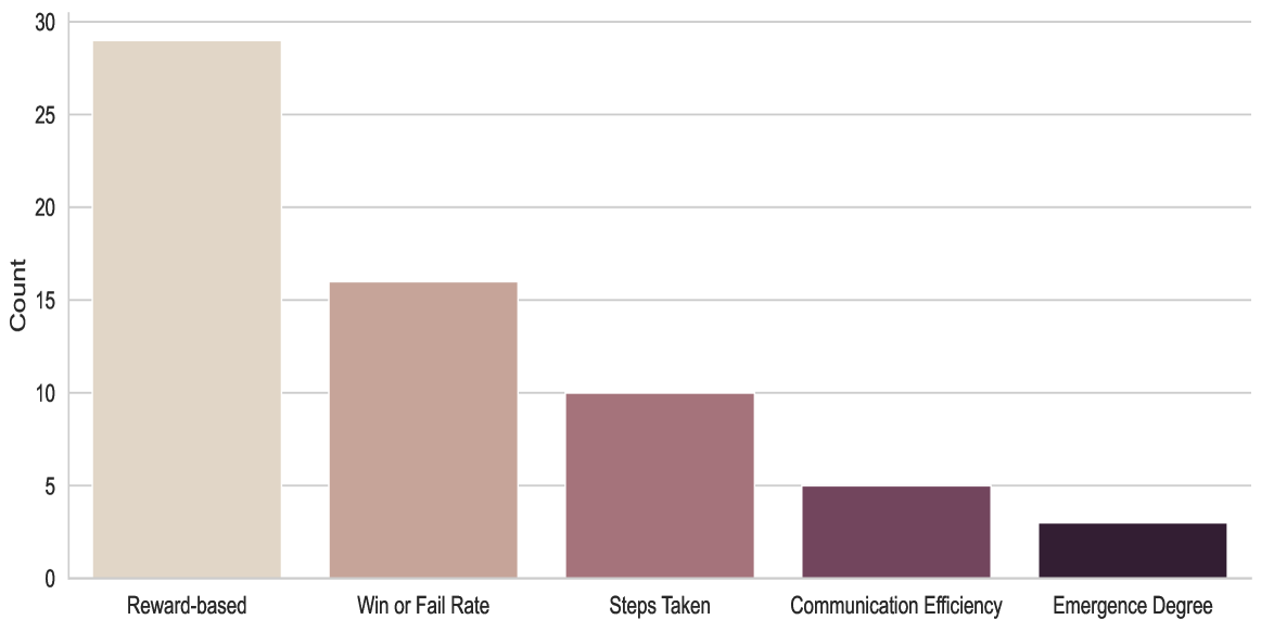
## Bar Chart: Count of Metrics or Categories
### Overview
The image displays a vertical bar chart showing the count associated with five distinct categories. The chart has a clean, minimalist design with a light gray background and horizontal grid lines. The bars are colored in a gradient from light beige to dark purple, but no legend is provided to explain the color coding. The data appears to represent a frequency or occurrence count for each category.
### Components/Axes
* **Chart Type:** Vertical Bar Chart.
* **Y-Axis (Vertical):**
* **Label:** "Count"
* **Scale:** Linear scale from 0 to 30.
* **Major Ticks/Gridlines:** At intervals of 5 (0, 5, 10, 15, 20, 25, 30).
* **X-Axis (Horizontal):**
* **Categories (from left to right):**
1. Reward-based
2. Win or Fail Rate
3. Steps Taken
4. Communication Efficiency
5. Emergence Degree
* **Legend:** None present. The color gradient of the bars (light beige to dark purple) does not have an explanatory key.
* **Title:** No chart title is visible.
### Detailed Analysis
The chart presents a clear descending trend in count from the first category to the last. Below is the approximate value for each bar, determined by visual alignment with the y-axis gridlines.
| Category (X-axis) | Approximate Count (Y-axis) | Visual Trend & Color Description |
| :--- | :--- | :--- |
| **Reward-based** | ~29 | The tallest bar, colored light beige. It nearly reaches the 30 mark. |
| **Win or Fail Rate** | ~16 | The second tallest bar, colored a muted rose/taupe. It sits just above the 15 gridline. |
| **Steps Taken** | ~10 | The third bar, colored a dusty mauve. Its top aligns exactly with the 10 gridline. |
| **Communication Efficiency** | ~5 | The fourth bar, colored a dark plum. Its top aligns exactly with the 5 gridline. |
| **Emergence Degree** | ~3 | The shortest bar, colored a very dark purple/black. It is slightly more than half the height of the 5 gridline. |
**Trend Verification:** The visual trend is a strict, stepwise decrease in bar height from left to right. Each subsequent category has a lower count than the one before it.
### Key Observations
1. **Dominant Category:** "Reward-based" is the most frequent or highly counted metric by a significant margin, with a count nearly double that of the next category.
2. **Clear Hierarchy:** The data establishes a strict order of prevalence: Reward-based > Win or Fail Rate > Steps Taken > Communication Efficiency > Emergence Degree.
3. **Precise Mid-Point:** The "Steps Taken" bar sits exactly at the midpoint of the y-axis scale (10 out of 0-30).
4. **Low-End Clustering:** The last two categories, "Communication Efficiency" and "Emergence Degree," have relatively low counts (5 and ~3), suggesting they are less frequently observed or measured.
5. **Color Gradient:** The bar colors transition smoothly from light to dark, which may be an aesthetic choice or could imply an ordinal relationship between the categories (e.g., from more concrete to more abstract concepts).
### Interpretation
This chart likely summarizes the frequency of different evaluation metrics, performance indicators, or behavioral categories within a dataset or a body of research, possibly related to multi-agent systems, reinforcement learning, or complex systems analysis.
* **What the data suggests:** The overwhelming count for "Reward-based" indicates that reward mechanisms are the most commonly tracked or reported element in the context this data was drawn from. Metrics related to outcomes ("Win or Fail Rate") and process efficiency ("Steps Taken") are moderately common. More complex, systemic properties like "Communication Efficiency" and especially "Emergence Degree" are measured or reported far less frequently.
* **Relationship between elements:** The descending order could reflect a hierarchy of measurement difficulty or research focus. Reward-based metrics are often fundamental and easier to quantify in AI systems. In contrast, "Emergence Degree" is a complex, higher-order property that is notoriously difficult to define and measure, which aligns with its low count.
* **Notable anomaly:** The lack of a chart title or legend is a significant omission for a technical document. The color gradient, while visually appealing, remains unexplained, leaving the viewer to speculate whether it carries semantic meaning (e.g., representing a spectrum from simple to complex) or is purely decorative.
* **Underlying implication:** The data implies a potential research or monitoring bias towards easily quantifiable, direct performance metrics (reward, win rate, steps) over more nuanced, interaction-based, or systemic properties (communication, emergence). This could highlight a gap in evaluation methodologies for the studied system.