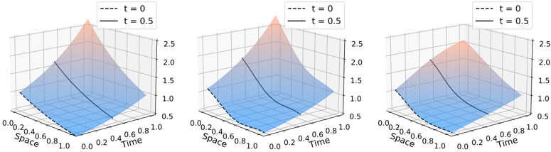
## 3D Surface Plots: Wave Propagation Over Time
### Overview
The image presents three 3D surface plots, each depicting a wave-like function at different time points. The plots visualize how the wave shape changes as time progresses. Each plot shares the same "Space" and "Time" axes, but the surface height represents the function's value at that specific space and time.
### Components/Axes
* **X-axis:** Labeled "Space", ranging from approximately 0.0 to 1.0.
* **Y-axis:** Labeled "Time", ranging from approximately 0.0 to 0.8.
* **Z-axis:** Vertical axis, ranging from approximately 0.0 to 2.5.
* **Legends:** Each plot has a legend in the top-right corner indicating two curves:
* `t = 0` (dashed black line)
* `t = 0.5` (solid orange line)
### Detailed Analysis or Content Details
**Plot 1 (Left):**
* The surface is a peak centered around Space = 0.5 and Time = 0.0.
* The dashed black line (`t = 0`) starts at approximately (0.0, 0.0) and rises to a peak at (0.5, 0.0), then descends to approximately (1.0, 0.0).
* The solid orange line (`t = 0.5`) starts at approximately (0.0, 0.5), rises to a peak at (0.5, 0.5), and descends to approximately (1.0, 0.5). The peak is slightly shifted in time.
* The surface height is highest at Space = 0.5, Time = 0.0, reaching approximately 2.3.
**Plot 2 (Center):**
* The surface is similar to Plot 1, but the peak is more flattened and shifted further in time.
* The dashed black line (`t = 0`) starts at approximately (0.0, 0.0) and rises to a peak at (0.5, 0.0), then descends to approximately (1.0, 0.0).
* The solid orange line (`t = 0.5`) starts at approximately (0.0, 0.5), rises to a peak at (0.5, 0.5), and descends to approximately (1.0, 0.5). The peak is more pronounced.
* The surface height is highest at Space = 0.5, Time = 0.0, reaching approximately 2.4.
**Plot 3 (Right):**
* The surface is even more flattened and shifted in time compared to Plot 2.
* The dashed black line (`t = 0`) starts at approximately (0.0, 0.0) and rises to a peak at (0.5, 0.0), then descends to approximately (1.0, 0.0).
* The solid orange line (`t = 0.5`) starts at approximately (0.0, 0.5), rises to a peak at (0.5, 0.5), and descends to approximately (1.0, 0.5). The peak is significantly flattened.
* The surface height is highest at Space = 0.5, Time = 0.0, reaching approximately 2.2.
### Key Observations
* The wave peak appears to be propagating along the "Time" axis. As time increases (moving from Plot 1 to Plot 3), the peak flattens and shifts towards higher time values.
* The dashed black line (`t = 0`) remains consistent across all three plots, representing the initial wave shape.
* The solid orange line (`t = 0.5`) shows the wave shape at a later time, demonstrating the wave's evolution.
* The maximum height of the wave decreases slightly as time progresses.
### Interpretation
The plots demonstrate the propagation of a wave over time. The initial wave shape is represented by the dashed black line at `t = 0`. As time increases to `t = 0.5`, the wave shape changes, indicated by the solid orange line. The flattening and shifting of the peak suggest that the wave is dissipating or spreading out as it propagates. The decreasing maximum height further supports the idea of wave attenuation. The plots provide a visual representation of a dynamic system evolving over time, likely modeling a physical phenomenon like wave motion or signal propagation. The consistent "Space" and "Time" axes allow for a direct comparison of the wave's behavior at different time points.