## Line Graph: Age Group vs. ~f_A (Logarithmic Scale)
### Overview
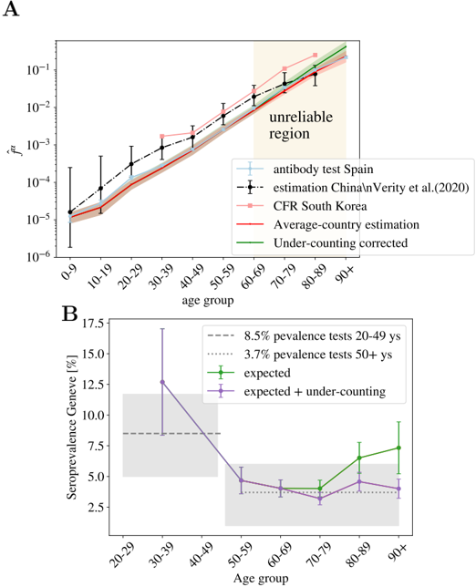
The chart displays the relationship between age groups (0-9 to 90+) and a logarithmic metric (~f_A) across multiple data sources. A shaded "unreliable region" is highlighted for age groups 60-90+.
### Components/Axes
- **X-axis**: Age groups (0-9, 10-19, ..., 90+).
- **Y-axis**: ~f_A (logarithmic scale, 10⁻⁶ to 10⁻¹).
- **Legend**:
- **Blue dashed line**: Antibody test Spain.
- **Black dashed line**: Estimation China/Verity et al. (2020).
- **Pink dashed line**: CFR South Korea.
- **Red solid line**: Average-country estimation.
- **Green solid line**: Under-counting corrected.
### Detailed Analysis
- **Antibody test Spain (blue dashed)**: Increases steadily from ~10⁻⁵ (0-9) to ~10⁻² (90+).
- **Estimation China/Verity et al. (black dashed)**: Similar trend to Spain, with ~10⁻⁵ (0-9) to ~10⁻² (90+).
- **CFR South Korea (pink dashed)**: Slightly lower than Spain, ~10⁻⁵ (0-9) to ~10⁻² (90+).
- **Average-country estimation (red solid)**: Flattest trend, ~10⁻⁵ (0-9) to ~10⁻³ (90+).
- **Under-counting corrected (green solid)**: Highest values, ~10⁻⁵ (0-9) to ~10⁻¹ (90+).
- **Unreliable region (shaded)**: Covers age groups 60-90+, indicating potential data quality issues.
### Key Observations
- All data series show increasing ~f_A with age, but the **under-counting corrected** line (green) has the steepest slope.
- The **unreliable region** (60-90+) overlaps with the highest ~f_A values, suggesting possible overestimation or data limitations in older populations.
- **Average-country estimation** (red) deviates significantly from other sources, remaining relatively flat.
### Interpretation
The data suggests that **under-counting corrections** (green line) significantly elevate ~f_A values, particularly in older age groups. The **unreliable region** (60-90+) may reflect challenges in data collection or modeling accuracy for elderly populations. The divergence between **average-country estimation** (red) and other sources highlights variability in regional reporting or methodological assumptions.
---
## Bar Chart: Age Group vs. Seroprevalence Geneve (%)
### Overview
This chart compares seroprevalence rates in Geneva across age groups (20-29 to 90+), with reference lines for 8.5% (20-49) and 3.7% (50+).
### Components/Axes
- **X-axis**: Age groups (20-29, 30-39, ..., 90+).
- **Y-axis**: Seroprevalence Geneve (%) (0-17.5%).
- **Legend**:
- **Dashed gray line**: 8.5% prevalence (20-49).
- **Dotted gray line**: 3.7% prevalence (50+).
- **Green solid line**: Expected seroprevalence.
- **Purple solid line**: Expected + under-counting.
### Detailed Analysis
- **20-29 age group**: ~12% seroprevalence (highest).
- **30-39**: ~10% (slightly lower).
- **40-49**: ~8% (approaching 8.5% reference).
- **50-59**: ~5% (below 3.7% reference).
- **60-69**: ~4% (consistent with 3.7% reference).
- **70-79**: ~3% (slightly below 3.7%).
- **80-89**: ~6% (increase from 70-79).
- **90+**: ~7% (highest in older groups).
- **Expected (green)**: Flat line at ~5% across all age groups.
- **Expected + under-counting (purple)**: Dips below 5% for 50-79, then rises to ~5% for 80-90+.
### Key Observations
- **Younger age groups (20-49)** show higher seroprevalence (~10-12%) compared to older groups.
- **Older age groups (50+)** exhibit lower seroprevalence (~3-7%), with a notable increase in 80-90+.
- The **expected + under-counting** line (purple) underestimates seroprevalence for 50-79 but aligns with observed values for 80-90+.
### Interpretation
The data indicates **age-related disparities in seroprevalence**, with younger populations showing higher infection rates. The **expected + under-counting** line suggests that under-reporting may suppress seroprevalence estimates in middle-aged groups (50-79), while older groups (80-90+) may have more accurate or slightly adjusted values. The **8.5% and 3.7% reference lines** highlight thresholds for different age brackets, emphasizing the need for age-specific epidemiological models.