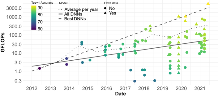
## Scatter Plot: DNN Performance Over Time
### Overview
This image presents a scatter plot illustrating the relationship between the date (from 2012 to 2021) and GFLOPS (floating point operations per second) for Deep Neural Networks (DNNs). The plot also incorporates Top-1 Accuracy as a color-coded attribute of each data point. Three lines are overlaid to represent trends: Average per year, All DNNs, and Best DNNs. The plot also differentiates data points based on whether they have "Extra data" associated with them.
### Components/Axes
* **X-axis:** Date, ranging from 2012 to 2021.
* **Y-axis:** GFLOPS, on a logarithmic scale from 0.3 to 3000.
* **Color Scale (Top-1 Accuracy):** A gradient from yellow (90) to blue (60), representing Top-1 Accuracy.
* **Legend:** Located at the top-right of the plot.
* `Average per year`: Represented by a dotted gray line.
* `All DNNs`: Represented by a solid black line.
* `Best DNNs`: Represented by a dashed gray line.
* `No`: Represented by a solid blue circle.
* `Yes`: Represented by a green triangle.
### Detailed Analysis
The plot shows a general upward trend in GFLOPS over time for all DNNs. Let's analyze each trend line and data series:
* **Average per year (dotted gray line):** This line shows a slow, relatively steady increase in GFLOPS from approximately 1.5 GFLOPS in 2012 to around 30 GFLOPS in 2021.
* **All DNNs (solid black line):** This line exhibits a more pronounced upward trend, starting at approximately 1.5 GFLOPS in 2012 and reaching around 60 GFLOPS in 2021.
* **Best DNNs (dashed gray line):** This line shows the most rapid increase, starting at approximately 2 GFLOPS in 2012 and reaching over 1000 GFLOPS in 2021.
**Data Point Analysis (Color-coded by Top-1 Accuracy):**
* **2012:** A few data points (blue circles) around 1-2 GFLOPS, with Top-1 Accuracy around 60-70.
* **2013-2016:** Data points (blue circles) are scattered, generally below 10 GFLOPS, with Top-1 Accuracy ranging from 60-80.
* **2017-2018:** An increase in data points (blue circles and green triangles) between 10-100 GFLOPS, with Top-1 Accuracy ranging from 60-90.
* **2019-2021:** A significant increase in data points (green triangles and yellow circles) ranging from 30-3000 GFLOPS, with Top-1 Accuracy ranging from 70-90. The highest GFLOPS values (above 1000) are associated with yellow data points (Top-1 Accuracy of 90).
* **"Extra data" differentiation:** Green triangles (Yes) generally appear at higher GFLOPS values than blue circles (No), particularly from 2018 onwards.
**Approximate Data Points (based on visual estimation):**
| Year | All DNNs (GFLOPS) | Best DNNs (GFLOPS) | Average per year (GFLOPS) |
|---|---|---|---|
| 2012 | 1.5 | 2 | 1.5 |
| 2015 | 5 | 10 | 5 |
| 2018 | 20 | 200 | 15 |
| 2021 | 60 | 1200 | 30 |
### Key Observations
* There is a clear exponential growth in the performance (GFLOPS) of DNNs over the period 2012-2021.
* The "Best DNNs" consistently outperform the average and all DNNs.
* Top-1 Accuracy generally increases with GFLOPS, suggesting a correlation between computational power and model accuracy.
* Data points with "Extra data" tend to have higher GFLOPS values, indicating that additional data may contribute to improved performance.
* The logarithmic scale on the Y-axis emphasizes the rapid growth in GFLOPS, especially in the later years.
### Interpretation
The data demonstrates the rapid advancement of DNN technology over the past decade. The increasing GFLOPS values indicate a significant increase in computational power, which is likely driven by advancements in hardware (e.g., GPUs) and algorithmic improvements. The correlation between GFLOPS and Top-1 Accuracy suggests that increasing computational power leads to more accurate models. The differentiation based on "Extra data" suggests that the quality and quantity of training data also play a crucial role in model performance. The divergence between the "All DNNs" and "Best DNNs" lines highlights the impact of research and development efforts in pushing the boundaries of DNN capabilities. The plot provides a compelling visual representation of the progress in the field of deep learning and its potential for future advancements. The use of a logarithmic scale is important to understand the magnitude of the growth, as a linear scale would compress the earlier data points and obscure the exponential trend.