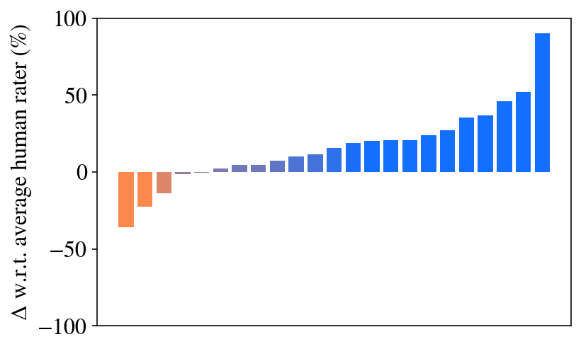
## Bar Chart: Delta w.r.t. Average Human Rater
### Overview
The image is a bar chart displaying the difference (delta) with respect to the average human rater, expressed as a percentage. The x-axis represents different categories (unspecified, but implied to be individual raters or items being rated), and the y-axis represents the percentage difference from the average human rating. The bars are colored in a gradient from orange to blue, with orange bars indicating negative differences and blue bars indicating positive differences.
### Components/Axes
* **X-axis:** Categories are not explicitly labeled, but are represented by the individual bars.
* **Y-axis:**
* Label: "Δ w.r.t. average human rater (%)"
* Scale: Ranges from -100% to 100% with markers at -100, -50, 0, 50, and 100.
* **Colors:**
* Orange: Indicates a negative difference from the average human rater.
* Blue: Indicates a positive difference from the average human rater.
### Detailed Analysis
The chart shows a distribution of differences from the average human rater. The bars are arranged in ascending order.
* **Orange Bars (Negative Differences):**
* The first bar (leftmost) has a value of approximately -35%.
* The second bar has a value of approximately -20%.
* The third bar has a value of approximately -10%.
* **Blue Bars (Positive Differences):**
* The fourth bar is approximately 0%.
* The fifth bar is approximately 2%.
* The sixth bar is approximately 5%.
* The seventh bar is approximately 8%.
* The eighth bar is approximately 10%.
* The ninth bar is approximately 12%.
* The tenth bar is approximately 14%.
* The eleventh bar is approximately 16%.
* The twelfth bar is approximately 18%.
* The thirteenth bar is approximately 20%.
* The fourteenth bar is approximately 30%.
* The fifteenth bar is approximately 35%.
* The sixteenth bar is approximately 40%.
* The seventeenth bar is approximately 45%.
* The eighteenth bar is approximately 50%.
* The nineteenth bar is approximately 95%.
### Key Observations
* The majority of the bars are blue, indicating that most categories have a positive difference from the average human rater.
* There is a significant outlier with a value close to 95%.
* The negative differences are smaller in magnitude compared to the largest positive difference.
### Interpretation
The chart suggests that there is a wide range of agreement among raters, with some raters consistently rating lower than the average and others consistently rating higher. The large positive outlier indicates a rater or item that is rated significantly higher than the average. The distribution of differences could be due to various factors, such as individual biases, different interpretations of the rating scale, or genuine differences in the quality of the items being rated. The fact that most bars are blue suggests a general tendency to rate higher than the average, or a selection bias in the data.