## Bar Chart: Performance Relative to Average Human Rater
### Overview
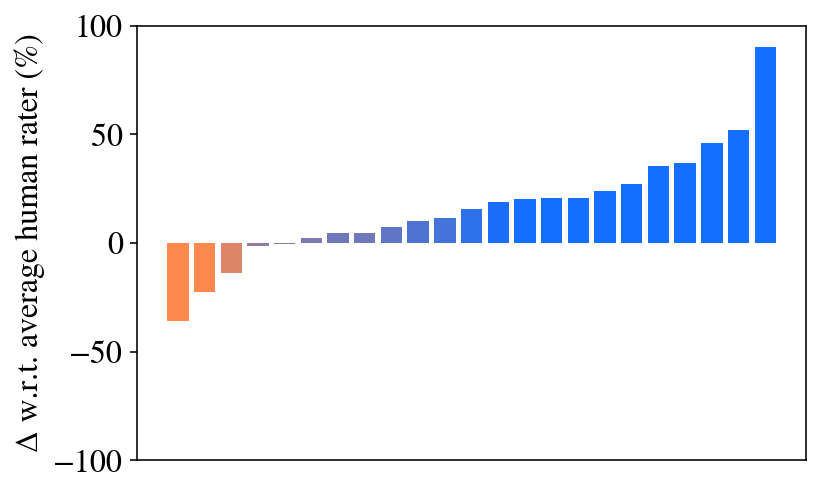
The image displays a vertical bar chart showing the percentage change (Δ) of various items relative to an average human rater. The chart contains 20 bars, ordered from the most negative value on the left to the most positive value on the right. The bars are color-coded: three bars on the left are orange (negative values), and the remaining 17 bars are blue (positive values), with the blue color becoming progressively darker as the values increase.
### Components/Axes
* **Y-Axis (Vertical):**
* **Label:** "Δ w.r.t. average human rater (%)"
* **Scale:** Linear scale ranging from -100 to 100.
* **Major Tick Marks:** At -100, -50, 0, 50, and 100.
* **X-Axis (Horizontal):**
* **Label:** None present. The axis contains 20 discrete, unlabeled positions for the bars.
* **Legend:** No explicit legend is present. Color is used to distinguish negative (orange) from positive (blue) values.
* **Data Series:** A single series of 20 bars representing individual items or categories. The specific identities of these items are not labeled in the chart.
### Detailed Analysis
The chart presents a sorted distribution of performance deltas. The values are approximate, derived from visual estimation against the y-axis scale.
* **Negative Values (Orange Bars, Left Side):**
* Bar 1 (far left): Approximately -40%.
* Bar 2: Approximately -25%.
* Bar 3: Approximately -15%.
* **Trend:** These three bars show a clear negative performance relative to the human average, with the magnitude of underperformance decreasing from left to right.
* **Transition Zone (Near Zero):**
* Bars 4 and 5 are very close to the 0% line, with values near 0% and +2% respectively. They appear as thin lines, indicating minimal deviation from the average.
* **Positive Values (Blue Bars, Right Side):**
* The positive bars show a consistent, monotonic increase in value from left to right.
* **Approximate Values (from left to right):** +5%, +8%, +10%, +15%, +18%, +20%, +20%, +25%, +30%, +35%, +45%, +50%, +90% (far right).
* **Trend:** The blue bars exhibit a clear upward slope, indicating progressively better performance relative to the human average. The final bar on the far right is a significant outlier, showing a performance nearly 90% above the average.
### Key Observations
1. **Bimodal Distribution:** The data is split into a small group of underperformers (orange) and a larger group of overperformers (blue).
2. **Monotonic Increase:** Within the positive group, performance improves steadily from one item to the next.
3. **Significant Outlier:** The rightmost bar shows a performance delta (+90%) that is dramatically higher than the second-highest bar (+50%), suggesting a standout item.
4. **Clustering Near Zero:** Two items perform almost exactly at the average human rater level.
5. **Missing Context:** The chart lacks a title, x-axis labels, and a legend explaining what the individual bars represent (e.g., different AI models, algorithms, or test conditions).
### Interpretation
This chart visualizes a comparative performance analysis. The metric "Δ w.r.t. average human rater (%)" suggests that each bar represents the percentage by which an item's score deviates from a baseline established by averaging human ratings.
* **What it demonstrates:** The data suggests that the majority of items (17 out of 20) outperform the average human rater, with one item showing exceptional superiority. Only a small subset (3 items) performs worse than the human average.
* **Relationship between elements:** The ordering from worst to best performance creates a clear visual narrative of progression. The color shift from orange to blue reinforces the transition from negative to positive performance.
* **Notable patterns/anomalies:** The most striking pattern is the steep, accelerating increase in performance among the top-performing items, culminating in the outlier. This could indicate a "winner-takes-all" scenario or a breakthrough method among the tested items. The absence of labels is a critical limitation, preventing identification of the specific entities being compared. The chart effectively communicates relative ranking and the magnitude of performance differences but requires external context to be fully actionable.