## Bar Chart: F1 and BLEU-1 Scores vs. k Values
### Overview
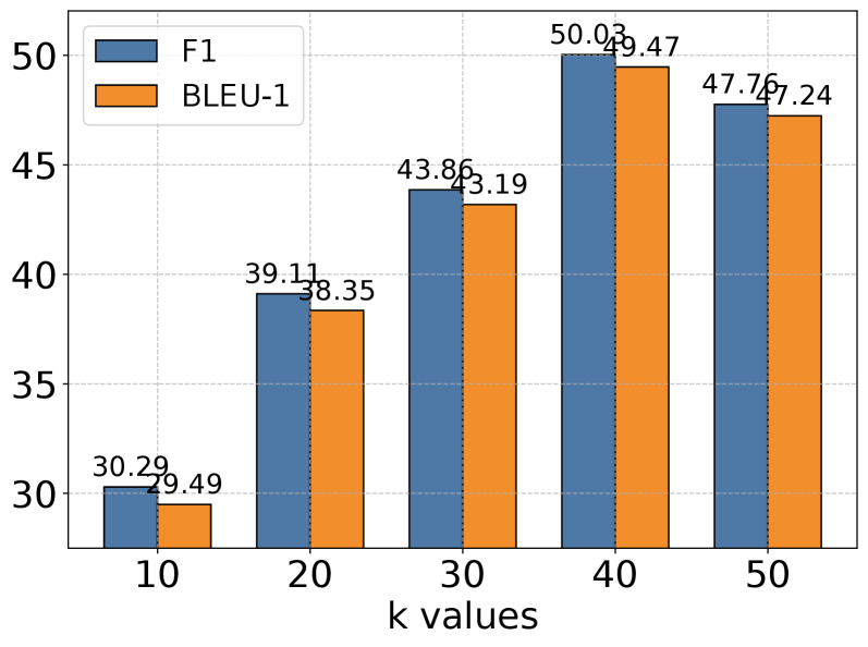
The image is a bar chart comparing F1 and BLEU-1 scores for different values of 'k'. The chart displays two sets of bars for each k value, one representing the F1 score (blue) and the other representing the BLEU-1 score (orange). The x-axis represents 'k values', and the y-axis represents the score.
### Components/Axes
* **X-axis:** 'k values' with markers at 10, 20, 30, 40, and 50.
* **Y-axis:** Numerical scale ranging from approximately 28 to 52, with no explicit label.
* **Legend:** Located in the top-left corner, indicating that the blue bars represent 'F1' and the orange bars represent 'BLEU-1'.
* **Gridlines:** Horizontal dashed gridlines are present.
### Detailed Analysis
The chart presents the following data points:
* **k = 10:**
* F1 (blue): 30.29
* BLEU-1 (orange): 29.49
* **k = 20:**
* F1 (blue): 39.11
* BLEU-1 (orange): 38.35
* **k = 30:**
* F1 (blue): 43.86
* BLEU-1 (orange): 43.19
* **k = 40:**
* F1 (blue): 50.03
* BLEU-1 (orange): 49.47
* **k = 50:**
* F1 (blue): 47.76
* BLEU-1 (orange): 47.24
**Trend Verification:**
* **F1 (blue):** Generally increases from k=10 to k=40, then decreases slightly at k=50.
* **BLEU-1 (orange):** Generally increases from k=10 to k=40, then decreases slightly at k=50.
### Key Observations
* Both F1 and BLEU-1 scores increase as 'k' increases from 10 to 40.
* Both scores peak at k=40 and then slightly decrease at k=50.
* The F1 score is consistently slightly higher than the BLEU-1 score for each 'k' value.
### Interpretation
The chart suggests that increasing the value of 'k' initially improves both F1 and BLEU-1 scores, indicating better performance up to a point. However, beyond k=40, the performance starts to decline slightly, suggesting that there might be an optimal value for 'k' around 40. The consistent difference between F1 and BLEU-1 scores might indicate inherent differences in what these metrics capture, or it could be a characteristic of the specific model or task being evaluated.