## Scatter Plot: A-mem vs. Base
### Overview
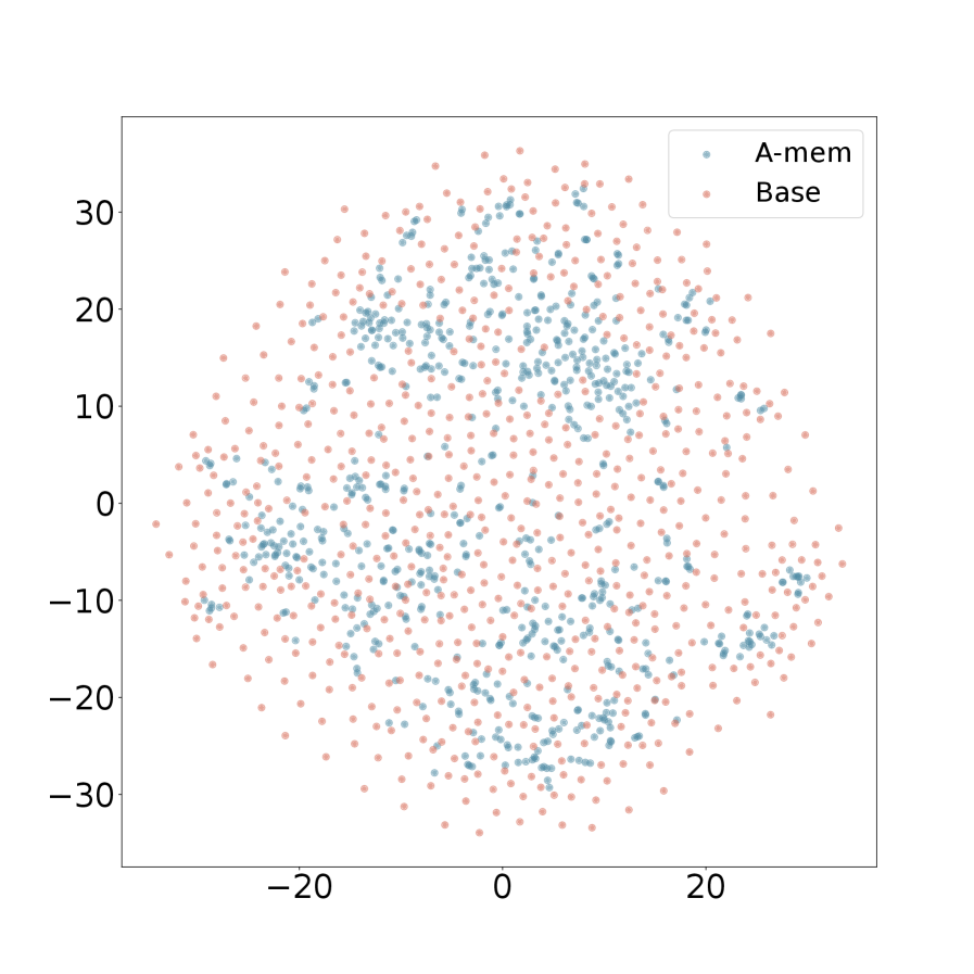
The image is a scatter plot displaying two data sets, labeled "A-mem" and "Base". The data points are distributed in a roughly circular pattern, centered around the origin (0,0). The plot shows the spatial distribution of these two datasets, with some overlap.
### Components/Axes
* **X-axis:** Ranges from approximately -25 to 25. No explicit label is provided.
* **Y-axis:** Ranges from approximately -35 to 35. No explicit label is provided.
* **Legend:** Located in the top-right corner.
* "A-mem": Represented by light blue data points.
* "Base": Represented by light red data points.
### Detailed Analysis
* **A-mem (Light Blue):** The light blue data points are scattered throughout the plot, with a slightly higher concentration in the upper half of the circular distribution.
* **Base (Light Red):** The light red data points are also scattered throughout the plot, appearing to fill in the spaces between the light blue points.
* **Distribution:** Both datasets appear to be distributed in a roughly circular shape, centered around the origin. There is significant overlap between the two datasets.
* **Specific Data Points:**
* The highest Y-value for A-mem is approximately 30.
* The lowest Y-value for A-mem is approximately -30.
* The highest X-value for A-mem is approximately 25.
* The lowest X-value for A-mem is approximately -25.
* The highest Y-value for Base is approximately 35.
* The lowest Y-value for Base is approximately -35.
* The highest X-value for Base is approximately 25.
* The lowest X-value for Base is approximately -25.
### Key Observations
* The two datasets, "A-mem" and "Base," are intermixed, suggesting a degree of similarity or correlation in their underlying characteristics.
* The circular distribution indicates that the data points are clustered around a central point, with no clear directional bias.
* The absence of axis labels makes it difficult to interpret the specific meaning of the X and Y axes.
### Interpretation
The scatter plot visualizes the relationship between two datasets, "A-mem" and "Base." The overlapping distribution suggests that the two datasets share some common characteristics or underlying factors. Without axis labels, it's impossible to determine the specific variables being compared. The plot could represent the results of a dimensionality reduction technique, such as t-SNE or PCA, where the original high-dimensional data has been projected onto two dimensions for visualization. The clustering around the origin might indicate that the data points are relatively similar to each other, with no strong outliers or distinct subgroups.