## Scatter Plots: Load Effect of Temperature vs. Work Index by Day of Week
### Overview
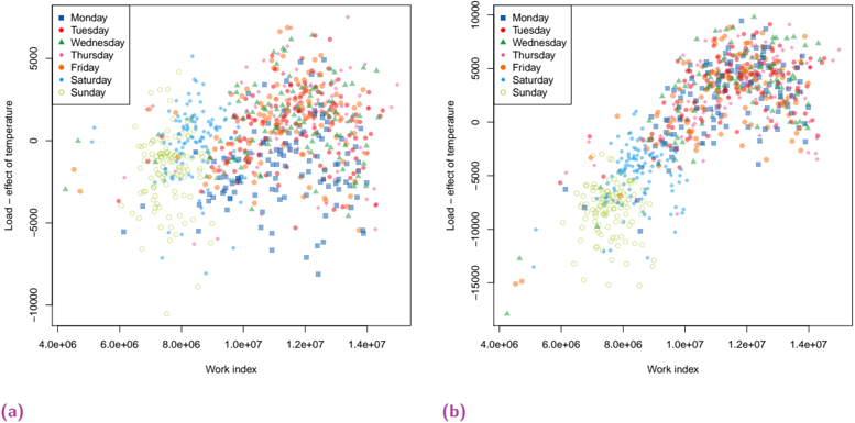
The image presents two scatter plots, labeled (a) and (b), visualizing the relationship between "Load – effect of temperature" (y-axis) and "Work index" (x-axis). Each plot differentiates data points by the day of the week, using different colors and markers. The plots appear to show a positive correlation between Work Index and Load effect of temperature, with variations based on the day of the week.
### Components/Axes
* **X-axis:** "Work index", ranging from approximately 4.0e+06 to 1.4e+07.
* **Y-axis:** "Load – effect of temperature", ranging from approximately -10000 to 5000.
* **Legend (Top-Right of both plots):**
* Monday (Blue circles)
* Tuesday (Orange circles)
* Wednesday (Green triangles)
* Thursday (Red circles)
* Friday (Purple circles)
* Saturday (Light-blue circles)
* Sunday (Yellow circles)
* **Labels:** (a) and (b) are placed below each respective plot.
### Detailed Analysis or Content Details
**Plot (a):**
* **Monday (Blue):** Data points are scattered, with a slight upward trend. Values range from approximately -5000 to 4000 in Load effect of temperature, and 4.5e+06 to 1.4e+07 in Work index.
* **Tuesday (Orange):** Data points are concentrated in the lower-middle region, with a moderate upward trend. Values range from approximately -5000 to 3000 in Load effect of temperature, and 4.5e+06 to 1.4e+07 in Work index.
* **Wednesday (Green):** Data points are clustered around the origin, with a slight upward trend. Values range from approximately -2000 to 2000 in Load effect of temperature, and 5.0e+06 to 1.2e+07 in Work index.
* **Thursday (Red):** Data points are scattered, with a clear upward trend. Values range from approximately -2000 to 5000 in Load effect of temperature, and 4.5e+06 to 1.4e+07 in Work index.
* **Friday (Purple):** Data points are scattered, with a moderate upward trend. Values range from approximately -5000 to 4000 in Load effect of temperature, and 4.5e+06 to 1.4e+07 in Work index.
* **Saturday (Light-blue):** Data points are scattered, with a slight upward trend. Values range from approximately -5000 to 3000 in Load effect of temperature, and 4.5e+06 to 1.4e+07 in Work index.
* **Sunday (Yellow):** Data points are scattered, with a moderate upward trend. Values range from approximately -5000 to 3000 in Load effect of temperature, and 4.5e+06 to 1.4e+07 in Work index.
**Plot (b):**
* **Monday (Blue):** Data points are scattered, with a slight upward trend. Values range from approximately -10000 to 5000 in Load effect of temperature, and 4.0e+06 to 1.4e+07 in Work index.
* **Tuesday (Orange):** Data points are concentrated in the lower-middle region, with a moderate upward trend. Values range from approximately -10000 to 4000 in Load effect of temperature, and 4.0e+06 to 1.4e+07 in Work index.
* **Wednesday (Green):** Data points are clustered around the origin, with a slight upward trend. Values range from approximately -5000 to 2000 in Load effect of temperature, and 4.5e+06 to 1.2e+07 in Work index.
* **Thursday (Red):** Data points are scattered, with a clear upward trend. Values range from approximately -5000 to 5000 in Load effect of temperature, and 4.0e+06 to 1.4e+07 in Work index.
* **Friday (Purple):** Data points are scattered, with a moderate upward trend. Values range from approximately -10000 to 4000 in Load effect of temperature, and 4.0e+06 to 1.4e+07 in Work index.
* **Saturday (Light-blue):** Data points are scattered, with a slight upward trend. Values range from approximately -10000 to 3000 in Load effect of temperature, and 4.0e+06 to 1.4e+07 in Work index.
* **Sunday (Yellow):** Data points are scattered, with a moderate upward trend. Values range from approximately -10000 to 3000 in Load effect of temperature, and 4.0e+06 to 1.4e+07 in Work index.
### Key Observations
* Both plots exhibit a general positive correlation between Work Index and Load effect of temperature. As Work Index increases, Load effect of temperature tends to increase.
* Wednesday consistently shows the lowest Load effect of temperature values for a given Work Index.
* Thursday consistently shows the highest Load effect of temperature values for a given Work Index.
* Plot (b) shows a generally lower range of Load effect of temperature values compared to Plot (a).
* The distributions of data points for each day of the week are relatively similar between the two plots, but the overall scale of the y-axis differs.
### Interpretation
These scatter plots likely represent energy consumption or load data, where "Work index" could be a measure of activity or demand, and "Load – effect of temperature" represents the additional load due to temperature variations. The differentiation by day of the week suggests that energy usage patterns vary significantly depending on the day.
The consistent pattern of Wednesday having the lowest load effect and Thursday having the highest suggests that these days have fundamentally different energy usage profiles. This could be due to variations in industrial activity, commercial operations, or residential behavior.
The difference in the y-axis scale between plots (a) and (b) indicates that the two plots may represent different datasets or time periods, or that a different calculation or scaling method was used for the Load effect of temperature. Plot (b) shows a more negative range of Load effect of temperature, suggesting a stronger cooling demand or a different baseline.
The positive correlation between Work Index and Load effect of temperature implies that increased activity or demand leads to higher energy consumption, and that temperature plays a significant role in modulating this consumption. Further investigation would be needed to understand the specific factors driving these patterns and to develop strategies for optimizing energy usage.