\n
## Scatter Plot & Heatmaps: City Visit Energy Analysis
### Overview
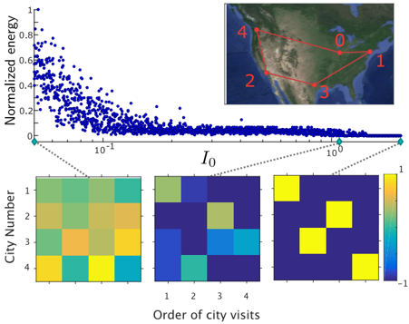
The image presents a scatter plot alongside a map illustrating city visits, and three heatmaps showing relationships between city visits. The scatter plot displays normalized energy against a variable labeled "I₀" on a logarithmic scale. The map shows a route connecting several cities, numbered 0 through 4. The heatmaps visualize the correlation between city number and order of city visits.
### Components/Axes
* **Scatter Plot:**
* X-axis: "I₀" (Logarithmic scale, ranging approximately from 10⁻¹ to 10²).
* Y-axis: "Normalized energy" (ranging from 0 to approximately 0.9).
* **Map:**
* Cities are labeled 0, 1, 2, 3, and 4.
* Red lines connect the cities in a specific order.
* **Heatmaps:**
* X-axis: "Order of city visits" (1, 2, 3, 4).
* Y-axis: "City Number" (1, 2, 3, 4).
* Color scale: Ranges from -1 (dark blue) to 1 (yellow).
* **Legend (Heatmaps):** Located on the right side of the heatmaps, indicating the color scale corresponds to values from -1 to 1.
### Detailed Analysis or Content Details
**Scatter Plot:**
The scatter plot shows a strong negative correlation. The data points are densely clustered on the left side (low I₀ values, high normalized energy) and become increasingly sparse as I₀ increases. The trend is a downward slope, indicating that as I₀ increases, normalized energy decreases.
* At I₀ ≈ 10⁻¹, normalized energy is approximately 0.7-0.8.
* At I₀ ≈ 1, normalized energy is approximately 0.2-0.3.
* At I₀ ≈ 10², normalized energy is approximately 0.01-0.05.
**Map:**
The map shows a route starting at city 0, then to 1, 3, 2, and finally back to 0. The cities appear to be located in the United States.
* City 0: Appears to be in the Northeast US.
* City 1: Appears to be in the Midwest US.
* City 2: Appears to be in the Southwest US.
* City 3: Appears to be in the South-Central US.
* City 4: Appears to be in the Pacific Northwest US.
**Heatmaps:**
The heatmaps show the correlation between city number and order of city visits. Each heatmap represents a different perspective or parameter set.
* **Heatmap 1 (Left):** Shows a mix of positive and negative correlations. City 1 and 2 have a moderate positive correlation with order 1 and 2. City 3 and 4 have a moderate negative correlation with order 3 and 4.
* **Heatmap 2 (Center):** Shows a more pronounced pattern. City 1 has a positive correlation with order 1. City 2 has a positive correlation with order 2. City 3 has a positive correlation with order 3. City 4 has a positive correlation with order 4.
* **Heatmap 3 (Right):** Shows a very strong positive correlation. City 1 has a strong positive correlation with order 1. City 2 has a strong positive correlation with order 2. City 3 has a strong positive correlation with order 3. City 4 has a strong positive correlation with order 4.
### Key Observations
* The scatter plot demonstrates a clear inverse relationship between I₀ and normalized energy.
* The map illustrates a specific sequence of city visits.
* The heatmaps reveal correlations between city number and the order in which they are visited, with the correlation strength increasing from left to right.
* The heatmaps suggest a strong preference for visiting cities in a specific order.
### Interpretation
The data suggests an analysis of energy expenditure or some other quantifiable metric related to a sequence of city visits. The scatter plot likely represents the energy required to travel between cities as a function of some parameter I₀, which could be distance, time, or a combination of factors. The negative correlation indicates that as I₀ increases, the energy required decreases, potentially due to optimization or efficiency gains.
The map provides the context for the data, showing the specific route taken. The heatmaps then quantify the relationships between the cities and the order in which they are visited. The increasing correlation strength across the heatmaps suggests that the model or algorithm used to analyze the data is converging on a preferred sequence of city visits.
The strong positive correlation in the rightmost heatmap indicates a high degree of predictability or preference for visiting cities in a specific order. This could be due to factors such as travel costs, time constraints, or the inherent structure of the network of cities. The data could be used to optimize travel routes, predict future city visits, or understand the underlying patterns of human movement.