## Sankey Diagram: Tool Correctness to Question Success Analysis
### Overview
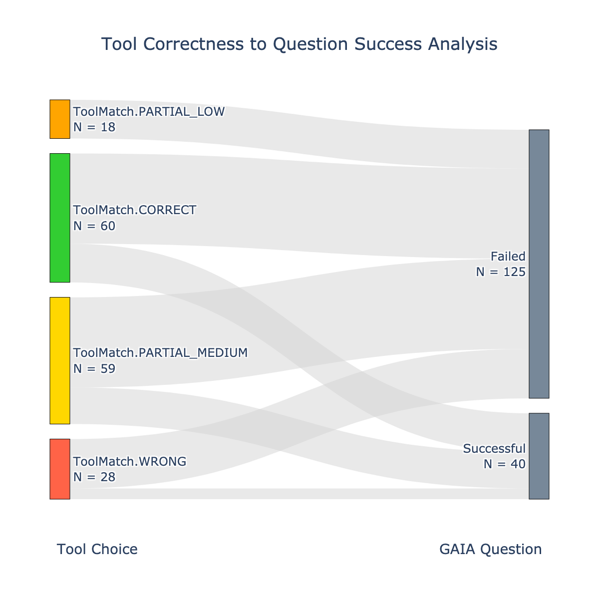
This is a Sankey diagram visualizing the relationship between the correctness of tool usage ("Tool Choice") and the success of answering questions ("GAIA Question"). It shows how instances from four distinct tool correctness categories flow into two final outcome categories (Failed or Successful). The width of the connecting bands is proportional to the flow quantity.
### Components/Axes
* **Title:** "Tool Correctness to Question Success Analysis" (centered at the top).
* **Left Axis (Source):** Labeled "Tool Choice" at the bottom-left. It contains four vertically stacked, color-coded categories:
1. **ToolMatch.PARTIAL_LOW** (Orange bar, top-left). Count: `N = 18`.
2. **ToolMatch.CORRECT** (Green bar, second from top). Count: `N = 60`.
3. **ToolMatch.PARTIAL_MEDIUM** (Yellow bar, third from top). Count: `N = 59`.
4. **ToolMatch.WRONG** (Red bar, bottom-left). Count: `N = 28`.
* **Right Axis (Target):** Labeled "GAIA Question" at the bottom-right. It contains two vertically stacked, gray-blue outcome categories:
1. **Failed** (Taller bar, top-right). Count: `N = 125`.
2. **Successful** (Shorter bar, bottom-right). Count: `N = 40`.
* **Flow Bands:** Light gray, semi-transparent bands connect the left categories to the right categories. The width of each band represents the number of instances flowing from a specific tool correctness category to a specific outcome.
### Detailed Analysis
The diagram maps the following flows from left to right:
1. **From ToolMatch.PARTIAL_LOW (N=18):**
* A very thin band flows to **Failed**.
* An extremely thin, almost negligible band flows to **Successful**. This is the smallest flow in the diagram.
2. **From ToolMatch.CORRECT (N=60):**
* A very wide band flows to **Failed**. This is the single widest flow band in the entire diagram.
* A moderately wide band flows to **Successful**.
3. **From ToolMatch.PARTIAL_MEDIUM (N=59):**
* A wide band flows to **Failed**.
* A moderately wide band flows to **Successful**.
4. **From ToolMatch.WRONG (N=28):**
* A moderately wide band flows to **Failed**.
* A very thin band flows to **Successful**.
**Spatial Grounding & Trend Verification:**
* The **Failed** outcome (top-right) receives the majority of flow from all four source categories, with the thickest incoming band originating from the green `ToolMatch.CORRECT` bar.
* The **Successful** outcome (bottom-right) receives a smaller portion of the flow. Its thickest incoming bands come from the green (`CORRECT`) and yellow (`PARTIAL_MEDIUM`) bars.
* The visual trend shows that while `ToolMatch.CORRECT` has the highest total count (60), a larger proportion of its instances flow to "Failed" than to "Successful". Conversely, `ToolMatch.WRONG` has a lower total count (28), but a very small proportion flows to "Successful".
### Key Observations
1. **Dominant Flow to Failure:** The "Failed" outcome (N=125) is significantly larger than the "Successful" outcome (N=40), indicating a high overall failure rate in the analyzed dataset.
2. **Paradox of Correctness:** The `ToolMatch.CORRECT` category, despite its name, contributes the largest single volume of instances to the "Failed" outcome. This is the most striking visual and numerical pattern.
3. **Partial Success Correlation:** The `ToolMatch.PARTIAL_MEDIUM` category shows a more balanced flow between "Failed" and "Successful" compared to the other categories.
4. **Low Impact of Wrong Tools:** The `ToolMatch.WRONG` category contributes a relatively small number of instances to both outcomes, with a very minor contribution to "Successful".
5. **Minimal Contribution from Low Partial Match:** The `ToolMatch.PARTIAL_LOW` category has the smallest overall count and contributes minimally to either outcome.
### Interpretation
This Sankey diagram reveals a complex and potentially counterintuitive relationship between tool usage correctness and final task success. The data suggests that simply using a tool "correctly" (`ToolMatch.CORRECT`) is not a strong predictor of successfully answering a GAIA question; in fact, it is associated with the highest number of failures. This could imply several investigative possibilities:
* The "GAIA Question" set may be inherently difficult, where even correct tool application is insufficient for success.
* The definition of "correct" tool match might be misaligned with the requirements for solving the question.
* There may be other critical factors beyond tool correctness (e.g., reasoning, data interpretation, question complexity) that determine the final outcome.
The diagram effectively isolates "tool correctness" as one variable in a larger system. The high volume of failures stemming from correct tool use is a significant anomaly that warrants deeper investigation into the nature of the questions, the tools' capabilities, or the evaluation criteria for "success." The flow from `PARTIAL_MEDIUM` to "Successful" suggests that a medium level of tool appropriateness might sometimes be sufficient or that other compensating factors are at play in those instances.