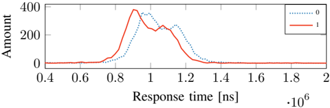
## Chart: Response Time Distribution by Category
### Overview
The image is a line chart comparing the distribution of response times for two categories, labeled "0" and "1". The x-axis represents response time in nanoseconds (ns), scaled by 10^6, and the y-axis represents the amount or frequency of each response time.
### Components/Axes
* **X-axis:** Response time [ns] * 10^6. Scale ranges from 0.4 to 2.0, with increments of 0.2.
* **Y-axis:** Amount. Scale ranges from 0 to 400, with increments of 200.
* **Legend (Top-Right):**
* Dotted Blue Line: "0"
* Solid Red Line: "1"
### Detailed Analysis
* **Category "0" (Dotted Blue Line):**
* The line starts near 0 at x=0.4.
* It rises to a peak around x=0.9, with a value of approximately 300.
* It then decreases, reaching approximately 250 at x=1.0.
* The line continues to decrease, reaching approximately 150 at x=1.2.
* The line approaches 0 after x=1.4.
* **Category "1" (Solid Red Line):**
* The line starts near 0 at x=0.4.
* It rises to a peak around x=0.95, with a value of approximately 380.
* It then decreases, reaching approximately 240 at x=1.1.
* The line continues to decrease, reaching approximately 20 at x=1.4.
* The line approaches 0 after x=1.6.
### Key Observations
* Both categories exhibit a unimodal distribution, with a single peak.
* Category "1" has a higher peak amount (approximately 380) compared to category "0" (approximately 300).
* Category "1" peaks slightly later (around 0.95) than category "0" (around 0.9).
* Both categories have a similar spread, with response times concentrated between 0.6 and 1.4.
### Interpretation
The chart compares the distribution of response times for two distinct categories, "0" and "1". The data suggests that category "1" generally has a higher frequency of responses around its peak compared to category "0". While both categories have similar response time ranges, the slight shift in peak and the higher peak amount for category "1" indicate a difference in the underlying processes or conditions that generate these response times. The data could be used to understand performance differences or identify potential bottlenecks in a system where these categories represent different states or operations.