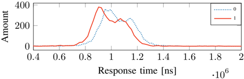
## Line Graph: Response Time vs. Amount
### Overview
The image depicts a line graph comparing two data series labeled "0" (blue dotted line) and "1" (red solid line) across response times ranging from 0.4 × 10⁶ ns to 2.0 × 10⁶ ns. The y-axis represents "Amount" (0–400), while the x-axis represents "Response time" in nanoseconds (ns). Both lines exhibit a single prominent peak followed by a decline, with the red line consistently outperforming the blue line in magnitude and timing.
### Components/Axes
- **X-axis (Response time [ns])**: Labeled with values 0.4, 0.6, 0.8, 1.0, 1.2, 1.4, 1.6, 1.8, 2.0, scaled by 10⁶ ns (i.e., 0.4 × 10⁶ ns to 2.0 × 10⁶ ns).
- **Y-axis (Amount)**: Linear scale from 0 to 400.
- **Legend**: Located in the top-right corner, with:
- Blue dotted line labeled "0"
- Red solid line labeled "1"
- **Gridlines**: Vertical and horizontal gridlines at axis markers for reference.
### Detailed Analysis
1. **Red Line (Label "1")**:
- **Trend**: Rises sharply from ~0.8 × 10⁶ ns, peaking at **~1.0 × 10⁶ ns** with an **Amount of ~350**.
- **Decline**: Drops steadily after the peak, reaching ~0 by 1.4 × 10⁶ ns.
- **Key Data Points**:
- At 0.8 × 10⁶ ns: ~50
- At 1.0 × 10⁶ ns: ~350 (peak)
- At 1.2 × 10⁶ ns: ~250
- At 1.4 × 10⁶ ns: ~0
2. **Blue Line (Label "0")**:
- **Trend**: Begins rising earlier (~0.6 × 10⁶ ns), peaking at **~1.1 × 10⁶ ns** with an **Amount of ~300**.
- **Decline**: Drops more gradually than the red line, reaching ~0 by 1.6 × 10⁶ ns.
- **Key Data Points**:
- At 0.8 × 10⁶ ns: ~100
- At 1.0 × 10⁶ ns: ~200
- At 1.1 × 10⁶ ns: ~300 (peak)
- At 1.3 × 10⁶ ns: ~150
- At 1.5 × 10⁶ ns: ~0
### Key Observations
- The red line ("1") peaks **0.1 × 10⁶ ns earlier** than the blue line ("0") but achieves a **16.7% higher peak value** (~350 vs. ~300).
- Both lines exhibit a **single dominant peak** followed by a rapid decline, suggesting a transient event or process.
- The blue line ("0") has a **broader response window** (peaking later and declining more slowly) compared to the red line.
### Interpretation
The graph likely represents a comparison of two systems, processes, or conditions (labeled "0" and "1") in terms of their response time and associated "Amount" (e.g., energy, resource usage, or output). The red line ("1") demonstrates a **faster and more efficient response**, achieving a higher peak with less delay. The blue line ("0") shows a **delayed but sustained response**, which might indicate a trade-off between speed and duration. The divergence in peak timing and magnitude suggests differing operational characteristics, such as optimization for speed vs. stability. The absence of data beyond 1.6 × 10⁶ ns implies the system(s) stabilize or terminate after the observed peaks.