\n
## 3D Surface Plot: Ternary Diagram
### Overview
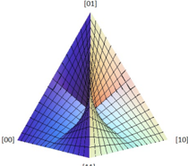
The image depicts a 3D surface plot representing a ternary diagram. The diagram is a triangular pyramid with vertices labeled [00], [01], and [10]. The surface within the pyramid is colored to represent varying values, with a clear division between a blue/purple region and a yellow/orange/pink region. A grid is overlaid on the surface.
### Components/Axes
* **Axes:** The diagram represents a ternary plot, meaning the axes represent proportions of three components that sum to 1. The axes are labeled as follows:
* [00] - Bottom-left corner
* [01] - Top corner
* [10] - Bottom-right corner
* The third axis, implicitly defined, would complete the equilateral triangle base.
* **Surface:** The surface represents a function of the three components. The color of the surface indicates the value of the function at that point.
* **Grid:** A regular grid is overlaid on the surface, aiding in visualizing the shape and values.
### Detailed Analysis
The surface is divided into two distinct regions:
* **Left Region (Blue/Purple):** This region, extending from [00] towards [01], exhibits a generally concave shape. The color transitions from deep blue near [00] to a lighter purple as it approaches the dividing line. The surface appears relatively flat near [01].
* **Right Region (Yellow/Orange/Pink):** This region, extending from [00] towards [10], shows a more complex curvature. The color transitions from yellow near [00] to orange and then pink as it approaches [10]. The surface appears to rise more steeply than the left region.
* **Dividing Line:** A sharp boundary separates the two regions, running approximately from [01] to [10]. This line suggests a discontinuity or a significant change in the function being represented.
Due to the nature of the plot, precise numerical values cannot be extracted without knowing the function being plotted. However, we can describe the relative values based on color:
* The lowest values are likely represented by the deep blue color near [00] in the left region.
* The highest values are likely represented by the pink color near [10] in the right region.
* The dividing line represents a point of inflection or a significant change in value.
### Key Observations
* The diagram demonstrates a clear asymmetry between the two regions. The right region exhibits more curvature and a wider range of colors, suggesting a more complex relationship between the components.
* The sharp dividing line indicates a potential threshold or a significant change in the underlying process.
* The grid provides a visual reference for the relative values of the surface.
### Interpretation
This ternary diagram likely represents a compositional system where the proportions of three components determine a certain property or outcome. The color-coded surface illustrates how this property changes as the composition varies. The sharp dividing line suggests a critical composition where the property undergoes a significant shift.
The asymmetry between the two regions indicates that the system is more sensitive to changes in composition on the right side of the diagram (towards [10]). This could be due to a non-linear relationship between the components and the property being measured.
Without knowing the specific context of the diagram, it is difficult to provide a more detailed interpretation. However, the diagram suggests a complex interplay between the three components and a potential threshold effect. This type of diagram is commonly used in fields such as materials science, chemistry, and ecology to represent compositional data and understand the relationships between different variables.