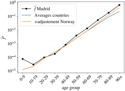
## Line Graph: Age Group vs. f̂ Values
### Overview
The image is a line graph comparing three data series across age groups (0-9 to 90+) on a logarithmic y-axis (10⁻⁵ to 10⁰). The lines represent:
- **Black**: `f̂Madrid` (Madrid-specific values)
- **Blue**: `Averages countries` (global averages)
- **Orange**: `+adjustment Norway` (adjusted values for Norway)
### Components/Axes
- **X-axis**: Age groups (0-9, 10-19, ..., 90+), labeled sequentially.
- **Y-axis**: Logarithmic scale (`f̂`) from 10⁻⁵ to 10⁰.
- **Legend**: Positioned in the top-left corner, with color-coded labels for each series.
### Detailed Analysis
1. **`f̂Madrid` (Black Line)**:
- Starts at ~10⁻⁴ for 0-9.
- Drops sharply to ~10⁻⁵ at 10-19.
- Rises steadily to ~10⁻¹ at 90+.
- Notable dip at 10-19, then consistent upward trend.
2. **`Averages countries` (Blue Line)**:
- Begins at ~10⁻⁵ for 0-9.
- Gradually increases to ~10⁻¹ at 90+.
- Smooth, linear ascent with no dips.
3. **`+adjustment Norway` (Orange Line)**:
- Starts below `f̂Madrid` at ~10⁻⁵ for 0-9.
- Crosses `f̂Madrid` near 60-69 (~10⁻²).
- Overtakes `f̂Madrid` by 80-89 (~10⁻¹) and reaches ~10⁰ at 90+.
### Key Observations
- **Madrid's Dip**: The black line shows an anomalous drop at 10-19, contrasting with its overall upward trend.
- **Norway's Adjustment**: The orange line surpasses both Madrid and global averages in older age groups (60+), suggesting significant adjustments in later life stages.
- **Logarithmic Scale**: Emphasizes exponential growth in older age groups, particularly for Norway's adjusted values.
### Interpretation
The data suggests that `f̂` (possibly a frequency, risk, or adjusted metric) increases with age across all regions. Madrid's sharp dip at 10-19 may reflect localized factors (e.g., policy changes, demographic shifts). Norway's adjusted values indicate targeted interventions or demographic adjustments that amplify outcomes in older populations. The global average (`Averages countries`) serves as a baseline, showing consistent but slower growth compared to adjusted Norway. The logarithmic scale highlights disproportionate increases in older age groups, particularly for Norway, which may imply policy effectiveness or demographic aging trends.