\n
## Chart: Median TTS vs Problem Size
### Overview
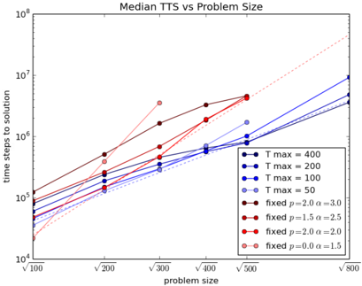
The image presents a line chart illustrating the relationship between median Time To Solution (TTS) and Problem Size. The chart displays multiple lines, each representing a different parameter setting. The x-axis represents Problem Size, and the y-axis represents Time Steps to Solution, both on a logarithmic scale.
### Components/Axes
* **Title:** "Median TTS vs Problem Size" (centered at the top)
* **X-axis:** "problem size" (bottom-center). Scale is logarithmic, with markers at √100, √200, √300, √400, √500, and √800.
* **Y-axis:** "time steps to solution" (left-center). Scale is logarithmic, ranging from 10<sup>4</sup> to 10<sup>8</sup>.
* **Legend:** Located in the top-right corner. Contains the following labels and corresponding colors:
* T max = 400 (Black)
* T max = 200 (Dark Blue)
* T max = 100 (Light Blue)
* T max = 50 (Purple)
* fixed p = 2.0 α = 3.0 (Dark Red)
* fixed p = 1.5 α = 2.5 (Medium Red)
* fixed p = 2.0 α = 2.0 (Light Red)
* fixed p = 0.0 α = 1.5 (Red with circles)
### Detailed Analysis
The chart displays several lines representing different parameter settings. The lines generally trend upwards, indicating that as problem size increases, the time steps to solution also increase.
* **T max = 400 (Black):** The line starts at approximately 2 x 10<sup>5</sup> at √100 and increases to approximately 2 x 10<sup>6</sup> at √800. It shows a roughly linear increase.
* **T max = 200 (Dark Blue):** The line starts at approximately 1 x 10<sup>5</sup> at √100 and increases to approximately 1 x 10<sup>6</sup> at √800. It shows a roughly linear increase.
* **T max = 100 (Light Blue):** The line starts at approximately 5 x 10<sup>4</sup> at √100 and increases to approximately 5 x 10<sup>5</sup> at √800. It shows a roughly linear increase.
* **T max = 50 (Purple):** The line starts at approximately 2 x 10<sup>4</sup> at √100 and increases to approximately 2 x 10<sup>5</sup> at √800. It shows a roughly linear increase.
* **fixed p = 2.0 α = 3.0 (Dark Red):** The line starts at approximately 1 x 10<sup>5</sup> at √100 and increases to approximately 1 x 10<sup>7</sup> at √800. It shows a steeper, non-linear increase.
* **fixed p = 1.5 α = 2.5 (Medium Red):** The line starts at approximately 3 x 10<sup>4</sup> at √100 and increases to approximately 3 x 10<sup>6</sup> at √800. It shows a roughly linear increase.
* **fixed p = 2.0 α = 2.0 (Light Red):** The line starts at approximately 2 x 10<sup>4</sup> at √100 and increases to approximately 2 x 10<sup>5</sup> at √800. It shows a roughly linear increase.
* **fixed p = 0.0 α = 1.5 (Red with circles):** The line starts at approximately 1 x 10<sup>4</sup> at √100 and increases to approximately 7 x 10<sup>6</sup> at √800. It shows a steeper, non-linear increase.
### Key Observations
* The lines representing "fixed p = 2.0 α = 3.0" and "fixed p = 0.0 α = 1.5" exhibit the steepest increases in TTS with increasing problem size.
* The lines representing different "T max" values are relatively close together and show a more gradual increase.
* The logarithmic scale compresses the differences at higher values, making it difficult to discern precise differences between the lines at the upper end of the problem size range.
### Interpretation
The chart demonstrates that the time steps to solution are significantly affected by the parameter settings, particularly the "p" and "α" values. The steeper slopes for the "fixed p" lines suggest that these parameter combinations lead to a more rapid increase in computational effort as the problem size grows. The "T max" parameter appears to have a less dramatic effect, with lines representing different "T max" values remaining relatively close together.
The logarithmic scales on both axes suggest that the relationship between problem size and TTS is likely exponential or polynomial. The chart could be used to inform the selection of appropriate parameter settings for a given problem size, balancing computational cost with solution accuracy. The outliers, namely the lines with the steepest slopes, indicate parameter combinations that may be less suitable for large problem sizes due to their high computational demands. The chart suggests that the algorithm's performance is highly sensitive to the choice of parameters, and careful tuning is necessary to achieve optimal results.