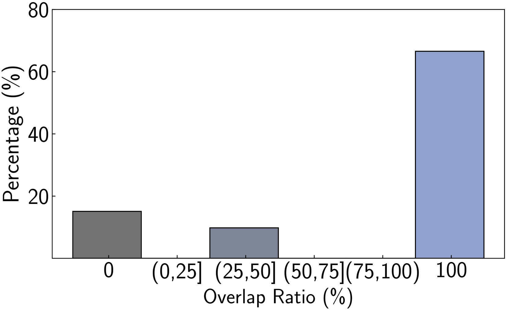
## Bar Chart: Percentage Distribution by Overlap Ratio
### Overview
This bar chart displays the percentage distribution across different ranges of "Overlap Ratio (%)". The chart features distinct bars, each representing a specific overlap ratio category, and their corresponding heights indicate the percentage.
### Components/Axes
* **Y-axis Title**: "Percentage (%)"
* **Scale**: Ranges from 0 to 80, with major tick marks at 20, 40, 60, and 80.
* **X-axis Title**: "Overlap Ratio (%)"
* **Categories**:
* `0` (represented by a dark gray bar)
* `(0,25]` (represented by a medium-dark gray bar)
* `(25,50]` (represented by a medium-dark gray bar)
* `(50,75]` (represented by no visible bar)
* `(75,100]` (represented by a light blue bar)
### Detailed Analysis or Content Details
The chart presents the following data points:
1. **Overlap Ratio `0`**:
* **Color**: Dark gray.
* **Value**: The bar reaches approximately **17%**.
2. **Overlap Ratio `(0,25]`**:
* **Color**: Medium-dark gray.
* **Value**: The bar reaches approximately **12%**.
3. **Overlap Ratio `(25,50]`**:
* **Color**: Medium-dark gray.
* **Value**: The bar reaches approximately **10%**.
4. **Overlap Ratio `(50,75]`**:
* **Color**: Not explicitly represented by a bar. This category appears to have a value of 0% or is not present in the data.
5. **Overlap Ratio `(75,100]`**:
* **Color**: Light blue.
* **Value**: The bar reaches approximately **65%**.
### Key Observations
* The highest percentage is observed for the overlap ratio range of `(75,100]`, which is approximately 65%.
* The overlap ratio of `0` has the second-highest percentage, around 17%.
* The overlap ratios `(0,25]` and `(25,50]` have significantly lower percentages, approximately 12% and 10% respectively.
* There is no visible bar for the `(50,75]` category, suggesting a percentage of 0% or that this category was not sampled.
* The distribution is heavily skewed towards higher overlap ratios, particularly the `(75,100]` range.
### Interpretation
This bar chart demonstrates a strong correlation between higher overlap ratios and a greater percentage of occurrences. The data suggests that scenarios with an overlap ratio between 75% and 100% are the most prevalent, accounting for the largest proportion of the measured data. Conversely, lower overlap ratios, especially those between 25% and 50%, are less common. The presence of a bar for `0` overlap ratio indicates that complete absence of overlap is also a notable category, though less frequent than the highest overlap range. The absence of data for the `(50,75]` range might imply that this specific intermediate overlap range is either rare or was not considered in the analysis. Overall, the chart indicates a trend where increased overlap is associated with higher frequency.