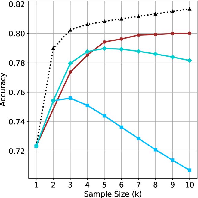
## Line Chart: Accuracy vs. Sample Size
### Overview
The image is a line chart comparing the accuracy of different models as a function of sample size (k). There are three data series represented by different colored lines with distinct markers. The x-axis represents the sample size, ranging from 1 to 10, and the y-axis represents accuracy, ranging from 0.72 to 0.82.
### Components/Axes
* **X-axis:** Sample Size (k), with values ranging from 1 to 10.
* **Y-axis:** Accuracy, with values ranging from 0.72 to 0.82, in increments of 0.02.
* **Data Series:**
* Black dotted line with triangle markers.
* Brown line with circle markers.
* Light blue line with square markers.
* Turquoise line with diamond markers.
### Detailed Analysis
* **Black dotted line with triangle markers:** This line shows a steep initial increase in accuracy, followed by a gradual increase.
* k=1: Accuracy ≈ 0.72
* k=2: Accuracy ≈ 0.79
* k=3: Accuracy ≈ 0.80
* k=5: Accuracy ≈ 0.807
* k=8: Accuracy ≈ 0.813
* k=10: Accuracy ≈ 0.818
* **Brown line with circle markers:** This line shows a steady increase in accuracy, plateauing after k=6.
* k=1: Accuracy ≈ 0.72
* k=3: Accuracy ≈ 0.775
* k=5: Accuracy ≈ 0.794
* k=8: Accuracy ≈ 0.799
* k=10: Accuracy ≈ 0.80
* **Light blue line with square markers:** This line shows an initial increase in accuracy, followed by a steady decrease.
* k=1: Accuracy ≈ 0.72
* k=3: Accuracy ≈ 0.756
* k=5: Accuracy ≈ 0.74
* k=8: Accuracy ≈ 0.72
* k=10: Accuracy ≈ 0.707
* **Turquoise line with diamond markers:** This line shows an initial increase in accuracy, plateauing after k=5, and then a slight decrease.
* k=1: Accuracy ≈ 0.723
* k=3: Accuracy ≈ 0.78
* k=5: Accuracy ≈ 0.79
* k=8: Accuracy ≈ 0.787
* k=10: Accuracy ≈ 0.782
### Key Observations
* The black dotted line consistently shows the highest accuracy across all sample sizes.
* The light blue line shows a decrease in accuracy after a certain sample size, suggesting overfitting or other issues.
* The brown line plateaus after k=6, indicating diminishing returns with larger sample sizes.
* The turquoise line plateaus after k=5, indicating diminishing returns with larger sample sizes.
### Interpretation
The chart compares the performance of different models (represented by the different colored lines) as the sample size increases. The black dotted line represents the best-performing model, as it consistently achieves the highest accuracy. The light blue line's decreasing accuracy suggests that this model may be overfitting the data as the sample size increases. The brown and turquoise lines show that increasing the sample size beyond a certain point (k=5 or k=6) does not significantly improve accuracy. This information is valuable for selecting the best model and determining the optimal sample size for a given task.