## Line Chart: Accuracy vs. Sample Size (k)
### Overview
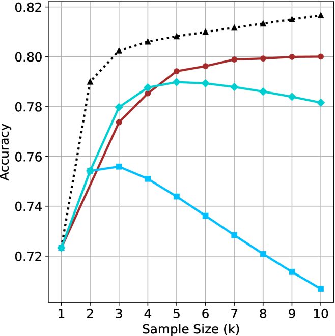
The image displays a line chart illustrating the relationship between "Accuracy" (y-axis) and "Sample Size (k)" (x-axis). The chart contains four distinct data series, each represented by a different color and marker style. There is no legend provided in the image to identify the specific models or methods associated with each line. All four lines originate from a single point at the start of the x-axis.
### Components/Axes
* **Y-Axis:** Labeled "Accuracy". The scale ranges from 0.72 to 0.82, with major grid lines at intervals of 0.02.
* **X-Axis:** Labeled "Sample Size (k)". The scale ranges from 1 to 10, with integer markers for each unit.
* **Grid:** A light gray grid is overlaid on the plot area, corresponding to the axis markers.
* **Data Series (Legend missing, identified by visual characteristics):**
* **Black Dotted Line:** Marked with triangles.
* **Dark Red Solid Line:** Marked with circles.
* **Teal (Green-Blue) Solid Line:** Marked with diamonds.
* **Light Blue Solid Line:** Marked with squares.
### Detailed Analysis
All four data series begin at the coordinate (1, ~0.723).
**1. Black Dotted Line (Triangles)**
* **Trend:** This line shows the highest performance across the entire range (for k > 1). It exhibits a sharp, steep increase between k=1 and k=2, followed by a consistent, slightly decelerating upward trend through k=10.
* **Approximate Values:**
* k=1: 0.723
* k=2: 0.790
* k=3: 0.802
* k=5: 0.808
* k=10: 0.817
**2. Dark Red Solid Line (Circles)**
* **Trend:** This line shows a strong upward trend, particularly between k=1 and k=5. After k=5, the rate of improvement slows significantly, appearing to plateau or approach an asymptote near 0.80.
* **Approximate Values:**
* k=1: 0.723
* k=2: 0.755
* k=3: 0.774
* k=5: 0.794
* k=10: 0.800
**3. Teal Solid Line (Diamonds)**
* **Trend:** This line increases steadily until it reaches a peak at k=5. Following k=5, the accuracy begins a slow, consistent decline through k=10.
* **Approximate Values:**
* k=1: 0.723
* k=2: 0.755
* k=3: 0.780
* k=5: 0.790
* k=10: 0.782
**4. Light Blue Solid Line (Squares)**
* **Trend:** This line shows the poorest performance for k > 3. It rises slightly to k=2/3, then enters a consistent, linear decline for the remainder of the range.
* **Approximate Values:**
* k=1: 0.723
* k=2: 0.755
* k=3: 0.756
* k=5: 0.744
* k=10: 0.708
### Key Observations
* **Divergence:** The models perform identically at k=1, but diverge significantly as the sample size increases.
* **Performance Hierarchy:** At k=10, the performance hierarchy is clearly defined: Black Dotted (highest) > Dark Red > Teal > Light Blue (lowest).
* **Optimal Points:** The Teal line reaches its peak at k=5, while the Light Blue line peaks earlier at k=3. The Black and Dark Red lines do not show a clear peak within the provided range, suggesting they may continue to improve or stabilize at higher values.
### Interpretation
This chart likely represents a comparison of different machine learning models or hyperparameter configurations (where 'k' could represent the number of neighbors in k-NN, or a similar parameter related to sample size or complexity).
* **The Black Dotted Line** represents the most robust model, as it consistently improves with larger sample sizes without showing signs of overfitting or performance degradation.
* **The Teal and Light Blue lines** demonstrate a classic "overfitting" or "noise sensitivity" pattern. As the sample size (k) increases beyond a certain threshold (k=5 for Teal, k=3 for Light Blue), the model's accuracy drops. This suggests that for these specific configurations, increasing the sample size introduces noise or irrelevant data that degrades the model's predictive capability.
* **The Dark Red line** appears to be a stable model that benefits from larger sample sizes but experiences diminishing returns, eventually plateauing.