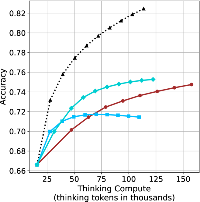
## Line Chart: Accuracy vs. Thinking Compute
### Overview
The image is a line chart comparing accuracy against "Thinking Compute" (measured in thousands of thinking tokens). There are four data series represented by different colored lines with distinct markers. The chart shows how accuracy changes as the thinking compute increases.
### Components/Axes
* **X-axis:** "Thinking Compute (thinking tokens in thousands)". The scale ranges from approximately 10 to 160, with major ticks at intervals of 25 (25, 50, 75, 100, 125, 150).
* **Y-axis:** "Accuracy". The scale ranges from 0.66 to 0.82, with major ticks at intervals of 0.02 (0.66, 0.68, 0.70, 0.72, 0.74, 0.76, 0.78, 0.80, 0.82).
* **Data Series:** Four data series are plotted on the chart, distinguished by color and marker style. The legend is missing, so the series are described by their color and marker.
### Detailed Analysis
**Data Series 1: Black dotted line with triangle markers**
* Trend: This line shows the highest accuracy and increases rapidly at first, then the rate of increase slows down.
* Data Points:
* (15, 0.67)
* (25, 0.73)
* (35, 0.77)
* (50, 0.79)
* (75, 0.805)
* (100, 0.815)
* (125, 0.825)
**Data Series 2: Cyan line with diamond markers**
* Trend: This line shows a moderate increase in accuracy, with the rate of increase slowing down as the thinking compute increases.
* Data Points:
* (15, 0.665)
* (25, 0.70)
* (35, 0.725)
* (50, 0.735)
* (75, 0.745)
* (100, 0.75)
* (125, 0.752)
**Data Series 3: Brown line with circle markers**
* Trend: This line shows a gradual increase in accuracy.
* Data Points:
* (15, 0.665)
* (25, 0.695)
* (50, 0.70)
* (75, 0.725)
* (100, 0.73)
* (150, 0.747)
**Data Series 4: Cyan line with square markers**
* Trend: This line increases initially, then flattens out and slightly decreases.
* Data Points:
* (15, 0.665)
* (25, 0.70)
* (35, 0.71)
* (50, 0.715)
* (75, 0.717)
* (100, 0.715)
* (125, 0.714)
### Key Observations
* The black dotted line with triangle markers consistently achieves the highest accuracy across all thinking compute values.
* The cyan line with square markers plateaus and slightly decreases after a certain point.
* The brown line with circle markers shows a steady, but less pronounced, increase in accuracy compared to the black dotted line and the cyan line with diamond markers.
### Interpretation
The chart suggests that increasing "Thinking Compute" generally leads to higher accuracy, but the extent of improvement varies depending on the specific data series (presumably different models or configurations). The black dotted line represents the most effective configuration, showing the highest accuracy gains with increasing compute. The flattening or slight decrease in accuracy for the cyan line with square markers indicates a point of diminishing returns or potential overfitting for that particular configuration. The data highlights the importance of optimizing not just the amount of compute, but also the specific model or configuration used.