## Line Chart: Accuracy vs. Thinking Compute
### Overview
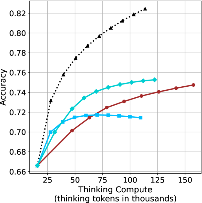
This image is a line chart illustrating the relationship between "Thinking Compute" (measured in thousands of thinking tokens) and model "Accuracy." The chart displays four distinct data series, each representing a different model or configuration. All models begin at a common baseline accuracy and diverge as compute increases, demonstrating varying scaling behaviors, including diminishing returns and, in one instance, performance degradation.
### Components/Axes
* **Y-Axis:** Labeled "Accuracy." The scale ranges from 0.66 to 0.82, with major grid lines at intervals of 0.02.
* **X-Axis:** Labeled "Thinking Compute (thinking tokens in thousands)." The scale ranges from 25 to 150, with major grid lines at intervals of 25.
* **Data Series (Legend inferred from visual markers):**
* **Black Dotted Line (Triangle markers):** The highest-performing series.
* **Cyan Solid Line (Diamond markers):** The second-highest performing series.
* **Red Solid Line (Circle markers):** The third-highest performing series.
* **Blue Solid Line (Square markers):** The lowest-performing series, showing a distinct peak and decline.
### Detailed Analysis
All four data series originate from a common starting point at approximately **(16, 0.66)**.
**1. Black Dotted Line (Triangles)**
* **Trend:** Steep, consistent upward slope. It shows the least amount of plateauing within the visible range.
* **Data Points:**
* Starts at ~0.66.
* (25, ~0.73)
* (50, ~0.775)
* (75, ~0.795)
* (100, ~0.81)
* (120, ~0.825)
**2. Cyan Solid Line (Diamonds)**
* **Trend:** Strong upward slope initially, transitioning to a concave-down curve (diminishing returns) as compute increases.
* **Data Points:**
* (25, ~0.70)
* (40, ~0.71)
* (50, ~0.725)
* (65, ~0.735)
* (80, ~0.745)
* (100, ~0.75)
* (120, ~0.753)
**3. Red Solid Line (Circles)**
* **Trend:** Steady, linear-to-slightly-concave upward slope. It does not show the sharp plateauing seen in the Cyan or Blue lines.
* **Data Points:**
* (25, ~0.67)
* (50, ~0.70)
* (65, ~0.715)
* (80, ~0.725)
* (95, ~0.73)
* (110, ~0.735)
* (125, ~0.74)
* (140, ~0.745)
* (155, ~0.748)
**4. Blue Solid Line (Squares)**
* **Trend:** Initial upward slope, peaking between 60k and 80k tokens, followed by a slight decline in accuracy.
* **Data Points:**
* (25, ~0.70)
* (40, ~0.71)
* (60, ~0.717)
* (80, ~0.717)
* (100, ~0.715)
* (110, ~0.715)
### Key Observations
* **Performance Divergence:** While all models start at the same accuracy, the gap between the highest (Black) and lowest (Blue) performing models widens significantly as compute increases, reaching a spread of approximately 0.10 accuracy points by 110k tokens.
* **The "Over-thinking" Anomaly:** The Blue line (squares) is the only series that exhibits a negative slope after a certain compute threshold (approx. 70k tokens). This suggests that for this specific model, increasing "thinking" beyond a certain point is detrimental to accuracy, potentially due to overfitting or the introduction of noise in the reasoning process.
* **Scaling Efficiency:** The Black line (triangles) demonstrates superior scaling efficiency, maintaining a steep trajectory where other models (Cyan and Blue) have already plateaued.
### Interpretation
This chart provides empirical evidence regarding the scaling laws of "thinking" models (likely Large Language Models utilizing Chain-of-Thought or similar reasoning compute).
The data suggests that "thinking compute" is not a universally beneficial resource; its utility is highly dependent on the model architecture. The Black line represents a model that effectively utilizes additional compute to improve reasoning, whereas the Blue line represents a model that reaches a "sweet spot" of compute, beyond which additional tokens degrade performance. This implies that for some models, there is an optimal compute budget, and exceeding it leads to diminishing returns or active performance degradation. The Red line suggests a model that scales reliably but less aggressively than the Black line.